| Image |
Comment |
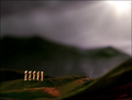
| 07/25/2006 02:42:37 PM |
Golden Glowby EayeshComment: regrettably, the wonkiness is a major distraction, though it does make the shot slightly pisa-esque. it also feels that there is slightly too much in the picture - i'd personally have been tempted to focus on the middle row of windows and the lovely intricate bit of stonework just above them. i think the bit of the church that isn't the tower takes away from the overall impact. the grey sky is a bit dull, but quite effective i think in enhancing the gold illumination of the tower. it has an awful lot of promise, this picture. fits the challenge, too. 5. |
 Photographer found comment helpful. Photographer found comment helpful. |
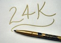
| 07/25/2006 02:36:58 PM |
Ink Of Goldby Mochrie99Comment: it fits the challenge, but due to the nature of the pen i think it would be difficult to make it Cor! Wow! in a photographic sense. the 24k bit is creative (you read it, next word in mind is automatically the challenge title) and technically there is little wrong with it. just feels a little cold - 4. |
| Photographer found comment helpful. |
| 07/25/2006 02:34:18 PM |
the connectionby smccComment: this is wondefully surreal and creative. so many wonderful elements in this, and i sincerely hope it does well. the very shallow DoF works very well, the colours nicely dark and atmospheric. the white in the corner is a smidgeon harsh, but that aside, brilliant, and very original. 10. |
| Photographer found comment helpful. |
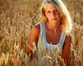
| 07/25/2006 02:32:11 PM |
Sheby Joey LawrenceComment: i have given this a nine - there is very much to like about this picture in terms of overall niceness; the warm lighting, the perfect complimentary environment, her lovely shampoo-commercial hair and even the slightly rustic (in a good way) attire all makes this very nice and warm and lovely. composition and crop works well too. it slightly lacks that wow-sparkle to give it the 10, but it's bloody close. |
| Photographer found comment helpful. |
| 07/24/2006 05:55:30 PM |
My Golden Retrieverby eostylesComment: so cute and totally fantastic! this should be amde into a big poster, 100 foot high and stuck on big ben. can offer no constructive criticism because it's perfect. 10 - easy! |
| Photographer found comment helpful. |
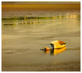
| 07/24/2006 05:51:57 PM |
Morning Has Brokenby ArtanComment: this would be great for the zen challenge! it also fits this one too - the boat is a great find and the fact that it's the nearly only man made thing in the picture (i'd have cloned out that cylinder in the top corner, myself) makes it really lovely. very nice composition, and nicely taken. 9. |
| Photographer found comment helpful. |
| 07/24/2006 05:49:26 PM |
A Golden Brewby bgslawComment: it's a good idea, but i think it's a pity that the foam didn't go to the top of the glass... the image also feels a little flat and two dimensional - i think it's because it was taken so level with the subject you can't see that the glass is round, and it feels a bit unsettling. it fits the challenge though, and i like the reflections in the grill at the base of the shot. 5. |
| Photographer found comment helpful. |
| 07/24/2006 05:45:32 PM |
Love Letterby JMSComment: it's the little touches that make this quite rewarding, and better than a photo of a pen by rights should be! the paper and the style of the hand writing work very well, and the detail of the pen very pleasing. i would like to have had the writing a little more in focus (the "you!" hurts the eyes a little bit) and the "I" is a bit uglier than the rest of the writing, but other than that, very very nice. 9. |
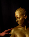
| 07/24/2006 03:31:49 PM |
...for everything King Midas touched turned to gold.by BrielleComment: this is very gorgeous, but the hand is totally superfluous - it just doesn't fit either in terms of composition or in stylistic terms - hate to say it, but it kind of undoes the fantastic work and obvious effort of getting your model just right. perhaps the hand doesn't look kingly enough, and the hand is too close to the bottom edge of the shot. it's still a great picture, but feel unbalaced. 8. |
| Photographer found comment helpful. |
| 07/24/2006 02:49:08 PM |
Delicacyby DjabordjaborComment: naturally, the croplets of water does make it a little cliched, but damn it, it adds so much to the shot! it's very nice, the lighting is beautifully done, and overall very nice. i thought the crop is a bit narrow, with possibly a bit too much black at the top, but that's a really minor niggle. it's a beautiful shot, and would be a good starting point for a similarly themed series... 9. |
| Photographer found comment helpful. |
Home -
Challenges -
Community -
League -
Photos -
Cameras -
Lenses -
Learn -
Help -
Terms of Use -
Privacy -
Top ^
DPChallenge, and website content and design, Copyright © 2001-2025 Challenging Technologies, LLC.
All digital photo copyrights belong to the photographers and may not be used without permission.
Current Server Time: 08/16/2025 10:35:13 AM EDT.