| Image |
Comment |
| 08/02/2006 05:35:41 PM |
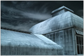
Zen & the Art of Architectureby lwkimagesComment: this is wonderful shot of architecture; the green shades and the dramatic effects of sky, lighting, glass are very dramatic and WOWSER in instant appeal. not quite sure where the link between this wonderful image and zen is, but then it's a very much a whatever you intepret to be type thing. i feel that you're a bit hampered by the limit in size of the shot, it seems to have such presence and impact that only a bill board would do it full justice. truly gorgeous. 10.
looks faintly kew gardens... is it? |
 Photographer found comment helpful. Photographer found comment helpful. |
| 08/02/2006 05:23:39 PM |
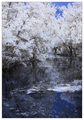
Take me away and into the futureby JudiComment: i love IR photography, but for zen, i'm not sure it's really the most effective effect. IR has a cold feel to it, and though striking, isn't really warm and comforting enough for my own interpretation of "zen". it's very pretty, but it just seems too cluttered to feel calming. the not very wide crop only serves to enhance a cramped cluttered feel. i think losing the lower 25% might help; the super still water is zen like, and i think a squarer crop would help it breath some more. erm, 6. |
| Photographer found comment helpful. |
| 08/02/2006 05:19:44 PM |
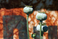
Rocks and Bambooby admart01Comment: composition of this image appears a bit all over the place really, what with there being no real focus of interest - plus there appears to be too much negative space to make the whole thing gel together as a single piece. as a still life it's nice, and the water droplets are (albeit a bit cliched) effective. i think less might prove to be more; lose the bamboo and it would have greater promise, i think. 5 |
| Photographer found comment helpful. |
| 08/02/2006 08:34:54 AM |
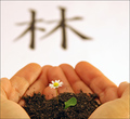
the forestby robaComment: i love the precise little details in this; what lessens the impact somewhat are the far eastern characters in the background. they're neither centred nor balanced on the side in some rule of third mannerism. they're also too blurry - it looks like a pair of crane flys landed on the lens! they're also totally redundant because the hands and single flower conveys much zen; a wide crop just below the tips of the index fingers gives a more pleasing balanced picture, i feel. i like the flower and hand elements a lot, so overall 7. |
| Photographer found comment helpful. |
| 08/02/2006 08:28:08 AM |
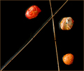
Marble Meets Marbleby scalvertComment: nice! very visual piece of art here. having it floating is very clever, as it increases it's zenness ten fold. it is reminiscent of something, but not sure what... 8. |
| Photographer found comment helpful. |
| 08/02/2006 08:03:08 AM |
Zen behind the barnby BanksonComment: the whole concept of zen is naturally open to a very wide sort of interpretation, but for me this doesn't really do it or strike a very zen like chord for me. visually, it's very attractive, especially with the choice of background. there does seem to be a very noticeable difference in focus on the plants though, and it is a bit distracting. 6. |
| Photographer found comment helpful. |
| 08/02/2006 08:00:43 AM |
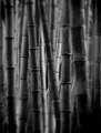
Light and Darkby bvoiComment: i like this very much; the bamboo is a natural link to the zen thing being very far eastern in feel and mood. the softness around the border is a nice touch, and it works exceedingly well conveying an almost dreamlike mental-journey-feeling ambience. the only thing i'm not too sure about is the B&W - kind of makes it look a bit like one of those 10000x microscopic picture of bacteria, which isn't very zen-like. still, it has that BAM! in instant appeal, and deserves to do well. 9. |
| Photographer found comment helpful. |
| 08/02/2006 03:33:28 AM |
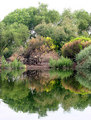
Sweetwater Wetlandsby phinbobComment: the thing that strikes you first about this is how white the sky is, which sadly detracts from the rest of the shot. it does feel slightly over exposed; the redder earthier areas look a bit washed out too. i'd suggest playing with levels on a basic editting package like elements would enhance and bring out the colours a bit more. 4. |
| 08/02/2006 02:53:11 AM |
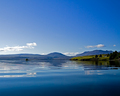
One quiet day in july.......by ivargComment: it's certainly very zen; enhanced by the smooth water and the total lack of humans. serene, i'd say. it's also visually lovely - 7. |
| Photographer found comment helpful. |
| 08/02/2006 02:49:37 AM |
Balanceby smilebig4me1xComment: blue playdoh? very clever! it's very pretty and likeable, though for me i think something is missing; it doesn't really have that BAM! factor... i think perhaps the white background feels a little overpowering. a pale blue, or a grey, or even a mirror might be worth playing with. still, i think it's very cute. kind of a zen for pre-schoolers. 8. |
| Photographer found comment helpful. |
Home -
Challenges -
Community -
League -
Photos -
Cameras -
Lenses -
Learn -
Help -
Terms of Use -
Privacy -
Top ^
DPChallenge, and website content and design, Copyright © 2001-2025 Challenging Technologies, LLC.
All digital photo copyrights belong to the photographers and may not be used without permission.
Current Server Time: 08/15/2025 11:52:26 PM EDT.