| Image |
Comment |
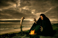
| 08/15/2006 03:16:50 AM |
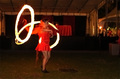
Summoning the flames by TUBORGComment: super lovely, albeit slightly scary creepy, stylish image. lovely ominous sky (oh, weird, i can see two eyes above your character in the clouds staring at the stick - creepy!). the colours of the image are impressively striking and rich in hues, though in that sort of familiar icelandic way. your PP skills are really top notch. i love how the flames glow such a nice bright orange against the rest of the image. the set up is great, the bent stick, the star wars garb, and the remote feeling environment all add to this. the fact that your model looks like a younger thinner meatloaf lessens the darkness factor a bit, but other than that, great stuff. 9. |
 Photographer found comment helpful. Photographer found comment helpful. |
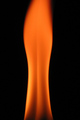
| 08/15/2006 03:03:25 AM |
Fiery Beautyby skasubaComment: nice; i see the line of a back, and it's very visually appealing. the deep orange against the black is also strikingly effective, and looks immediately really cool. the top of the flame loses its sharply defined edge evident in the rest (might have cropped it out myself) but otherwise very lovely. 8. |
| Photographer found comment helpful. |
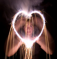
| 08/15/2006 03:01:09 AM |
The Fire in My Heartby scarbrdComment: it's an amazingly dynamic and exciting effect, but it is let down somewhat by the blurry person doing it. if you get her to wear a black coat, black gloves and maybe a black balaclava with no eye holes, and had the heart on it's own, i think it would prove to be a remarkable piece of symbolic artwork. but the unavoidable movement lessens the overall impact. 7. |
| Photographer found comment helpful. |
| 08/15/2006 02:57:01 AM |
Heartburnby buzzrockComment: regrettably, it's far too blurry. and even though it has a nice grain, it (paradoxically) looks like the noise reduction has been overdone... it's a weird mix of processing, really. it's a great concept, though. 4. |
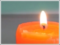
| 08/15/2006 02:50:01 AM |
Tameby pacpintoComment: this feels a smidgeon over exposed, though it might be the background that gives that impression - just feels to light and bright really. there's also weird artefacts along the edge of the candle... i like that the wick is nice and sharp, and it does work to focus the eye on the flame in the first instance. but then my eye wanders around and there's not a lot to absorb. just doesn't really grab me, i'm afriad. sorry. 4. |
| Photographer found comment helpful. |
| 08/15/2006 02:46:00 AM |
Fire Dancerby drz01Comment: it's a dramatic image, but i think it suffers a little from the camera being hand held (use a table if without tripod), and to be honest, the girl dancing around too much. in terms of composition, i feel that you could get away with having her centred because the right half of the frame looks a bit redundant, and the blur of camaera movement is more apparent here. or alternatively, go mad with the burn tool; you're allowed to and blackening out a lot of the background would draw principal attention back to the girl. the ghost effect of the girl is a bit unnerving (her second head is creepy!) and the "i'm a little teapot" pose that she's now doing feels a bit silly... i do sympathise; i've tried shooting similar performers and it's a right bitch! 6 for the drama and the high difficulty level. |
| Photographer found comment helpful. |
| 08/15/2006 02:31:55 AM |
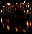
Candlelight Reflectionsby andrea22_alsComment: i'm guessing you also has a mirror behind the candles, because there is something very odd going on with the candles at the back left. i'm also guessing you might have had some preconceived ideas about what you wanted to achieve, and i think the picture suffers as a result; the desire to include the reflections in the bottom half doesn't really add to the overall picture - i think i'd have cropped it out entirely. it's also giving the illusion of being wonky (which voters never like because it's usually the first thing they see), and it's far too dark; i think some additional lighting (like a typical flashlight) rather than a longer exposure might have helped, because the way you've set the candles up is really nice, almost like a city skyline. 4. |
| Photographer found comment helpful. |
| 08/15/2006 02:25:40 AM |
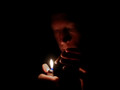
Flameby marboComment: nice macro, but it feels like there is almost a depth of field issue going on, as if the flame is some distance behind the match and it doesn't feel as if the match has actually been lit. it's a weird optical illusion i guess. it's a nice study of what happens once a match is struck, but i do with the flame element was more defined. 6. |
| Photographer found comment helpful. |
| 08/15/2006 02:23:05 AM |
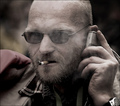
midnight smokerby saintaugustComment: one feels if the guy was directly head on partly obscured with a trilby hat might boost its noir quotient a bit... as it is, i like that it's quite a moody shot, though it feels that the white balance is a bit off (bit too red for me) and his fingers on his left hand both obscure his face and appear fuzzy in comparison with the rest. as you can tell, most of my criticisms are regarding his posture; technically (apart from the WB thing) this is really nice. i especially like the large portions of black; it feels like its enveloping and suffocating your subject (but in a good, cool way). you can also sense the immediate darkness as soon as the lighter goes out. yeh, this is really evocative in terms of mood and style. more i look, more i like it. 7. |
| Photographer found comment helpful. |
| 08/14/2006 04:16:26 PM |
Smoke Gets In Your Eyesby gsalComment: challenge description is more fire than smoke... i do like the pictures menace though ;treatment in terms of colour and shades and ever so slight desat works reall effectively. i think it might be better if he didn't have the phone to his head though, just seems a monir distraction for us the viewer. it's a cool candid portrait; but still not sure how relevant it is to this challenge... 7. |
| Photographer found comment helpful. |
Home -
Challenges -
Community -
League -
Photos -
Cameras -
Lenses -
Learn -
Help -
Terms of Use -
Privacy -
Top ^
DPChallenge, and website content and design, Copyright © 2001-2025 Challenging Technologies, LLC.
All digital photo copyrights belong to the photographers and may not be used without permission.
Current Server Time: 08/15/2025 03:03:42 PM EDT.