|
|
| Image |
Comment |
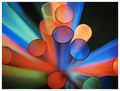
| 03/12/2007 06:35:57 AM | Colourful Tubesby OmniComment: very lovely bright colours, and a good striking image. the apparent randomness of the straws is very appealing in a natural kind of way. the only complaint is that though i see the circles, the most prominent thing about the image is how ones eyes are drawn into the middle of the shot in a flying at light speed kind of way. still, very gorgeous stuff.
Dave's Weighted Scoring System �; composition + technical 2.5/3, challenge 0.5/1, post processing results 1.5/2, ooooh factor 3/3, originality 0.5/1 = 8 |  Photographer found comment helpful. Photographer found comment helpful. |
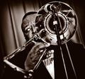
| 03/12/2007 06:02:02 AM | grooveby ThingOneComment: Super-groovy! there's much to admire and like from this shot. the colours are very fitting in terms of period, the depth of field (blur in the foreground) adds much life to the shot indicating movement and makes it feel totally unstaged or posed. i love the angle, crop and the burning around the frame. the only detracting element is the guys eye (too much area of white and the ball looks faintly feline) and i'm in two minds whether i like that he's looking so far to his right. i like that it does convey a personality of shyness from you the photographer, but it also gives a nonchalant attitude like "i'm too cool for this gig"... still, minor grumble and otherwise it's a cool cat of a photo.
Dave's Weighted Scoring System �; composition + technical 3/3, challenge 1/1, post processing results 2/2, ooooh factor 2.5/3, originality 0.5/1 = 9 | | Photographer found comment helpful. |
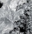
| 03/12/2007 03:34:40 AM | Secretby ltlmschrisssComment: an elegantly stylish image; especially like the use of the desaturation which i find to be very effective. has something very cover of a book thing about it - would probably be a fairly successful stock photo. only slight reservation is that it feels a tad too tightly cropped, and might have in fact benefitted from a black frame. and also not sure if it really says "circle" prominently enough. Otherwise very likeable though.
My New Scoring System �; composition + technical 2/3, challenge 0.5/1, post processing results 2/2, ooooh factor 2.5/3, originality 0.5/1 = 7.5 (or 8) | | Photographer found comment helpful. |
| 12/20/2006 05:28:23 PM | a violent youthby posthumousComment: really love this photograph - deeply not surprised to find it near the bottom of the pile though (people have really limited imagination). you should get some satisfaction from the five 10s, which are all well deserved. the blur, level of noise, and the colours being restricted to reds, browns and whites are very effective, creative and lovely. a good cat capture. | | Photographer found comment helpful. |
| 09/13/2006 03:07:32 AM | In Outby NiteseadComment: slightly disorientated as it took me a moment to realise it's taken looking up, not down. using the negative trick made the dizziness moreso. i actually quite like the abstract nature of this, and strikes me as something quite creative. the only thing that lessens the abtract feel is that pesky leaf up the top, which looks far too conventional and normal. but i love how the rest of the leaves form a nicely random patterned background to the trunk. visually quite lovely.
new scoring system�; composition + technical 2/3, challenge 1/1, post processing results 1.5/2, ooooh factor 2.5/3, originality 1/1 = 8 | | Photographer found comment helpful. |
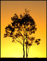
| 09/13/2006 02:56:29 AM | Sunset Twinsby kingsleyComment: D'oh! if you hadn't titled it "twins" i probably wouldn't have noticed that it didn't meet the challenge! the silhouette against the yellow is nice, though the blacks turn orange on some of the branches, which kind of lessens the very asain block wall paper type stamp vibe i got with it. also , the sky at the top of the shot turns a rather unsightly shade of grey, but i guess there was little you could do with that. it's a pretty shot, i like the centred composition, and i like the delicate nature of the tree... just doesn't set my pants alight.
my new system of scoring: composition + technical 2/3, challenge 0.5/1, post processing results 1/2, ooooh factor 1/4 = 4.5 (well, 5) | | Photographer found comment helpful. |
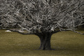
| 09/13/2006 02:49:14 AM | Wickedby LozzaComment: i love the tree itself, i think it's wonderful tolkien-esque with all the spindly branches and the super stumpy trunk. i also really like how the tree is solidly branching out beyond the frame, filling out the top corners so well.
however, i don't think that the selective desat does your photo any favours whatsoever; the b&w tree works, but the odd and unattractive mustardy green grass at the bottom just makes it look weird, and not in a particularly funky stylistic way. if you editted the greens to be less satuated and lighter so more white and pale, i think the shot would feel more balanced and dynamic. composition + technical 2/3, challenge 1/1, post processing results 1/2, ooooh factor 2/4 = 6 | | Photographer found comment helpful. |
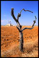
| 09/11/2006 04:59:49 AM | Once was a treeby h2Comment: personally, something like "give me a 'P'!" seems like a more obvious title. the tree here is so human-esque; i love how it really has bodiness and personality. i'm also glad you avoided the temptation to have the wind thing in the background inside the arms of the tree - good composition decision there. other aspect i like is the red soil; very photogenic and almost martian; gives the whole thing an otherworldly kind of look. very nice indeed - 8. | | Photographer found comment helpful. |
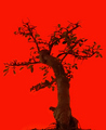
| 09/11/2006 04:34:27 AM | "Autumn's the mellow time." (William Allingham)by obsidianComment: i think this would have been a bit more effective if it was a really solid silhouette; i think the red background would have set that off really well, and a posh wallpaper company might have used it as a print. as it is, it's still rather striking; the red is really lovely and bold. very likeable; 7. | | Photographer found comment helpful. |
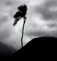
| 09/11/2006 02:33:53 AM | Enduranceby BalkoComment: stunning composition and visually gorgeous. the very well chosen title really expresses the solitude of the tree muchly. the silhouette and greyscale works great, and really, this tree was a super find for the challenge. can't imagine how it could be even minutely improved or made more awe inspiringly likeable, so 10. | | Photographer found comment helpful. |
Home -
Challenges -
Community -
League -
Photos -
Cameras -
Lenses -
Learn -
Prints! -
Help -
Terms of Use -
Privacy -
Top ^
DPChallenge, and website content and design, Copyright © 2001-2024 Challenging Technologies, LLC.
All digital photo copyrights belong to the photographers and may not be used without permission.
Current Server Time: 04/25/2024 10:48:41 PM EDT.
|