| Image |
Comment |
| 02/20/2004 08:30:17 AM |
Frostby ManikzComment: This certainly meets the �texture� part of the challenge, but, it could use a single point of interest to make good use of that interesting texture as background. |
 Photographer found comment helpful. Photographer found comment helpful. |
| 02/20/2004 08:28:08 AM |
Copper Shineby KentuckyGalComment: That over exposed penny hurts this a lot. The focus seems just a tad off, but I think that might have been OK. One question: why are all the pennies the same? Why not an old one thrown in to give a different but similar thing to look at? |
| 02/19/2004 07:17:41 PM |
Is Curly a texture????by boyte1Comment: Great colors. Composition needed a little something to break up the sea of ribbons, but, this is a pleasant photo. |
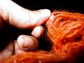
| 02/19/2004 07:14:56 PM |
red carpet hairby denisprayComment: Thumb seems overexposed, and the yarn could have been sharper. The composition is good. |
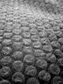
| 02/19/2004 07:12:36 PM |
Pop Me...You Know You Want Toby lizzyc3Comment: The composition is too regular to hold my interest. With all greys, I think you needed to put something that grabbed interest in as an eye catcher. |
| Photographer found comment helpful. |
| 02/19/2004 07:11:12 PM |
fluffyby Rando D300Comment: The tree looks in focus and the bird looks just out of focus a little. A little more DOF would have captured them both and improved the score a little, but this is still a good shot with good composition and colors. |
| 02/19/2004 07:09:04 PM |
Interwovenby BBBastetComment: A little more sharpness might have scored another point, but this isn't bad by any stretch of the imagination. The colors, and nearly parrallel lines running left/right are interesting. |
| 02/19/2004 07:17:03 AM |
Harmonyby RoosterComment: Too dark, but the reflection on the top head are great. If you could have gotten that on the other figures this would have been neat. |
| Photographer found comment helpful. |
| 02/19/2004 07:13:17 AM |
|
| Photographer found comment helpful. |
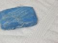
| 02/19/2004 07:12:41 AM |
stone and treeby hordursvComment: Composition could have been better. The concrete line in the middle is too even. I also might have used more depth of field. |
Home -
Challenges -
Community -
League -
Photos -
Cameras -
Lenses -
Learn -
Help -
Terms of Use -
Privacy -
Top ^
DPChallenge, and website content and design, Copyright © 2001-2025 Challenging Technologies, LLC.
All digital photo copyrights belong to the photographers and may not be used without permission.
Current Server Time: 08/19/2025 07:07:05 AM EDT.