|
|
|
Showing 331 - 340 of ~492 |
| Image |
Comment |
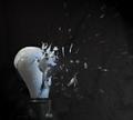
| 12/26/2004 11:04:59 AM | Shattered Ideaby Travis99Comment: Greetings from the Critique Club...
Your composition is great. You captured enough of everything that the viewer knows exactly what is going on and doesn't have to look around the image to find an area of interest.
The lighting seems a bit dark for my taste, personally. It doesn't look like a flash was used here, but a soft one might have helped. The lighting that was used seems to put some reflections on the bulb which are a little bit distracting, but not too much.
The focus throughout seems a bit soft but that's probably due to the high ISO -- which could be fixed with more light and a faster shutter speed.
Overall, it's a great capture, and I'm sure it took a long time to set up. keep shooting! |
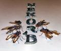
| 12/26/2004 10:58:36 AM | ~Mirage~by tmilobComment: Greetings from the Critique Club...
Definately fits the challenge, so that's good heh. Seems the lighting is a bit harsh on the lower part of the photo and almost in need of some more in the upper part.
The focus seems a bit soft throughout, but it's not that bad. As far as composition goes, it's obviously well thought-out, but as far as for viewing, my eyes seem to jump around quite a bit never really coming to rest on a main subject of interest.
I, too, ask myself why the flies? I don't really feel they add anything extra to the image, just seem to busy it up some. I've noticed that when shooting close up shots like this, the image will come out a lot 'cleaner' if you use a paper that is more shiny than coarse. The shadows will fall smoother and there will be soft reflections whereas in this shot, everything seems a bit coarse.
-- Fix the lighting, and use a 'smoother' paper, and I bet your score would increase quite a bit. Overall, it's a good idea, keep shooting! Message edited by author 2004-12-26 10:59:26. |
| 12/26/2004 10:52:21 AM | Broken Lawby mcrochipComment: Greetings from the Critique Club...
Definately a broken building that you captured, so you met the challenge well I'd say. The fence with the sign on it really doesn't add much in my opinion other than telling the viewer that the building isn't accessible for whatever reason and is possibly dangerous (you can't really read the sign).
The focus throughout the photo seems a bit off except maybe on the door where it seems good -- A smaller aperture here probably would have gotten a bit higher of a score.
Also, the top part of the building seems a bit noisy. If you used a faster ISO and a longer shuter speed, possibly the image would have come out a bit stronger. And like others have said, I think the white balance may have been a bit off.
Otherwise, great subject choice, just a few things that could have bumped up your score some for next time. Keep shooting! |  Photographer found comment helpful. Photographer found comment helpful. |
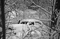
| 12/26/2004 10:47:25 AM | Brokenby Dim7Comment: Greetings from the Critique Club...
There is definately a broken car in the image. The car is rather hard to make out and hard to find. Perhaps if it held more of the frame, it would stand out more -- or perhaps not. The whole idea that the car has been sitting there broken for some time is very apparent by the snow covering it. There is just too much snow to really make it out though.
As far as the composition, the tree to the left is almost as bad as say a finger that got in the way of the lense. My eyes sort of jump around the image from place to place never really coming to rest on the broken car.
The shot also seems just a tad dark throughout for my taste. Maybe a little slower of a shutter speed to allow a bit more light in would have helped a little. Either way, good idea, keep shooting! |
| 12/22/2004 10:41:40 PM | Pain in the Neckby smellyfish1002Comment: Greetings from the Critique Club...
Not sure I like the crop. Seems like you could have included more at the top but also more at the bottom and left more black all around as open space even on the left where it seems like it just faded to black.
Your subject is definately interesting -- seems like an old clay model of some sort. The neck is definately broken, but I can't say I feel most viewers would notice that if the title didn't point it out.
There's a lot of potential I think with this subject, but nothing just stands out, grabs me, or pulls me into the image. Instead, my eyes just seem to wander all around. Just my humble opinion :-D |
| 12/20/2004 12:07:14 AM | |
| 12/20/2004 12:03:09 AM | | | Photographer found comment helpful. |
| 12/20/2004 12:01:02 AM | Halvesby deapeeComment: for the record -- it is cut AND broken -- wanna come over and try it see if it works ;-)
thanks all for the comments. |
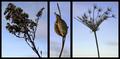
| 12/18/2004 10:24:54 AM | Winterby thatcloudthereComment: It doesn't really work for me. All three just seem a bit out of focus. My eyes just don't really like how the middle one is so much smaller. Sorry for my brutal honesty, really just trying to help (I know my opinion doesn't mean much, thought I'd share it anyway though). | | Photographer found comment helpful. |
| 12/15/2004 12:11:44 AM | | | Photographer found comment helpful. |
|
Showing 331 - 340 of ~492 |
Home -
Challenges -
Community -
League -
Photos -
Cameras -
Lenses -
Learn -
Help -
Terms of Use -
Privacy -
Top ^
DPChallenge, and website content and design, Copyright © 2001-2025 Challenging Technologies, LLC.
All digital photo copyrights belong to the photographers and may not be used without permission.
Current Server Time: 08/04/2025 07:22:57 PM EDT.
|