| Image |
Comment |
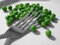
| 02/29/2004 09:26:48 PM |
not peas again....by nordicComment: I like the green, it really stands out from the rest of the photo. To improve this run the picture through neat image, there is some noise visible on the fork. I also don't like the shadows at the top. |
 Photographer found comment helpful. Photographer found comment helpful. |
| 02/29/2004 04:44:06 PM |
Multiplicity Destroys Mundanity by PaulkComment: I like the photo, but can't figure out what this is. It would have helped to take this at a different time, or a different day. The sky is just too bright, and blown out in the top left corner. |
| Photographer found comment helpful. |
| 02/29/2004 04:42:24 PM |
Growth Opportunity by EddyGComment: Great job of being creative, so many entries are so similar, yours stands out. This also fits the subject very well, rubber bands are very ordinary. I think you should've used a smaller DOF, or somehow stopped the viewers eyes from moving up, and off the page. |
| Photographer found comment helpful. |
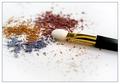
| 02/29/2004 04:39:57 PM |
Ordinary Eyeshadowby ScantyNebulaComment: The DOF is nice, lets me focus on one portion of the photo. I also like all of the colors. You should have probobly tried to compose it a little differently, so that the brush tip isn't in the middle of the photo. |
| Photographer found comment helpful. |
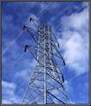
| 02/29/2004 04:38:06 PM |
Power and Puffsby falveyComment: I like all of the diagonal lines in the photo. The clouds , and blue in the background is also very nice. You should have probobly gotten a little closer to the tower, and closer to the ground, this would make the tower look bigger. Overall, I like it very much. |
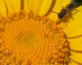
| 02/24/2004 11:44:55 PM |
A Taste of Pollenby sspinComment: This is a great photo, I like the composition, and bright yellow color. It would've been better if the bee was in focus,it looks a little off. The yellow looks a little oversaturated, but that might just be me. |
| Photographer found comment helpful. |
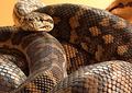
| 02/24/2004 11:43:14 PM |
Queensland Carpet Pythonby BrennanOBComment: I like the snake, there is sertaintly an interesting texture here. Its a shame that you didn't make the photo big enough to see the details, I am sure you will see this effect your voting. Remember to always make the long side 640 pixles. |
| Photographer found comment helpful. |
| 02/24/2004 11:39:32 PM |
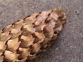
Cone of Silenced Textureby MWittComment: The background is too distracting, having a texture in the background distracts me from the pine cone. You should try having the background farther from the subject so that it looks more blurry. |
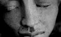
| 02/24/2004 11:37:44 PM |
MOMENTby SIDUS1Comment: I like that you submited an original photograph. Improving the DOF, getting more in focus should help. Right now I think that only the nose is in focus, it would be better if the face was in focus. |
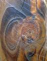
| 02/24/2004 11:36:03 PM |
Texture: Woodby TampaDanComment: Putting the know a little lower in the frame should help with the composition. Other than that, I think the texture of the tree is interesting. |
| Photographer found comment helpful. |
Home -
Challenges -
Community -
League -
Photos -
Cameras -
Lenses -
Learn -
Help -
Terms of Use -
Privacy -
Top ^
DPChallenge, and website content and design, Copyright © 2001-2025 Challenging Technologies, LLC.
All digital photo copyrights belong to the photographers and may not be used without permission.
Current Server Time: 08/01/2025 09:26:15 PM EDT.