| Image |
Comment |
| 08/11/2004 08:12:28 PM |
Follow the palm lined pathby UNCLEBROComment: vibrant colors but the photo looks a tad over exposed. The reason I say this is because it looks blurry because of how bright the colors are in relation to the sky which is even brighter. The photo overall fits the challenge well. nicely done. <5> |
 Photographer found comment helpful. Photographer found comment helpful. |
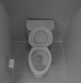
| 08/11/2004 08:09:58 PM |
"Vanishing Point"by ardnetihComment: lol funny but I don't think this meets the challenge. "The vanishing point is the appearance of a point on the horizon at which parallel lines converge together." But something about the picture... It would appear the pictur eis not level and by this I mean you were probably standing on your left foot when you took the shot and not centered or level with the toilet. I like the grey scale and admire the way you got no hot spots from the shiney bowl. last but not least I would lke to offer you a job in my bathroom. Unfortunately mine is not as clean. lol |
| Photographer found comment helpful. |
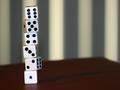
| 07/30/2004 01:36:07 PM |
Crooked Straightby toekneeComment: An interesting take but I'm not fussy on the shot. It looks like a last minute entry just to enter the challenge. Altho I have never shot dice perhaps a marker to color in the black dots to eliminate the hotspots would have helped. Also a slightly not so wide shot would have a greater impact for this picture. I like the shallow DOF tho. |
| Photographer found comment helpful. |
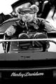
| 07/30/2004 01:30:18 PM |
Necessityby jmsetzlerComment: I like the black and white idea and the DOF but its hard to understand if the shot is of the bike or the bear. Overall I like the shot. A very artistic approach to this challenge. It also looks likt the picture could have been rotated a couple of degrees CW to straighten it out. <8> |
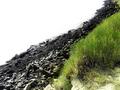
| 07/30/2004 01:25:29 PM |
grass and rock layersby ritaardComment: I'm not fussy on this particular shot. The white in the top left makes it a very hard picture to look at for any lenght of time. I also don't like the title. Perhaps something more like "evolution of life" or something more to do with nature would have had a greater impact. a tighter crop from the top and bottom might have also eliminated some of the white giving the picture more appeal. |
| 07/30/2004 01:21:21 PM |
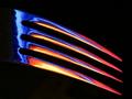
PHoto PHorkby scab-labComment: wow well done. great colors and clarity. I really like the look on the black background. makes the picture more vibrant. <10> |
| Photographer found comment helpful. |
| 07/30/2004 01:19:15 PM |
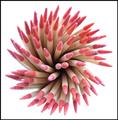
Toothpicksby ridvanerkanComment: An interesting shot but I find it to be to bright and bleaching out the pinkish color on the end of the toothpicks. It may have also been a little better if the image was sharper. Great positioning of the toothpicks tho. |
| Photographer found comment helpful. |
| 07/30/2004 01:16:51 PM |
Flaming Fondueby kirtiebuComment: In my opinion this does not meet the challenge because I really don't know what it is. It is however a great shot but perhaps a little to small. Nice colors and really well done avoiding the hotspot from the pot (i assume). <5> |
| Photographer found comment helpful. |
| 07/30/2004 01:14:12 PM |
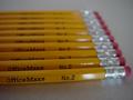
Pick A Pencilby alisasaurComment: the slight angle of the picture is a nice touch but the DOF is to shallow in my opinion and makes the shot look blurry. |
| Photographer found comment helpful. |
| 07/30/2004 01:12:57 PM |
Remotely Inclinedby markmyshotsComment: great shot. I like the way the remote glows against the tv in the background. great clarity, nice DOF and excellent colors. <8> |
Home -
Challenges -
Community -
League -
Photos -
Cameras -
Lenses -
Learn -
Help -
Terms of Use -
Privacy -
Top ^
DPChallenge, and website content and design, Copyright © 2001-2025 Challenging Technologies, LLC.
All digital photo copyrights belong to the photographers and may not be used without permission.
Current Server Time: 08/09/2025 12:01:28 AM EDT.