| Image |
Comment |
| 06/06/2005 08:18:48 AM |
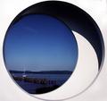
End of a Nautical Dayby JPRComment: Interesting shot. Altho the curvse and circles do very litle for my tastes I find the photo to fit the challenge really well and puts a natural abstract feeling to the photo which in my opinion raises the bar for this challenge. I like the colors, clarity and focus involved with this photo and think it wil do very well dispite me not liking the photo itself. Again just my taste and is a very well thought out and well planned photo. Well done and good luck in this challenge. <9>
BTW: my tastes have very little to do with how I vote. |
 Photographer found comment helpful. Photographer found comment helpful. |
| 06/06/2005 08:13:52 AM |
Laundry Dayby neophyteComment: I'm not fond of the subject at all. I find it gives a "last minute" feel to your entry. I do like the clarity and the B&W conversion but really cannot get past the subject. Good luck in this challenge. <5> |
| Photographer found comment helpful. |
| 06/06/2005 08:09:34 AM |
Clematisby banmornComment: A beautiful shot with excellent colors but I find the photo appears to be a little to over-sharpened. Perhaps its pollin (and could very well be) but I find it to be distracting. If I sit back a bit further from the monitor it clears up a bit which is why I said it could be pollin. For the most part the photo is very well done and well centered. I do love the clarity of the pedals and it looks just as it would feel if you were holding it in your hand. Well done and good luck in this challenge. <8> |
| Photographer found comment helpful. |
| 06/06/2005 08:01:19 AM |
Wheelby MonaComment: I don't know if its the contrast or the soft focus I don't like but one of the 2 is bugging me. It makes the photo appear to be blurry which can naturally happen when shooting wood. It may also be color balance. As for the subject IMO wagon wheels have been over done on this site altho it does fit the challenge. Perhaps a sharpening thru photo shop and playing with the color levels would have improved this shot a bit. I also would have liked to seen the sides cropped more to bring the attention to the wheel and not the wood thats framing it. Perhaps a B&W conversion and contrast adjustment would have also made a difference in this photo. Good luck in this challenge. <5> |
| 06/06/2005 07:56:17 AM |
Stairway to Heavenby idnicComment: Altho this is a photo of a framing of a house IMO I do not think this is what they mean for this particular challenge. I has beautiful blues and it is a very crisp photo I find the photo itself lacks interest/subject. Perhaps a tighter crop would have made for a better photo, for example if you cropped up the bottom stair (about where you see the 5 blue marks on the plywood) and centered the crop (crop some off the right side) would have made for a more appealing photo. All and all I tink its the subject itself that I personally find unappealing. It also appears that the camera was on a bit of an angle giving it an odd depth on the right side of this photo. However I do realy like the blue sky in the background and love the way you have captured the cloud within the frame of the house. Good luck in this challenge. <5> |
| Photographer found comment helpful. |
| 06/06/2005 07:54:25 AM |
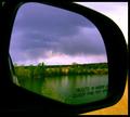
Running from the Stormby singsunshineComment: Well done. I bet this image gets slammed for having the "object in mirror..." but I feel it adds to the photo just as much as it takes away. Its to bad you couldn't find a better angle to take the shot from as the mirror housing is taking away from some of the photo. I do like the DoF and the photo has excellent colors and clarity. Well done and good luck in this challenge. <9> |
| Photographer found comment helpful. |
| 06/01/2005 08:12:07 AM |
TOSkyline.jpgby p3wizComment: same with this image... try a 1 degree rotation CCW to straighten out the buildings. |
| Photographer found comment helpful. |
| 05/27/2005 07:52:19 AM |
Gerber Daisyby amcfotoComment: I would have to suggest a nice semi-thick black border would bring the photo more to life (IMO). I also find the contrast to be a little on the high side altho that could be this monitor. If you turn down the contrast just a tad it should clear up the center and give the photo a little more sharpness. Excelent colors and the pedals are very crisp and clearly defined. |
| Photographer found comment helpful. |
| 05/26/2005 08:08:23 AM |
Light Danceby DrakeComment: The photo appears to be a little OoF and to high contrast for my liking. I also don't think the title fits the photo very well either. Good luck in this challenge. |
| 05/26/2005 08:06:41 AM |
In the grooveby rhipsterComment: I'm not fond of the focus in this photo. It also looks like some funny editing on the bottom left corner. When entering a challenge it might be a wise question to ask, "is this something you'd hang on your wall???" Good luck in this chalenge. |
Home -
Challenges -
Community -
League -
Photos -
Cameras -
Lenses -
Learn -
Help -
Terms of Use -
Privacy -
Top ^
DPChallenge, and website content and design, Copyright © 2001-2025 Challenging Technologies, LLC.
All digital photo copyrights belong to the photographers and may not be used without permission.
Current Server Time: 08/07/2025 06:57:57 AM EDT.