| Image |
Comment |
| 06/07/2005 08:11:25 AM |
Hullby Mr_PantsComment: I'm not fond of this photo for his challenge because I think there is more frame then subject. Not only that but I had to re-read your title to fully understand what the photo was about. I think this photo would have done better in the rusted challenge. Good luck in this challenge. <4> |
 Photographer found comment helpful. Photographer found comment helpful. |
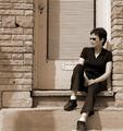
| 06/07/2005 08:08:33 AM |
The Doorwayby ColeyComment: I've looked at this photo several times now and have yet to see the frame. It's a nice portrait with excellent clarity, contrast and the lack of color really makes this photo unique but in my opinion it does not meet the challenge. <5> |
| Photographer found comment helpful. |
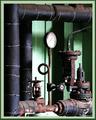
| 06/06/2005 10:28:45 AM |
Rustby eyesightphotoComment: I wish the pressure gauge was clean to make it stand out more in the photo. I like the framing and clarity of this photo and find the photo to have an overall pleasing feel to it. Well done and good luck in this challenge. <7> |
| Photographer found comment helpful. |
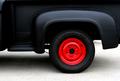
| 06/06/2005 10:18:59 AM |
Hot Wheelby DefyTimeComment: I'm not fond of this photo but I can't quite figure out why. prehaps its the lack of color??? or the shadow under the truck??? not sure. However it does fit the challenge but IMO the frame/background/foreground is bigger then the subject. Good luck in this challenge. <5> |
| 06/06/2005 10:14:47 AM |
Within the shadeby ergoComment: I've been looking at this photot then left then came back and yet I still don't see a frame. Overall I think the photo is a nice photo and a very pleasing one to look at but I don't see the connection to this challenge. Good luck. <4> |
| Photographer found comment helpful. |
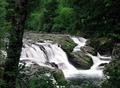
| 06/06/2005 10:09:02 AM |
Dugon Fallsby ace flymanComment: Seeing the frame is not as easy as some photo's IMO this photo does meet the challenge. It is very pleasing to the eye and has great colors, clarity and crispness. I find it to be a little on the dark side tho but find the dark brings out the greens which is nice for a change. Well done and good luck in this challenge. <8> |
| Photographer found comment helpful. |
| 06/06/2005 09:52:52 AM |
ta-daaaby 4scoreComment: I'm not fussy of you subject. I find it lacking and uninspirational. I also don't like the roof showing thru on the top left side and find it to be distracting. Good luck in this challenge. <7> |
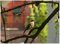
| 06/06/2005 09:45:31 AM |
Little Birdby bobdaveantComment: I like the DoF but find it gives a OoF to the rest of the photo (just slightly). Perhaps its just a contrast issue. Good luck in this challenge. <5> |
| Photographer found comment helpful. |
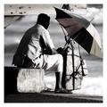
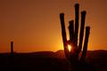
| 06/06/2005 09:39:59 AM |
Arizona Sunset: Rays of Light Framed by Saguaroby lwphotographyComment: I guess it meets the challenge. Barely IMO but it does. However I find the frame and subject are not perportionate and there is more background the subject. I like the sun setting and the crispness/clarity of the silohouette but the unpreportionate sizes is to much. Good luck in this challenge. <6> |
| 06/06/2005 09:35:03 AM |
Framed in Rockby SteveinnzComment: way to bright and way to much contrast. The contrast is washing the colors away and the brightness is taking away from the detail. Good luck in this challenge. <4> |
| Photographer found comment helpful. |
Home -
Challenges -
Community -
League -
Photos -
Cameras -
Lenses -
Learn -
Help -
Terms of Use -
Privacy -
Top ^
DPChallenge, and website content and design, Copyright © 2001-2025 Challenging Technologies, LLC.
All digital photo copyrights belong to the photographers and may not be used without permission.
Current Server Time: 08/07/2025 02:40:50 AM EDT.