| Image |
Comment |
| 05/17/2004 03:31:35 PM |
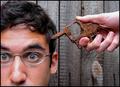
Rusted But Still Trustedby ShakeyComment: Hi Tim,
Greetings from the Critique Club...
Congrats on your best showing to date with the shot. As I read the comments, I don't have too much to add.
If you were going for a purely "product" shot, I would agree that there are a few technical problems (dof and lighting) that detract a bit from it. The pure white background and simple - square on composition are sending the message that maybe that's what this shot is meant to be and so folks have an expectation that the other elements need to be there.
The oof red in the handles adds a bit of punch to the shot and the in-your-face angle give the shot its interest (I'd like the tips to be more in focus). I would fix the rotation so that it's level. The symetry of the subject's placement call for a squarer frame and a dead center placement.
Please contact me if you have any questions on my comments.
Regards,
Theresa |
 Photographer found comment helpful. Photographer found comment helpful. |
| 05/17/2004 03:19:18 PM |
Bangby budokanComment: Hi Sam,
Greetings from the Critique Club.
(Reading through the comments -- seems your humor was appreciated by some but in poor taste to others. Seems like this type of shot gets extra points from some balanced out by those who didn't like the symoblism).
I don't know if I can add anything brilliant to the notes below.
Your border brings out/repeats the lines in the photo and compliments the composition. Playing around with the 50/50 balance of head/hand (as some offered in their suggestions) could have the benefit of getting rid of the knot in the wood as I found it an intrusive part of the background.
Overall, I think this shot is well done. It's creative take on the theme is refreshing. Your subjects expression is spot-on and the rusty object plays an important role in the story you're telling.
Please pm me if you've got any questions on my comments,
Regards,
Theresa |
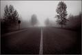
| 05/17/2004 02:57:19 PM |
Foggy Road Homeby PedroComment: ooo I wish that sign wasn't there ;) great use of b&w; you've really set the mood. |
| Photographer found comment helpful. |
| 05/17/2004 02:54:13 PM |
|
| Photographer found comment helpful. |
| 05/16/2004 08:02:05 PM |
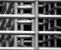
Guide Rail..by toddheadComment: Greetings from the Critique Club...
I'm not sure I can add any brilliant comments from the ones you've already received...
Your play of light and shadow as well as dof are what make this shot interesting. Use of black and white and right angles makes the metalic, cold feel of the shot jump out. I think if the fore-most bars were crisper the feeling would be intensified and that would make the shot stronger (to those of us who liked the sterile feel the metal gives the viewer). Likewise a bigger difference between dark and light areas would intensify the impact.
Your eye for abstract composition is clearly shown here. Nicely done.
Regards,
Theresa |
| Photographer found comment helpful. |
| 05/16/2004 07:52:25 PM |
True Speed Of Lightby DufusComment: Hi Stefan,
Greetings from the Critique Club!
Your technique to produce this shot was truely painting with your camera and produced an entry that really met the challenge.
I like the flowing lines of light that create an intense set of curved lines. You filled the frame well with both symetrical and random light.
Because the dominant color of the lines is white, your white border accents this. For me the softening/blurring of the border detracts from the graphic, hard edges of your compostion. A contrasting black may have shown off the other vibrant colors.
Regards,
Theresa |
| Photographer found comment helpful. |
| 05/16/2004 07:40:55 PM |
Composition 1by elsapoComment: Greeting from the Critique Club (you have the dubious honor of being my first!!)
Meets the challenge topic for sure, wonderfully undefineable abstract
I really like the shifting colors and "bubble" feel. You've worked the refracted light well and by varying the colors added to the interest. I agree with others' comments on the lower part, a bit more variation of color/light would help. A bit of "too much of a good thing"
Please feel free to pm me with any questions.
Theresa
|
| Photographer found comment helpful. |
| 05/16/2004 07:23:47 PM |
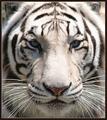
Black & Whiteby tyt2000Comment: I like your full-face composition -- it adds the drama to your shot. One of my ribbon picks. |
| Photographer found comment helpful. |
| 05/16/2004 07:22:55 PM |
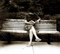
Socialby AaronComment: one of my ribbon picks this challenge (not sure I get the title but I do like the way you used dof to connect me to the theme.)
A thinner border would have improved the composition a bit |
| 05/16/2004 05:55:12 PM |
|
| Photographer found comment helpful. |
Home -
Challenges -
Community -
League -
Photos -
Cameras -
Lenses -
Learn -
Help -
Terms of Use -
Privacy -
Top ^
DPChallenge, and website content and design, Copyright © 2001-2025 Challenging Technologies, LLC.
All digital photo copyrights belong to the photographers and may not be used without permission.
Current Server Time: 08/25/2025 12:10:57 AM EDT.