| Image |
Comment |
| 05/18/2004 07:16:15 PM |
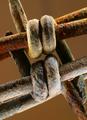
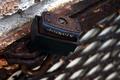
May the implements of slavery rust to pieces!by fulcrumComment: Hi James,
Nice showing with your first entry -- welcome! (in case you don't know -- marking "helpful" the comments you received during the challenge that were helpful is a way of aknowledging those that took the time.)
I don't have much to add to the comments below -- I'll just highlight the ones that are true for me. The lighting, while harsh, gives the edge to the composition and let's it match your title (without this the title is contrived and without anchor in the frame)
The color and macro approach let me get close to the subject to study what you saw in it. The elements are complex enough to hold my interest and connected enough to paint a cohesive picture. I tried the shot in landscape format and wonder if it improves the composition?
All in all an excellent entry.
If you have any questions, feel free to pm me.
Regards,
Theresa |
 Photographer found comment helpful. Photographer found comment helpful. |
| 05/18/2004 07:03:06 PM |
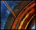
Rusty Rainbowby larrylefComment: Hi Larry,
Greetings from the Critique Club... (I see you've made no comments on others' shots yet have asked for a critique on a shot with 25+ comments -- may I recommend you offer your perspective to others and comment? It's a great way to say "Thanks")
First I must confess I like abstract stuff and this fits that category very well.
The strengths of this shot are the colors (artistic mix of bold chromatic tones), the curves (creating the interest in the composition - placement in the frame is right on) and the soft focus (give it more of an abstract feel and softens the colors to blend into each other)
As for the needle elements -- I see they drove some folks nuts -- I happen to like their addition (thought it would be a fine shot without them) You've placed them in a way that breaks the curved lines and punches through the blue with the "opposite" orange color disturbing the symetry and creating a tension in what would otherwise be a "colorful tire shot"
I also think your border works as it is the same color and width as the rim that divides the red/orange area from the thin curves thus tieing it into the photo in an interesting way. The square format compliments the "modern art" feel.
If you have any questions on my comments, feel free to pm me.
Regards,
Theresa
|
| Photographer found comment helpful. |
| 05/17/2004 09:23:57 PM |
Timeworn...by jmleliiComment: Hi Jeremy,
Greetings from the Critique Club...
Congrats on a new personal best with this shot.
You have composed an interesting shot here. You've used dof very well to isolate your main subjects against a pleasantly blurred background. I also like how the top part of the hinge is oof and the part connected to the lock is crisp. I helps pull my eye through the shot as does the angle of the elements.
I agree that the hot spot detracts a bit.
The blues and grays make a subtle color statement that completes the overall effect.
To make it a bit better? I think playing around with the location and angle of the light might add some punch to the rust tones and bring out some interesting shadows without interfering with your existing colors. The flat lighting, while effective, doesn't add depth or interest.
I hope you found my comments helpful. Please pm me if you have questions.
Regards,
Theresa |
| Photographer found comment helpful. |
| 05/17/2004 09:12:16 PM |
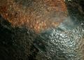
Aged Ironby StangComment: Greetings from the Critique Club...
You've closed in on the subject and that has created an abstract quality to the shot but I don't think you brought out as much of the rust detail as you may have wanted. I'd agree with the commenters that talked about adjusting the light for different effects (e.g. shadows gives a sense of curves but that area loses detail so perhaps more light would have lost the curve but gained you the rust). The shot could be either more abstract or have a focal point that's given special treatment to make it stand out in some way. This may have helped in getting a more interesting shot.
I think the red/copper rust area in the top left is much more interesting that the greenish rust stuff at the lower left. This could be because the green area seems over exposed and it lost much of the texture. Moving the light source around at different angles often enhances the details in different areas. I know I'd like to see more of the red stuff -- as your comments say there is incredible detail there.
I hope my comments were clear and at least a bit helpful. Send me a pm if you have any questions on my comments.
Regards,
Theresa
|
| 05/17/2004 09:00:12 PM |
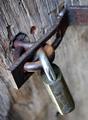
Rusty Masterby SeedofsinComment: Hi David,
Greetings from the Critique Club...
Your main subject, the lock, is sharp but the grid along with the light-colored wall that takes up a good deal of the frame isn't. The white draws my eye away from your rust area and leaves me looking at a large area of background. Using light to draw attention to the lock would help as would cropping out some of the "not main subject" areas. This would target the lock and the upper rusty area (a more interesting aspect of your composition). This light would also differentiate the hook part of the lock and punch up the the blue.
I like the fact you brought me up close to the shot. I find myself turning my head to see how it would look turned 180 degrees. I think its orientation is better as you have it -- shows off the rusty key spot and more rust is always better :)
Always great to see a new member jump into the mix. Look forward to seeing more of your photos -- jump into the commenting as well! :)
Feel free to e-mail me with any questions
Regards,
Theresa |
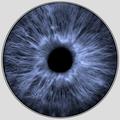
| 05/17/2004 07:07:07 PM |
Irisby labudsComment: a bit ikky but interesting and right on the theme |
| 05/17/2004 07:03:20 PM |
|
| Photographer found comment helpful. |
| 05/17/2004 06:59:19 PM |
|
| Photographer found comment helpful. |
| 05/17/2004 04:16:21 PM |
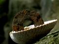
Cairn of entropyby StaralfurComment: Hi Mark,
Greeting from the Critique Club...
Congrats on your first entry and Welcome!
I feel your entry has a unique composition -- the tenuousness of the main subject creates a great tension in the shot. You have used out-of-focus areas (green foreground and background) to set your subject(s) agains well. The predominately green tones also set your subject(s) apart.
The washer would be a stronger subject if lit to stand out more from the background (not a lot but just a bit more). The shell isn't background but rather a key element so it needs space under the shell to avoid a chopped-off feel.
Please e-mail me with any questions you have on my comments.
Regards,
Theresa |
| Photographer found comment helpful. |
| 05/17/2004 03:47:41 PM |
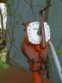
Rusty Gas Gaugeby MrsFuzzButtComment: Hi Jennifer,
Greetings from the Critique Club...
You've found about as interesting a gas gauge as possible but because of the other disconnected elements in your shot, the overall composition suffers. Each of the other elemement (tree, pipe, branches, blue wall, red slanted thing, sky) has the same treatment as the gauge (dof, lighting, weight in the frame) so each competes to be the main subject. If physically moving about to change the frame's contents, adjusting the dof, zooming in, etc. aren't possible then another gauge would be best. I also found the crank/handle's position distracting as it covered the dial - a 3:00 or 9:00 position might have worked better -- unless that would cause gas to come hissing out :)
The gauge itself has some great color and the lock and handle are interesting elements.
If you have any questions on my comments, feel free to pm me.
Regards,
Theresa |
Home -
Challenges -
Community -
League -
Photos -
Cameras -
Lenses -
Learn -
Help -
Terms of Use -
Privacy -
Top ^
DPChallenge, and website content and design, Copyright © 2001-2025 Challenging Technologies, LLC.
All digital photo copyrights belong to the photographers and may not be used without permission.
Current Server Time: 08/25/2025 12:14:05 AM EDT.