| Image |
Comment |
| 07/25/2004 07:51:55 AM |
|
| 07/25/2004 07:50:54 AM |
|
 Photographer found comment helpful. Photographer found comment helpful. |
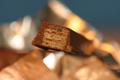
| 07/25/2004 07:49:37 AM |
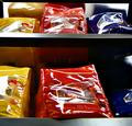
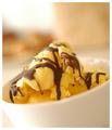
Shell Gameby C_Steve_GComment: It could be that I'm used to only dark chocolate in a Kiss (if these are suppose to be more of a butterscotch color - I apoligize) but the center kiss seems too yellow/washed out -- could be a color adjustment's needed or a different color light? |
| Photographer found comment helpful. |
| 07/25/2004 07:47:14 AM |
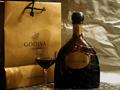
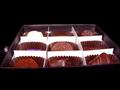
yummyby slingshotComment: you've arranged the items well, I like the bit of space empty to the right, would like the background a bit blurred (the lighting here is great), a bit more space under the glass and A crisper bag (perhaps the other side of the bag w/o the fold?). a touch more light on the bottle to bring out details (but keep that partial shadow as it adds interest) Good luck with your shot! |
| Photographer found comment helpful. |
| 07/23/2004 05:56:23 PM |
Closedby admart01Comment: Thanks all for your comments -- I'm thrilled with how well this shot did and learned a lot from all your comments. I found I really like shooting windows :) |
| 07/23/2004 05:51:19 PM |
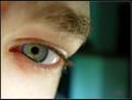
Visionaryby ZoomdakComment: Hello Thomas and Greetings from the Critique Club...
Your score suffered a bit from the "not on theme" but you knew that (and according to your Manafesto - that's okay by you! - for the record I gave it an 8 but the tie to the topic was in my own mind)
Wish you had filled in the details as promised as I would like to know how you see the fit to the theme.
On to the photo itself. The lighting and colors make this an engaging photo, IMHO. The blue in the eye and the patch of blue light compliment each other and draw the background and main subject together. The blur of the eyebrow and upper cheekbone makes the sharpness in the eye even more pronounced and helps make it more of the main element. The top left pinkish area detracts a bit as my eye is drawn there but finds nothing as interesting as the other elements you've put together. Even the white rimmed border supports your image.
As far as I can tell, a title that more explicitly tied the shot to the theme is all that is needed to get the score higher -- you already have a technically and artistically well executed shot.
I look forward to more of your work in upcoming challenges. Please pm me if you have any questions on the comments.
Regards,
Theresa |
| Photographer found comment helpful. |
| 07/23/2004 05:38:13 PM |
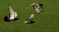
I believe I can flyby RUEDISCHMUTZComment: Hello Ruedi:
Greetings from the Critique Club...
(I see you have met your goal of having some top ten finishes. I also noticed that you have received many comments but not made any)
This is an excellent panning shot with the three main subjects in crisp focus. The fact that their wings are in three different stages adds interest. You have given them some negative space on the right to fly into and that adds a good feel to the composition. This is a technically well-executed shot.
I was puzzled by the low number of comments for a "better than average" scoring shot. I think that while this is fine shot, there is not an aspect of the shot that pulls me in - not an aspect that stands out. This may have to do with the flat lighting or that the subjects are a bit far away from me to get a sense of them.
Please pm me if you have any questions or comments.
Regards,
Theresa
|
| 07/23/2004 05:17:50 PM |
|
| 07/23/2004 05:17:26 PM |
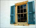
Choicesby brunasComment: the "s" is an odd element -- otherwise good title/shot fit |
| Photographer found comment helpful. |
| 07/23/2004 05:16:40 PM |
|
Home -
Challenges -
Community -
League -
Photos -
Cameras -
Lenses -
Learn -
Help -
Terms of Use -
Privacy -
Top ^
DPChallenge, and website content and design, Copyright © 2001-2025 Challenging Technologies, LLC.
All digital photo copyrights belong to the photographers and may not be used without permission.
Current Server Time: 08/26/2025 07:24:46 PM EDT.