| Image |
Comment |
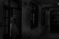
| 11/04/2015 02:57:34 PM |
Emerging from the dark by JopsyDaisyComment: Good entry for the challenge. Interesting choice of lens/perspective, making it stand out from other entries because of it. Well done. Perhaps you could have lightened the cleaver a bit more to make it stand out a bit. |
 Photographer found comment helpful. Photographer found comment helpful. |
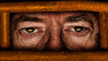
| 11/04/2015 02:53:56 PM |
IMG_6129by ke2211975Comment: If you don't like expert editing, then I think you did a great job finding something creepy enough to photograph for this challenge. But just painting some glowing eyes for example, would have made this picture already more "Expert" and perhaps would have given you higher scores - don't know how other voters weigh the editing rule in a challenge. |
| Photographer found comment helpful. |
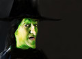
| 11/04/2015 02:51:27 PM |
Picasso's-Halloweenby peterhoutsComment: Nice idea. I just feel from a photographic point of view there are a few problems. The teeth are overexposed and the hair seems very out of focus and also just "stuck on somehow. I know its supposed to be a Picasso painting, but for me the pieces down't gel to a unified hole. But I like the idea. |
| Photographer found comment helpful. |
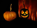
| 11/04/2015 02:48:59 PM |
Alter Egoby grahamgatorComment: Very good idea and execution. I like it. Perhaps you could have given the pumpkin in the foreground a "base" to be on. |
| Photographer found comment helpful. |
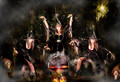
| 11/04/2015 02:46:25 PM |
Hocus Pocusby IvoryComment: I like it, especially the "devil dog" ;-). Like the "movement" you generated with the multiple exposure - good idea. |
| Photographer found comment helpful. |
| 11/04/2015 02:44:37 PM |
Windows to the Soulby dpjerryComment: Clever. My only problem is that the reflections in the eyes are too small for me to see the detail. Pity, because I am sure there is meaning in that. |
| Photographer found comment helpful. |
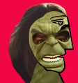
| 11/04/2015 02:42:29 PM |
Selfieby LydiaComment: :-) Nice work on your distortion. I feel perhaps a little sloppy on the hair. Love the eyes. |
| Photographer found comment helpful. |
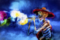
| 11/04/2015 02:40:32 PM |
Day of the Deadby franktheyankComment: Very different, I always like "different" when I think it is still an interpretation of the theme, which in this case I think it is. I like this. Also the lines to bring out more detail in the skull is really well done (not sure if you drew those or if it was made with something like Rodilius. One of my negatives is the white in the flower/smoke. It keeps detracting the eye. Perhaps it would have been better to "color" that part. |
| Photographer found comment helpful. |
| 11/04/2015 02:33:38 PM |
10 to Midnightby mrbig65Comment: Fore me this is not gory/creepy enough. I am also not a big fan of so much noise. Sorry, just my opinion. |
| Photographer found comment helpful. |
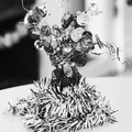
| 11/04/2015 02:31:37 PM |
HALLOWEENby ayalaedgar98Comment: For me there is too much overexposed and the bi-colour BG is disturbing rather than enhancing the picture. That's just my opinion of course. |
Home -
Challenges -
Community -
League -
Photos -
Cameras -
Lenses -
Learn -
Help -
Terms of Use -
Privacy -
Top ^
DPChallenge, and website content and design, Copyright © 2001-2025 Challenging Technologies, LLC.
All digital photo copyrights belong to the photographers and may not be used without permission.
Current Server Time: 08/11/2025 12:41:47 PM EDT.