| Image |
Comment |
| 02/22/2004 06:00:14 PM |
|
 Photographer found comment helpful. Photographer found comment helpful. |
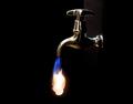
| 02/22/2004 05:56:15 PM |
Hot Tapby stickylizardComment: neat effect. would have been perfect, if you could have got all of the background a solid black. |
| Photographer found comment helpful. |
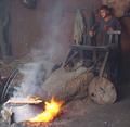
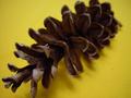
| 02/22/2004 05:52:20 PM |
One of Earth's Seedby kim100878Comment: A rather uninteresting subject. Some things I would have done differently that may have made it more appealing:
Instead of shooting down on top of the pine cone come at it more straight on (slight angle) from one end. Also, being in color, the yellow background is really bright and takes away from your subject. Because of the very shallow DOF, it is hard to tell where your actual point of focus is. |
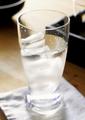
| 02/22/2004 05:45:07 PM |
in a glassby bluviewComment: lighting is very harsh. the shallow DOF doesn't work well here either, IMHO. |
| 02/22/2004 05:43:59 PM |
|
| 02/22/2004 05:41:39 PM |
|
| 02/22/2004 05:39:43 PM |
|
| Photographer found comment helpful. |
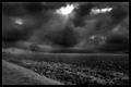
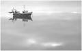
| 02/22/2004 05:38:42 PM |
Sea of tranquillity by geewhyComment: The negative space works very well here. With the slight haze and the great reflections off the water, everything blends together so there is no real horizon, which is a nice effect. Nice work. - 9 |
| Photographer found comment helpful. |
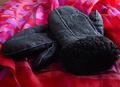
| 02/21/2004 12:53:14 PM |
Mittensby amsmythComment: **Critique Club**
Hi Anne!
Positives:
The lighting seems to be fairly good, and you have the mittens focused well.
Possible Improvements:
I have to agree with the other comments below that the background just does not work here. I would have used some sort of a solid background that was a lighter shade, to give more contrast. The crop does not seem to be uniform. Also, the top left corner is a distraction.
Overall just an unintersting subject, I'm sorry to say. Good luck in your future entries.
Regards,
-Chris |
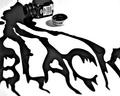
| 02/21/2004 12:23:50 PM |
Spilled Blackby MickComment: **Critique Club**
Hello Michael! Congrats on your top 10 placing, on only your third entry.
Positives:
I really like the composition with the model paint bottle in the top left, running down and forming the word "Black". The focus on the bottle and initial spill area is good as well.
Possible Improvements:
I'm going to say the shallow DOF detracts a bit. Personally, I like the way it is, but I think I agree with the other comments that it may be even better if it was entirely in focus. As someone mentioned below, the right side of the cap is blown out and blends into the white background.
Overall a unique take on the challenge that was done very well.
-Chris |
| Photographer found comment helpful. |
Home -
Challenges -
Community -
League -
Photos -
Cameras -
Lenses -
Learn -
Help -
Terms of Use -
Privacy -
Top ^
DPChallenge, and website content and design, Copyright © 2001-2025 Challenging Technologies, LLC.
All digital photo copyrights belong to the photographers and may not be used without permission.
Current Server Time: 08/27/2025 02:21:24 PM EDT.