| Image |
Comment |
| 10/22/2013 09:23:01 AM |
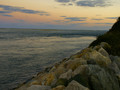
Hold back the waterby whiterookComment: A very literal take on the title, i find this to be less than it could be.
a more dramatic feel to the rocks and sky would help to elevate this image, where i find it feeling overall muted and flat.
a 5 from me |
| 10/22/2013 09:13:34 AM |
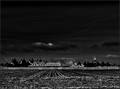
"Something Wicked This Way Comes" by Ray Bradburyby ThingFishComment: i find myself simultaneously wanting less foreground and sky; and knowing that it's the right amount to set the scene properly.
i also like that the "something wicked" can be either the suggested clouds, or the fact that the carnival itself is a wicked entity that is coming and should be treated as such.
a 7 from me |
 Photographer found comment helpful. Photographer found comment helpful. |
| 10/21/2013 04:06:55 PM |
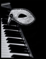
The Phantom of the Opera (1920. Gaston Leroux)by DenielleComment: I can honestly say that this image calls to me. it's power over me growing stronger yet!
i love the simplicity of the setup; this is what it's truly all about - a story in an glance, a picture for 1000 words as they say.
an 8 from me.
i'd give it a 9 and have it as a contender for my favorite image, except for the top left of the image being a tad too distracting with the lighter area existing where my mind wants to see a dark spot |
| Photographer found comment helpful. |
| 10/21/2013 04:03:56 PM |
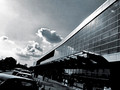
City-of-Glassby artistChanComment: interesting perspective and tonal choice. i can see a vision of something grand here, a concept being pitched for "the city of tomorrow, today" or something of that sort.
i like it, but at the same time it leaves me wanting more, which is good and bad because it certainly means you've succeeded in drawing me.
a 7 from me. |
| Photographer found comment helpful. |
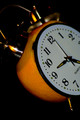
| 10/21/2013 03:58:34 PM |
A Clockwork Orangeby emoonsComment: Amusing take, Georgie, though a bit Dim overall and it kind of Peters out on the right side, don't you think? ;)
Fantastic choice for a novel, I had thought of this book initially myself though opted for different later.
I personally think the shallow focus provides several levels of appropriateness and it certainly looks thick skinned, hopefully it doesn't have to randomly attack people for no particular reason.
a 7 from me |
| Photographer found comment helpful. |
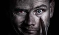
| 10/21/2013 03:52:13 PM |
Dr. Jekyll and Mr. Hyde (1886)by GarryComment: My thoughts on this - shouldn't the knife be on the other side of the face to go with the "crazy" persona?
the snarl on the lip is overly shadowy, leading to a void there instead of shadowy menacing that i picture being there from the eye.
one further controllable change would be to have the Jekyll persona clean shaven to provide another layer of contrast to the monster. i can see where some may have issue with that visually since it is asymmetrical, but that is the intended purpose of trying to capture this image.
a 7 from me regardless. |
| Photographer found comment helpful. |
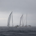
| 10/21/2013 03:48:44 PM |
Captains Courageous (Rudyard Kipling)by tomeComment: Your title is infinitely smarter than the people on these boats.
i could do with about 40-50% less sky above them and quite possibly a masked layer to increase contrast for the boats/people from the rain storm this image is clearly in
a 6 from me |
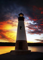
| 10/21/2013 03:46:36 PM |
To the Lighthouse: Virginia Woolfby vikasComment: I Find this less about the lighthouse and more about the dramatic battle happening in the sky behind it.
Personally, the lighthouse is underexposed as the primary subject in my opinion, and i truly cannot stop exploring the sky behind it, detracting from it as the subject.
as pretty as this is, it's getting a 5 from me. |
| Photographer found comment helpful. |
| 10/21/2013 03:42:34 PM |
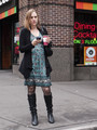
Alice in Wonderlandby tvsometimeComment: she has the "chasing the white rabbit" look alright; though it seems she's already obtained her spot of tea for the mad hatter's party.
the expression is what sells this image for me, regardless of location/era.
i give it a 7 |
| Photographer found comment helpful. |
| 10/21/2013 10:36:14 AM |
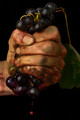
Grapes of Wrathby snafflesComment: I like the lighting and grit of the image.
Good DoF and the drops coming from the bottom add impact to the fist.
an 8 from me |
| Photographer found comment helpful. |
Home -
Challenges -
Community -
League -
Photos -
Cameras -
Lenses -
Learn -
Help -
Terms of Use -
Privacy -
Top ^
DPChallenge, and website content and design, Copyright © 2001-2025 Challenging Technologies, LLC.
All digital photo copyrights belong to the photographers and may not be used without permission.
Current Server Time: 08/25/2025 01:00:46 PM EDT.