| Author | Thread |
Comments Made During the Challenge  |
|
|
10/22/2013 11:00:25 PM |
I think this turned out well nice job!!
Commenting only |
|
 Photographer found comment helpful. Photographer found comment helpful. |
|
|
10/22/2013 08:22:15 PM |
|
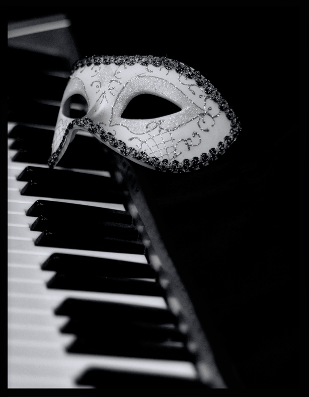
simple but a bit trite. another photo where the black and white is very controlled, like the DOF, but it is not clear to me for what purpose. 3 |
|
| Photographer found comment helpful. |
|
|
10/22/2013 03:37:49 PM |
|
I like the DOF, but I'm not sure of the angle that you chose. It looks a little flat overall, both in composition and in tonality, imo. I'm curious what it would have looked like at more of a diagonal on the keyboard, and with the whites a little whiter. -5- |
|
| Photographer found comment helpful. |
|
|
10/21/2013 07:57:24 PM |
|
4..it seems like the obvious solution to me. The execution could be better. The light is flat and seems to be from above. The b&W conversion is nice and contrasty but it lacks depth. Many shadow areas have lost their information and the whites could use a bit more pop. |
|
| Photographer found comment helpful. |
|
|
10/21/2013 06:57:36 PM |
|
I like the concept overall. It's a little underexposed. |
|
| Photographer found comment helpful. |
|
|
10/21/2013 04:06:55 PM |
I can honestly say that this image calls to me. it's power over me growing stronger yet!
i love the simplicity of the setup; this is what it's truly all about - a story in an glance, a picture for 1000 words as they say.
an 8 from me.
i'd give it a 9 and have it as a contender for my favorite image, except for the top left of the image being a tad too distracting with the lighter area existing where my mind wants to see a dark spot |
|
| Photographer found comment helpful. |
|
|
10/21/2013 06:54:26 AM |
|
The floating mask works well and helps to meet the challenge. But there's something missing - I can't put my finger on it. I guess it's missing excitement? A 6 from me |
|
| Photographer found comment helpful. |
|
|
10/19/2013 12:33:04 AM |
Cool.
Image works for the novel, and the overall image is good. Well lit, well processed, and a reasonably good composition.
7 |
|
| Photographer found comment helpful. |
|
|
10/18/2013 10:51:04 PM |
I like the image. I like the detail in the mask. I like the overall composition.
Gave it an 8 |
|
| Photographer found comment helpful. |
|
|
10/18/2013 09:59:24 PM |
|
Evocative shot although a greater sense of horror would have been appropriate. Anyway, nice and clean photography. 6 |
|
| Photographer found comment helpful. |
|
|
10/18/2013 12:42:21 PM |
|
I'm not a fan of a collection of objects that are obvious symbols. Yes, these are two things that are sort of in Phantom of the Opera. Yes, you created an image that sort of connects to the book. But to get a good score from me the image must have some merit beyond that. I don't see it. 2 |
|
| Photographer found comment helpful. |
|
|
10/18/2013 10:08:46 AM |
|
The tones, DOF and shiny keys all stand out on this shot, but I can't get away from feeling like I've seen it before. 6 |
|
| Photographer found comment helpful. |
|
|
10/17/2013 11:04:32 AM |
|
Good try, pretty well composed. I would have cropped a little tighter on the right. The mask ornaments distract though. Also the whites seem a little washed out. 5 |
|
| Photographer found comment helpful. |
|
|
10/17/2013 06:38:25 AM |
|
Ah the classic story. Got the essential ingredients there, though I'm fond of the half face mask myself, but props are props, the relationship is established. B&W is a good choice.5. |
|
| Photographer found comment helpful. |
|
|
10/17/2013 12:32:27 AM |
|
Perfect shot for that title. |
|
| Photographer found comment helpful. |
|
|
10/16/2013 07:59:24 PM |
a little simplistic, a little indecisive, a little boring
5 |
|
| Photographer found comment helpful. |
|
|
10/16/2013 11:57:22 AM |
|
Bit of a mish mash here, not keen on the mono. Composition lets this down.5. |
|
| Photographer found comment helpful. |
Home -
Challenges -
Community -
League -
Photos -
Cameras -
Lenses -
Learn -
Help -
Terms of Use -
Privacy -
Top ^
DPChallenge, and website content and design, Copyright © 2001-2026 Challenging Technologies, LLC.
All digital photo copyrights belong to the photographers and may not be used without permission.
Current Server Time: 07/01/2026 01:30:01 AM EDT.