|
|
|
Showing 471 - 480 of ~789 |
| Image |
Comment |
| 12/29/2004 06:23:38 AM | Snow Man Treeby DiscraftComment: This comment comes courtesy of the Critique Club :)
I've looked through your portfolio before, and judging by your work am fairly sure that you can probably pick out anything that you may not like here yourself. Either way, you asked for a critique from the CC, so I'll give ya one :p.
Like mffnqueen, I appreciate/like your zoom technique here - you definitely used it well in order to emphasize the snowmen on the tree. It even gives the viewer a bit of a three dimensional feel. Unfortunately, for this to have worked, you had to cut the lights... and by cutting the lights, you ended up underexposing the tree and surroundings. I'm not sure if there's much of a workaround for this, considering your choice of technique. I would say to possibly try flipping the lights on for a split second, but at this aperture it may end up blowing out the effect of the zoom. Possibly a smaller aperture would allow this, but I've never really tried anything like this so I'm sorry to say that I can't give a definitive idea on that.
I tend to like the fact that there isn't a snowman in the bottom left, as it throws a bit of tension into the image that I like. But, not sure how everyone else felt about this.
Hope some of this might've helped. Happy Holidays! |  Photographer found comment helpful. Photographer found comment helpful. |
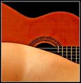
| 12/29/2004 06:03:08 AM | Strings Attachedby artvetComment: This one comes courtesy of the Critique Club :)
This is a very solid capture - even more so when compared to the original. Similar enough to provide the needed reference, but different enough (I like your reversal of the shapes, btw - I preferred the entries with twists rather than the completely identical ones) to provide a degree of interest. Not sure if this is the original or if it was tweaked, but it looks like you may have used some sharpening which gave some jagged edges - I may be wrong about the sharpening, but I do see some jagged eges either way.
Somehow I think that the strings do slightly distract from the original's emphasis on shapes, but that's not necessarily the point. Other than these small things, I don't know what else to say. Good effort and happy holidays :) | | Photographer found comment helpful. |
| 12/29/2004 03:29:03 AM | An act of Giving (Please read after)by NodeComment: great story to accompany the image. i'm sure that if we could include descriptions, this would've catapulted through the rankings (puts it into better perspective). glad you could share this with DPC. | | Photographer found comment helpful. |
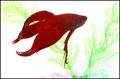
| 12/29/2004 12:57:56 AM | Feed me!by snackwellsComment: underrated - i guess cuz of the people aspect. i like the background - blue could've worked too, if it was light enough to not 'blend' with the fish. | | Photographer found comment helpful. |
| 12/28/2004 10:52:23 PM | so windyby HalimComment: This comment comes courtesy of the Critique Club :)
The first thing that strikes me here about this image is that it is full of motion. It definitely depicts 'Wind' well. Where it falls short, however, is some of its technical aspects. Color rendition could have been a little better - possibly editing this in some kind of graphics program, or exposing a little differently at the time of the shot (the main thing is that it seems a little dark - the whites on the US flag aren't quite as white as they could be in this image).
Other small things - the branches in the foreground are slightly distracting (and the sign in the background) - especially due to their static nature. This could be a great shot if you eliminated some of the distracting elements and possibly brought the exposure level up a notch or two. | | Photographer found comment helpful. |
| 12/28/2004 06:13:46 PM | the Winds of Winterby ArnarpComment: This comment is provided courtesy of the Critique Club :)
I think the comments here reflect pretty well why they may have chosen to vote down your image. It has much less to do with anything related to the quality of the image than it does with its perceived relation to the challenge. While it's true that this scene could be interpreted as windy (since there's not much a whole lot to prove otherwise), the main reason people did not like it is because you need to provide a way for them to interpret it as windy (moving plants, leaves, anything that shows motion).
Other than its relation to the challenge, it is a technically okay image - perhaps the bit of flare at the top is slightly distracting, but not on the whole.
We must remember that an image at DPC can do well if it relates very well to the challenge as long as it has no technical shortfallings - and that a technically excellent image that does not make people believe it fits the challenge can also do poorly. Good luck in the future! |
| 12/28/2004 07:18:32 AM | The Warrior Princessby totaldisComment: given that the two subjects overlap, i wish the boy was maybe slightly more out of focus (or that it was shot at a diff angle). just a matter of personal taste. i do like the profile shot and the crop on the boy. | | Photographer found comment helpful. |
| 12/28/2004 07:11:36 AM | Untitledby pentaxianComment: This comment comes courtesy of the Critique Club :)
The first thing that catches my eye in this image is, of course, the motion blur. It works well here to depict "Wind". Obviously, an extended shutter speed is pretty much out of the question considering the time of day (and that you already went down to f/22 for this one). You definitely created a good sense of motion given the sunny conditions you had to work with (must have been a windy day?).
I also noticed that, to me, the image has a bit of a different feel. It took me a little while to realize (with the help of some comments) that this could in fact be what looks like a slightly unnatural color. If this came out of your camera, then it certainly produces its share of contrast and saturation. I think this is more evident in the blue skies than it is in the foreground colors. If it did come out of the camera this way, I would consider possibly removing some emphasis from the sky a bit (via Hue/Saturation adjustments, I would guess) in order to place slightly more emphasis on the foreground. I might even consider a small crop at the top.
Overall a good image and you should be happy with it. I think a few more adjustments could make it really 'pop', but that's ultimately a matter of personal taste. |
| 12/27/2004 06:04:03 PM | blue windby chusterComment: This critique comes courtesy of the Critique Club :)
Like everyone has mentioned, without knowing the challenge, it becomes hard to discern that the flag is intended to be the main subject. If this wasn't your main concern, it could certainly be considered a more solid picture.
Two things that pose some room for improvement are basically a possible change in position or perspective. The palm tree in the bottom-right corner of the image does not show enough to gain much in photographic interest, but does distract the viewer's eye slightly. The flag, especially considering its colors, would possibly do well either fully in front of the clouds or fully in front of the sky - I'm not sure that I like the line of clouds cutting through it just towards the top of it.
I'm guessing that your camera does not allow you to zoom in far enough to fully isolate the flag, so you have done well with what you had to work with. The foreground lamp certainly provides a three dimensional appeal, but perhaps detracts from the idea of "wind". You have good color balance - perhaps a slight increase in exposure or brightness if you were hoping to render more detail in the foreground object. In another challenge, this may have done better, but DPCers are always looking for a solid connection to the challenge.
Hope this helps, let me know if you have any questions. |
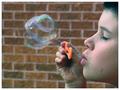
| 12/27/2004 03:06:57 PM | Gentle Breezeby thommoComment: This comment is provided courtesy of the Critique Club :)
You've been fortunate enough this far to have already received a few insightful comments, so some of this will sound familiar.
First looking at the image, I can't help but think that the composition here is quite solid. The boy's closed eyes convey a relaxed mood, which is appropriate for a playful image like this. I think your choice of a straight-on profile shot probably works much better than if you had approached this at an angle, as it leaves plenty of room for separation and distinction between the boy and the bubbles, and potentially the background.
I do not think the background is too distracting, as it gives the image a schoolyard feel. However, to address some of the comments you have received, it perhaps might have been advisable to try to throw it slightly more out of focus. Since you used an aperture of 4.5 here, I don't see you necessarily being able to lower that without possibly losing some sharpness in the foreground. Moving yourself and the subject further away from the wall may have been an option.
You've nailed the timing, catching the bubbles at just the right moment. The slight blur in the bubbles could (depending on the viewer) be interpreted as a good way to convey motion and action (especially contrasted against the stillness of the boy). Others yet may prefer a stiller image to capture the exact 'moment', although I think that it would give it more of an artificial feel.
The main thing here that I think holds room for improvement is, like others mentioned, the coloring of some areas on the subject's skin and hair, which occasionally appear to have a bluish-green tint. I have an inclination to believe that this probably was not in the original shot (though I may be wrong), and may actually be due to your use of Auto-features that you mention in your description. While these auto features can sometimes make an image better, they can also sometimes interpret things incorrectly and create problems. In the future, you might find it more advantageous to perform all the post-processing 'manually' without the auto feature.
Overall a great shot, and anything seen with room for improvement is nothing that can't be performed/fixed in photoshop - possibly via Layer Masks for the background and some Adjustment Layers for the Color Balance (may want to mask this as well, to avoid affecting the color in the bubbles). Message edited by author 2004-12-27 15:16:04. | | Photographer found comment helpful. |
|
Showing 471 - 480 of ~789 |
Home -
Challenges -
Community -
League -
Photos -
Cameras -
Lenses -
Learn -
Help -
Terms of Use -
Privacy -
Top ^
DPChallenge, and website content and design, Copyright © 2001-2025 Challenging Technologies, LLC.
All digital photo copyrights belong to the photographers and may not be used without permission.
Current Server Time: 08/06/2025 05:32:54 AM EDT.
|