| Image |
Comment |
| 09/05/2005 01:34:12 PM |
Speed of the Foeby JaimesonComment: i've spent awhile trying to figure this one out, but alas it has beaten me. i do find the background particularly interesting to stare at. |
 Photographer found comment helpful. Photographer found comment helpful. |
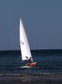
| 09/05/2005 01:23:15 PM |
Sail awayby stupotComment: wish you had changed the color balance the sky would be cooler blue, instead of grayish blue. I might have cloned out the person in the water, they take away from the feeling of islolated journey you could have portrayed quite well. |
| Photographer found comment helpful. |
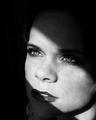
| 09/05/2005 01:19:57 PM |
Waiting For Youby mandyturnerComment: good idea. personally, i don't think you went far enough...i would have gone with everything black except the strip of light. you would have had to move the lips more into the light so they weren't cut in half. the dodging on the shoulder is a bit harsh. sorry for being critical. |
| Photographer found comment helpful. |
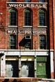
| 09/05/2005 01:12:28 PM |
Train Yard Storiesby KaDiComment: there's alot to like in this shot. the high contrast definitely helps add to the mood. you're going to hear that you should have slightly rotated ccw and adjusted the skew at the top so that shadow line on the right was more parallel. |
| Photographer found comment helpful. |
| 09/05/2005 10:39:30 AM |
Out of the Darkby thomaspeopleComment: i think you were on the right track ;) but your blacks needed to be more black. also your foreground looks strangely smudged or blurred...though i can't figure out why. |
| Photographer found comment helpful. |
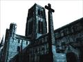
| 09/05/2005 10:35:26 AM |
Durham Cathedralby fredandaudComment: really like the shadow line you found and how your pic is very well balance between light and darker areas. also really like your choice for post-process. i only wish the cross better complimented the smaller tower, as it competes with and is very close to the larger one...perhaps that kind of angle wasn't possible |
| Photographer found comment helpful. |
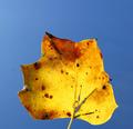
| 09/05/2005 10:24:37 AM |
Leafby irikaComment: nice contrast. i think you could have turned up the blue a notch or 2 more in your post process as it's a bit on the greyish side, to really give the pic some pop. Though it would have brought out your dust specks more...you did have the freedom to clone out if desired |
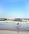
| 09/05/2005 10:20:58 AM |
Lift Offby ShannonLeeComment: good contrast. i really like the wave lines. I wish the bird was in the upper half of the image |
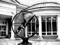
| 09/05/2005 10:19:45 AM |
The Study of Astrologyby JunieMoonComment: nice contrast. perhaps you could have found an angle that included the full library name or removed it all together. Your zodiac signs appear way, way over-sharpened to me. I think a nice overall "sharpen edges" in photoshop would have sufficed |
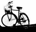
| 09/05/2005 01:30:12 AM |
Bikeby charmayneComment: great angle and detail. i so wish you had chosen not to leave the water bottle in the basket. nothing places meback in reality like a water bottle or a cel lphone...sorry. nice pic none the less. |
| Photographer found comment helpful. |
Home -
Challenges -
Community -
League -
Photos -
Cameras -
Lenses -
Learn -
Help -
Terms of Use -
Privacy -
Top ^
DPChallenge, and website content and design, Copyright © 2001-2025 Challenging Technologies, LLC.
All digital photo copyrights belong to the photographers and may not be used without permission.
Current Server Time: 08/09/2025 03:11:48 PM EDT.