| Author | Thread |
|
|
09/15/2005 01:51:32 PM |
*Critique Club*
Well, if you didn't find the 9 great comments you have already received as helpful, then I'm not sure I'll be able to add anything useful myself, since I tend to agree with all commenters thus far.
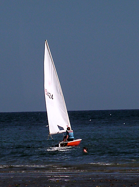
The first thing that jumps out to me is the tilted horizon. You have a very strong horizontal line in the background and not only does it cut straight through your main subject, but it's also tilted. What this does, is it makes the photo look like it was not only quickly composed, but also that not a lot of time was spend post processing, which is important, especially on a photo like this.
This photo suffers greatly from noise too. See the grain in the sky? This could be improved by running it through a program intended to reduce noise. Neatimage is one such program and can be downloaded //www.neatimage.com/ there. There is also a program called noiseninja, however I have had no experience with that.
While there is contrast in the photo, I'm not sure I would consider it as HIGH contrast. There really isn't any dark darks in the photo, except for the guys shorts, and that's such a small portion of the photo, that i'm afraid that it doesn't make for high contrast of the bright sail.
Focus seems a bit soft, but this could be due to the high noise in the photo. We don't really get much detail out of the man on the boat or the man in the water, and I find him a bit of a distraction.
A bit of brightness/contrast and some hue/saturation adjustments could help out the colors a bit. Definately wouldn't hurt to try.
~Heather~ |
|
 Photographer found comment helpful. Photographer found comment helpful. |
Comments Made During the Challenge  |
|
|
09/11/2005 09:23:50 PM |
|
Good idea and definitely high contrast but I think it would have looked better with a level horison. |
|
| Photographer found comment helpful. |
|
|
09/11/2005 01:10:31 AM |
|
Not bad. I wonder if this would have greater impact if the main focus wasn't almost dead centered? |
|
| Photographer found comment helpful. |
|
|
09/10/2005 10:32:43 PM |
|
Crisper shot would've worked better. The idea is cool and I love boat photos. The person swimming somewhat distracts from a pretty good comp. |
|
| Photographer found comment helpful. |
|
|
09/10/2005 01:29:09 AM |
|
Nice shot, it probably cheesey but it reminds me of the OC. Great job. |
|
| Photographer found comment helpful. |
|
|
09/07/2005 02:59:01 PM |
|
A different crop might help... also, there's a lot of noise in the sky and lots of colour fringing (or so it seems) in the horizon line. Neat image might improve the noise. Sorry, not a winner. |
|
| Photographer found comment helpful. |
|
|
09/06/2005 03:40:19 AM |
|
Nice color contrast. Well balanced. Would like to see better focus. |
|
| Photographer found comment helpful. |
|
|
09/05/2005 06:00:01 PM |
|
The horizon is on a slant and makes the photo look distractingly uneven. A 1 or 2 degree rotation CW would have corrected this. I also find the photo to be very grainy/noisy. Good luck in this challenge. <4> |
|
| Photographer found comment helpful. |
|
|
09/05/2005 01:23:15 PM |
|
wish you had changed the color balance the sky would be cooler blue, instead of grayish blue. I might have cloned out the person in the water, they take away from the feeling of islolated journey you could have portrayed quite well. |
|
| Photographer found comment helpful. |
|
|
09/05/2005 12:55:26 AM |
|
Entering any image with a sloping horizon open you up to criticism on this site and I'm afraid the composition is not strong enough to redeem that either. It has potential with a lower viewpoint and closer crop. |
|
| Photographer found comment helpful. |
Home -
Challenges -
Community -
League -
Photos -
Cameras -
Lenses -
Learn -
Help -
Terms of Use -
Privacy -
Top ^
DPChallenge, and website content and design, Copyright © 2001-2026 Challenging Technologies, LLC.
All digital photo copyrights belong to the photographers and may not be used without permission.
Current Server Time: 07/02/2026 06:20:14 AM EDT.