| Image |
Comment |
| 04/14/2005 01:56:28 AM |
Uuuuiiiiiihhhhhby WinterbergComment: Wow. Color and movement is amazing. And the pairing of the upper left art with her expression is the best part. Perhaps showing the other faces on top would add to it...perhaps you didn't crop...perhaps it was perfect as is. Now about that title..... |
 Photographer found comment helpful. Photographer found comment helpful. |
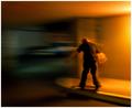
| 04/14/2005 01:36:25 AM |
Night Skaterby JPRComment: Cool photo technique. The skating looks a bit sketchy. Show him popping a big ollie and for me this pic would go from a 6 to a 9. |
| Photographer found comment helpful. |
| 04/14/2005 12:42:41 AM |
|
| Photographer found comment helpful. |
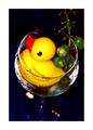
| 04/14/2005 12:31:21 AM |
Perfect Strike!by NitinComment: I really like the idea for this composition. What makes me uncomfortable though, is the bowling ball leading the eye into the frame and then the pins on the right acting like a wall to stop it. If you could have captured a strike in the other lane perhaps I'd be enjoying this even more, because both the top and bottom elements would be flowing the pic off to the right. In photoshop, give it a touch more USM or sharpen edges next time. Sorry for being overly critical. |
| Photographer found comment helpful. |
| 04/05/2005 04:50:29 PM |
|
| 02/02/2005 03:21:47 PM |
Rural Routeby IslanderComment: I see there's kind of a barn in the background. I think an even cooler shot could have incorporated some other rural structures to add a bit more interest. Even turning just a bit to the right to put the sign closer to the left side and show a bit more scenery would have really helped IMO. |
| 02/02/2005 03:14:11 PM |
No Outletby taterbugComment: Nice. The best idea i've seen so far. Completely blocking the other sign and being a bit more careful with the processing i think would have really helped your cause. |
| Photographer found comment helpful. |
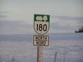
| 02/02/2005 03:08:47 PM |
Highway 29by sawatts1Comment: Eventhough it's not much bigger than a thumbnail, I still find this much more intriguing than most I've seen so far.(7) |
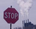
| 02/02/2005 03:05:04 PM |
STOP !!!!by medinfo2000Comment: Nice message. Perhaps up the contrast and saturation a bunch for more impact |
| Photographer found comment helpful. |
| 02/02/2005 02:59:12 PM |
"Please".....shareby HalimComment: I stared at this a long time, trying to figure out if it could be done in the camera. I think I hurt myself. The exposure on the sign is perfect eventhough I assume you would have had to use some kind of bright light. Anyway, it's an interesting effect, though I'm not sure how it promotes motorist concern. |
| Photographer found comment helpful. |
Home -
Challenges -
Community -
League -
Photos -
Cameras -
Lenses -
Learn -
Help -
Terms of Use -
Privacy -
Top ^
DPChallenge, and website content and design, Copyright © 2001-2025 Challenging Technologies, LLC.
All digital photo copyrights belong to the photographers and may not be used without permission.
Current Server Time: 08/04/2025 09:16:12 AM EDT.