| Image |
Comment |
| 05/16/2005 05:08:35 PM |
What Have I Done?by eyesightphotoComment: Nice mood set by the lighting. Wish the foreground was a bit crisper and the head was a bit more isolated from the body. |
 Photographer found comment helpful. Photographer found comment helpful. |
| 05/16/2005 05:01:53 PM |
Animated Suspensionby flip89Comment: Great idea. There's just too many swings for me. I know it would have been almost too much work, but cloning out the empty swings and the child that overlaps behind the other and this would be a really cool pic. |
| 05/16/2005 04:55:41 PM |
In the Darkby SJCarterComment: Very Interesting. Would have liked more separation between the hand and body. Maybe had him touching his forehead as if in thought. |
| Photographer found comment helpful. |
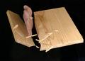
| 05/16/2005 04:51:41 PM |
Eye Glassby MatthewComment: I like this. I can't help but wonder if it could be improved by removing the left object that seems a bit distracting. Perhaps replacing it with a thick black border. |
| Photographer found comment helpful. |
| 05/16/2005 08:29:36 AM |
A long long time ago...by DefyTimeComment: Really like the legs, wish the light was stronger to include more contrast through to the top of your head. Maybe neat image or gaus blur could help the background look less like an apartment wall. |
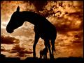
| 05/16/2005 08:18:41 AM |
At Last Light by PedroComment: Nice perspective. Too bad the second horse was directly behind the first |
| Photographer found comment helpful. |
| 05/16/2005 08:13:05 AM |
National Iconby redmoonComment: don't know if it was possible, but I would have liked more detail in the left spans. Perhaps moving up or down the river would have removed the background shoreline. |
| Photographer found comment helpful. |
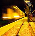
| 05/05/2005 11:55:18 PM |
Night Trainby kevrobertsonComment: Stand out shot. Just wish you had set up on the other side of the slats and given a bit more dark sky above the umbrella. |
| Photographer found comment helpful. |
| 04/14/2005 02:39:53 AM |
Off Centerby graphicfunkComment: Mr. Funk, Your work is usually very intriguing and obviously very stylized. Not that I'm any one to concern yourself with but I generally really like it or I really don't. In this case it feels too static or staged for the action presented, unlike your "Sore Loser" where you conveyed action in stopped motion to perfection. Perhaps spreading the fragments out a bit more or adding some more angle to the broken off piece would jazz things up. I'll shut up now as you get your 6+, which seems to easily elude me. Apparently I have way too much time on my hands tonight...the little sliver to the right seems hard to avoid. If you aren't who I thought and this is a real karate chop, I apologize, and I'll quietly go back to watching late night infomercials instead of making stupid comments. |
| Photographer found comment helpful. |
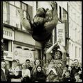
| 04/14/2005 02:25:34 AM |
Thrustby aznymComment: The expressions of the onlookers makes this a masterpiece, but perhaps you already knew that. -10 |
| Photographer found comment helpful. |
Home -
Challenges -
Community -
League -
Photos -
Cameras -
Lenses -
Learn -
Help -
Terms of Use -
Privacy -
Top ^
DPChallenge, and website content and design, Copyright © 2001-2025 Challenging Technologies, LLC.
All digital photo copyrights belong to the photographers and may not be used without permission.
Current Server Time: 08/01/2025 01:48:35 AM EDT.