| Image |
Comment |
| 03/07/2006 05:22:19 PM |
Exaustorby Vanessa 72Comment: This looks like the Sea Of Holes scene from The Yellow Submarine!
Ringo: "I've got a hole in me pocket."
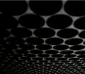
This doesn't look very focused, but the idea for the abstract is a good one. 6 |
| 03/07/2006 05:19:54 PM |
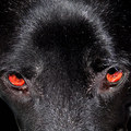
Dog Eyesby nlghttrainComment: Sorry, this doesn't do it for me. Nicely sharp. If the eyes were level and the shot was taken looking more down the dog's snout it might work better. |
 Photographer found comment helpful. Photographer found comment helpful. |
| 03/07/2006 05:18:39 PM |
|
| 03/07/2006 05:13:52 PM |
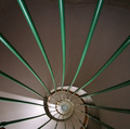
Circular Squareby ergatesComment: I like this very much! Excellent abstract, would like to see it a little sharper, may be contrast tapped up a bit? 9 |
| Photographer found comment helpful. |
| 03/07/2006 05:12:20 PM |
Stylized Sunriseby ajschelComment: oops... what happened to the bottom of it?! The clouds look full of potential and the rest of the picture looks great - was the file corrupted? |
| Photographer found comment helpful. |
| 03/07/2006 05:09:40 PM |
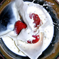
Ahh, Strawberries...by AzCKellyComment: I like, I like...! contrast is brilliant, the capture is perfect, the only thing that doesn't work well for me is the top left corner where the cream (?) has splashed away - it takes away from the symmetry of the shot, even if the subject is off-centre! Overall 9 |
| Photographer found comment helpful. |
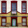
| 03/07/2006 05:06:54 PM |
107 West River Streetby TooCoolComment: This looks ever so slightly wonky to me, but it's not is it? I like it, well taken, good idea, nicely sharp and good colours. The only thing that takes it down for me is the simple fact that I don't find it interesting enough - and seeing as that's purely my own opinion, I give you an 8! |
| Photographer found comment helpful. |
| 03/07/2006 05:04:20 PM |
Reachingby tooterComment: Just not sharp enough for me. Needs to be brighter too. |
| Photographer found comment helpful. |
| 03/07/2006 05:03:32 PM |
Night Eyesby sir_bazzComment: I like this, but it doesn't look very focused. There's also a slight blur above the right eye which distracts. Good use of thirds which is harder to do in a square crop. |
| Photographer found comment helpful. |
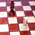
| 03/07/2006 05:02:09 PM |
Checkby GrahveComment: I recognise this chess set! Hmmm... could be wrong tho! This is a little out of focus, and would benefit from an adjustment of brightness/contrast (-10/+20 would be my preference) |
| Photographer found comment helpful. |
Home -
Challenges -
Community -
League -
Photos -
Cameras -
Lenses -
Learn -
Help -
Terms of Use -
Privacy -
Top ^
DPChallenge, and website content and design, Copyright © 2001-2025 Challenging Technologies, LLC.
All digital photo copyrights belong to the photographers and may not be used without permission.
Current Server Time: 08/04/2025 10:37:19 AM EDT.