| Image |
Comment |
| 08/28/2011 09:16:48 PM |
Beach Girlby marobertsComment: You did a good job in the edit to bring out the power of the ocean. This original (as you probably can see) is very blown out and almost too bright to look at. How you edit the photo is always contingent upon when effect you are looking for.
I did this quick edit with the mindset of just pulling out the general assets of the photo: Click here. (Generally: Removed seagull, curves, levels [on the ocean], selective color [to pull more warmth into the photo], sharpen [only her].)
The white balance of the original is off. There is way too much blue light. It made her look red. In the edit, I pulled in more warm light which is more conducive to a typical beach/sunlit scene.
In addition to this, there are many simple things one can do to bring out the power of the ocean or add a more moody feel to the image. Just playing around with color adjustments (photoshop: selective color, channel mixer, etc), with special focus on the blue and cyan channels.
One also has to know when a photo is worth the effort of editing. My comments about the general lighting conditions and the effect on the model still stand. |
| 08/13/2011 02:55:42 PM |
Noaby ytshuvaComment: Critiquing.
First of all, a fabulous portrait with an intense psychological connection between subject and viewer. There is an immense amount of depth in those dark brown eyes and those eyelashes...stunning.
I like the slight vignette, it added a lot of nice pastels into the image.
I enjoy the childish nature of the image. The wet skin, the biting the lip, the bright bathing suit. However, I don't like the angle. I wish you would have gotten down on her level. You eliminate her neck with the angle. It would be nice, as the viewer, to be at a child's level looking into her eyes.
Besides that, the image is great. The water-drop bokeh adds to all the little magical things going on. |
 Photographer found comment helpful. Photographer found comment helpful. |
| 08/13/2011 02:41:13 PM |
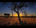
Africaby Silent-ShooterComment: Critiquing.
A very impressive peaceful image is my first thought. The light glow of the sun falls calmly on the eyes. The centered composition also adds to that sense of peace and balance (however there is definitely enough asymmetry to generate interest in the image). I love the light fog and mist you captured in the distance.
A few things I didn't care for: I think you went a bit too far in bringing out the detail on the tree. It has an unrealistic feel being so light. The edges of the tree are also slightly blurred which continues that evidence of post processing. I also wish that there were less straggly branches on the tree. Sometimes that's something that can't be changed but they do take away from the light, rolling hills and glowing horizon in the background.
The border is a nice touch. |
| Photographer found comment helpful. |
| 08/13/2011 02:24:42 PM |
Beach Girlby marobertsComment: Critiquing. I will be 100% honest.
First of all, your composition is too tight. Her fingers are so close to the border that it makes me anxious! You were so close to cutting off part of her hand entirely.
Photographing people requires much better lighting conditions (perhaps sunset when you would get gentler light and a more impressive sky). The sun is so harsh that it caused her face to scrunch up and look grumpy...not attractive. In addition, her shoulders are too high. The neck is an important thing to feature on a woman and in your image, she doesn't have one.
I understand the HDR experimentation...but it was the wrong picture to pick for it. The HDR brought out too many details in her skin and made her look probably 10 years older than she really is. HDR is not the right technique to use for photographing women in bikinis. The only positive of the HDR that I see...is in her hair and on the foreground sand. The technique brought out many beautiful textures.
I don't like the seagull...it's a bit distracting to me.
Your colors need work also. There's a lot of grays in the background. There's no pop in the sky. I also agree with the majority of comments about the halo.
Also, make sure you take a close look at your images and clone out the sensor dust...there's one I see on the upper right of the image. |
| 08/13/2011 02:13:13 PM |
jagged blueby posthumousComment: Critiquing.
I cannot fathom why this placed so low. I think the majority of voters did not take the time required to really look at this image.
The use of lines is intense in the image. Parallel and seemingly nonsensical lines come together to direct the eye through the image in an almost effortless fashion. Something about the lines I didn't like was perhaps the use of too much sharpening? The heavy black lines that encase the outlines don't harmonize with the overall softness of the image.
The woman with the high cheek bones creates a contrast. There is something so...otherworldly...so old world about her that juxtaposing her against the race of modernity makes viewers question...stare longer at the overall story behind the image. In addition, her melancholic expression perhaps communicates her disappointment with society.
I'm guessing you lost points because of the blankness of the sky and the blur & grain. However your composition is spectacular. Your image definitely deserves another look. |
| Photographer found comment helpful. |
| 08/09/2011 05:42:47 PM |
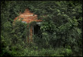
Eyes of the Pastby LydiaComment: I greatly enjoy this image. The faded texture of the leaves is gorgeous and it's so refreshing to see a normal level of contrast compared to some of the overly sharpened HDR images in this challenge. My eyes are appropriately drawn to that splash of orange brick.
It's hard to critique images of buildings because it would be hard to alter the image...however, I think the image would be improved by either 1. removing some of the branches on the left to free up that area a bit more or 2. having more branches so that only the upper portion of the wall would be visible. |
| Photographer found comment helpful. |
| 08/09/2011 05:37:42 PM |
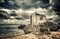
Claimed By The Seaby MsAmbrosiaComment: This image is stunning. The colors, compared to the tones of contrast, give it an otherworldly feel. The building looks like it doesn't even belong and reminded me slightly of a Jerry Uelsmann work. I also like how the clouds seem to frame the building, like a halo of white.
One thing I didn't like was the lack of sea. I wish we had a bit more water in the image. My eyes travel to the left and are a bit disappointed. |
| Photographer found comment helpful. |
| 08/07/2011 03:36:13 PM |
Glimmerby aliquiComment: I absolutely love that glimmer. The detail really pops with the strong contrast and alternations of complimentary yellow and blue. |
| Photographer found comment helpful. |
| 08/07/2011 03:35:28 PM |
Figure Studyby dsa157Comment: Fabulous, high-key portrait. Very natural. The vertical motif works spectacularly to create a sense of feminine power. Almost like she's some sort of queen. |
| 08/07/2011 03:31:33 PM |
Seriennaby fotomann_foreverComment: There's something naturally beautiful and sexy about her. Perhaps you are hinting at a contrast here, the apparent purity of her against the industrial background. The soft lighting compliments the image very well.
Refreshing to have a photo of a woman without the addition of large, silicon breasts. |
| Photographer found comment helpful. |
Home -
Challenges -
Community -
League -
Photos -
Cameras -
Lenses -
Learn -
Help -
Terms of Use -
Privacy -
Top ^
DPChallenge, and website content and design, Copyright © 2001-2025 Challenging Technologies, LLC.
All digital photo copyrights belong to the photographers and may not be used without permission.
Current Server Time: 09/02/2025 11:14:53 PM EDT.