| Image |
Comment |
| 02/20/2004 04:14:16 PM |
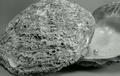
Contrastsby RgarciaComment: I really think this could use some color. I like the contrast of the rough outside and the smooth pearl/inside. |
 Photographer found comment helpful. Photographer found comment helpful. |
| 02/20/2004 04:13:43 PM |
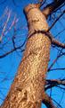
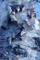
Scalyby illywikinikyComment: Color looks a little over saturated. The bark looks reflective. I like the perspective. |
| 02/20/2004 04:12:54 PM |
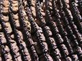
Untitledby NukktaComment: Not a real interesting shot. Too far out to appreciate the texture of the weave. |
| Photographer found comment helpful. |
| 02/20/2004 04:12:16 PM |
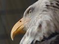
Unexploredby rickhd13Comment: Is this a rock? Hard to tell the details in this shot, it looks faded. |
| 02/20/2004 04:10:47 PM |
"riet"by middelboschComment: Nice closeup. Good color and lighting. Interesting effect. I like the one strand with a different color in it. |
| Photographer found comment helpful. |
| 02/20/2004 04:09:35 PM |
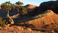
Weathered Woodby MadMountieComment: Nice choice. Maybe a little saturation would bring out the differences in the color better? |
| Photographer found comment helpful. |
| 02/20/2004 04:08:52 PM |
|
| Photographer found comment helpful. |
| 02/20/2004 04:08:09 PM |
|
| Photographer found comment helpful. |
| 02/20/2004 04:07:42 PM |
|
| Photographer found comment helpful. |
| 02/20/2004 04:07:20 PM |
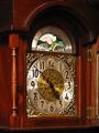
Timeby frateComment: A bit closer would show off the relief around the clock face better. |
| Photographer found comment helpful. |
Home -
Challenges -
Community -
League -
Photos -
Cameras -
Lenses -
Learn -
Help -
Terms of Use -
Privacy -
Top ^
DPChallenge, and website content and design, Copyright © 2001-2025 Challenging Technologies, LLC.
All digital photo copyrights belong to the photographers and may not be used without permission.
Current Server Time: 08/26/2025 05:28:41 AM EDT.