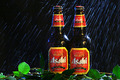
DPChallenge: A Digital Photography Contest You are not logged in. (log in or register
 
Browse Settings
Currently viewing:
Registered Userrananculus

Show comments:

Per page:

Order:

Comments:


Comments Made by rananculus
Pages:   ...
Showing 1 - 10 of ~165
Image Comment
Broken Heart
12/14/2006 03:51:03 AM
Broken Heart
by L o S T

Comment:
art
"I wandered lonely as a cloud" -Wordsworth
12/14/2006 03:48:07 AM
"I wandered lonely as a cloud" -Wordsworth
by posthumous

Comment:
wow. what light. beautiful.
Photographer found comment helpful.
Himba Boy
11/02/2006 12:16:47 PM
Himba Boy2nd Place
by gsal

Comment:
best of show
Photographer found comment helpful.
Fiddle
10/27/2006 09:18:00 AM
Fiddle
by Zigomar

Comment:
best of show
Photographer found comment helpful.
The Morning Run
10/23/2006 11:31:23 AM
The Morning Run
by vxpra

Comment:
11.....best of show
Photographer found comment helpful.
Cellow
10/19/2006 07:05:21 AM
Cellow
by De Sousa

Comment:
best of show
Photographer found comment helpful.
Asahi in Rainforest
10/17/2006 08:21:49 AM
Asahi in Rainforest
by william88

Comment:
greetings from the critique club

Congratulations on a fine shot and high finish. You planned, you set up, and you executed well. Your idea was creative and was deservedly received well. I'm sure that you knew that you had a strong submission when you entered it. You leave me with a difficult critique!

I find it interesting that the Beer or Softdrink Advertisement was a baic editing challenge when the advertising world is all about post production. The most obvious technical flaw of the frame being the hot spots created on the bottles from your remote flash. That flash made the raindrop effect work, but gave you a problem on the subject itself. A simple post-production fix, but not available to you. A flash difusion technique could very well have reduced the glare, but then you would have certainly lost the drama of the rain and of course the magic of the particular rain drops that that are bouncing off the bottles. Interesting delema.

I imagine that the first thing that the editor at the agency representing Asahi might scold you about would be "why is there so much negative space to the right of the subject". "Where am I supposed to put the text?". And he would be right. There is too much space to the right that does not benefit the subject. You can find your answer in the rule of thirds. Your subject is two bottles of beer. Put the exact center of your subject right on the exact right third vertical line and bingo....your your subject composition falls in perfect alignment to what the human eye expects.

I've had psychologists trying to explain to me why the rule of thirds is so magicle. I still don't get it. I do know that I don't even have to take off my shoes to count the number of times I have broken the rule to a positive result.

My last comment is compositional as well. More jungle! I might have tried (without blocking the labels in any way) to create more of an effect of that these bottles were an actual product of the plant. Like I could just go and pick one. Might be a nice effect.

Very nice work! You get an 8 from me!!

russ

Message edited by author 2006-10-17 08:29:02.
Photographer found comment helpful.
Je t\'adore
10/17/2006 03:07:29 AM
Je t\'adore
by esmaice87

Comment:
greetings from the critique club!

I must admit that I'm having a difficult time giving your shot a critique because it doesn't fit the definition of what I beleive to be a high contrast image. I went back to my textbooks for support.

I'll quote from Photography, Second Edition, by Bruce Warren. "A photographic image in which a subject with a full scale of luminances has been rendered as only two tones, black and white, with no intermediate tones shown".

Now, I am completely aware that many, if not most of the entries in this challenge are not high contast. Some of the highest finishers were out of bounds. Some just took normal everyday photos, bumped the contrast, and called it good. Not enough in my book. Bumping the contrast in your otherwise dynamic and creative composition only served to put a hotspot with contrast noise right into the middle of an otherwise well crafted frame.

I copied your photo and played with it in Photoshop.
//www.dpchallenge.com/image.php?IMAGE_ID=412788
I actually toned down the contrast to get rid of the hotspot. Whether it is better or worse now...only you can decide. But the shot looks great in high contrast as well. Proof that you were on the right track with your idea and the composition of your art.

Nice work.I give you a 6!!

Message edited by author 2006-10-17 06:18:24.
despair
10/16/2006 09:14:07 PM
despair1st Place
by tcmartin

Comment:
best of show
Photographer found comment helpful.
Heads or Tails
10/16/2006 09:12:53 PM
Heads or Tails
by jrd4t

Comment:
best of show
Photographer found comment helpful.
Pages:   ...
Showing 1 - 10 of ~165


Home - Challenges - Community - League - Photos - Cameras - Lenses - Learn - Prints! - Help - Terms of Use - Privacy - Top ^
DPChallenge, and website content and design, Copyright © 2001-2024 Challenging Technologies, LLC.
All digital photo copyrights belong to the photographers and may not be used without permission.
Current Server Time: 04/24/2024 07:35:26 AM EDT.