| Image |
Comment |
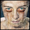
| 09/02/2011 08:18:59 AM |
Sicknessby Jon_HComment: This is really cool! You nailed the eyes, and I like the texture on the face. The only problem I have with this is that the texture layer on the face makes the picture look kind of flat. The shading of the texture doesn't quite match the shading on the face. Still, this is a powerful shot, well done! |
 Photographer found comment helpful. Photographer found comment helpful. |
| 09/02/2011 05:10:04 AM |
|
| Photographer found comment helpful. |
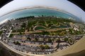
| 09/02/2011 05:08:58 AM |
Corniche & Sea Viewby dwyllieComment: I've been through that area many times... Great use of fisheye here. The photo is actually shaped like a human eye! Congrats on the HM! |
| Photographer found comment helpful. |
| 09/02/2011 05:05:18 AM |
|
| Photographer found comment helpful. |
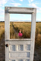
| 09/02/2011 05:03:36 AM |
My Dog's Favorite Window by ecmguyComment: Originally posted by kenskid:
Ok here's the deal. While this is a very good entry in "Out Your Favorite Window", I do see some issues.
1. Although it says the photo has been validated, I know you must have somehow cheated in basic editing. There is no way you could get this in basic...validated or not.
2. I like the blue hue to the photo. However, I can't help but see some issues with the two white bands at the top. I know it must have been tough to get a shot this good but you could have taken more time in making sure the white bands at the top were not "blown out" highlights. I mean you could have taken a few more shots and tried to get the whites in order.
3. The main reason I have to change my score (I voted several days ago) is this. The challenge is titled "Out Your Favorite Window". You titled your photo "My Dog's Favorite Window". So basically this entry does not meet challenge. With all of that said, I will have to move my vote from my original "seven" to a "ten". Ha! I had you going! Admit it. The Mad Commenter strikes again! |
Wow, you got me good... I was reading this on my phone, and I was halfway to my computer to send a snippy reply when I got to the bottom... |
| 09/02/2011 01:50:44 AM |
|
| Photographer found comment helpful. |
| 09/02/2011 01:49:55 AM |
The Artisan by gyabanComment: Wow... please please please please post a tutorial of this when the voting's over! I almost skipped through this until I realized what I was looking at! Magnificent! 10 |
| Photographer found comment helpful. |
| 09/01/2011 04:08:47 AM |
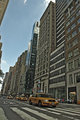
Typical New Yorkby SEGComment: This is a good concept, but I think HDR hurts this picture more than helps it. There's halos around the buildings and everything is reduced to a dull grayish texture. This would probably be an awesome place to get a shot during sunrise or sunset! |
| Photographer found comment helpful. |
| 09/01/2011 04:00:45 AM |
|
| Photographer found comment helpful. |
| 09/01/2011 03:58:47 AM |
Guess who Farted?by JarHeadComment: Nice title! This is good, but it seems a little blue to me, like you had your camera set to tungsten white-balance. |
| Photographer found comment helpful. |
Home -
Challenges -
Community -
League -
Photos -
Cameras -
Lenses -
Learn -
Help -
Terms of Use -
Privacy -
Top ^
DPChallenge, and website content and design, Copyright © 2001-2025 Challenging Technologies, LLC.
All digital photo copyrights belong to the photographers and may not be used without permission.
Current Server Time: 08/15/2025 11:05:43 AM EDT.