| Image |
Comment |
| 01/08/2005 09:44:46 PM |
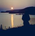
solitary sunsetby wkmenComment: On my monitor this image has a very noticeable blue cast to it. Imo, the silhouetted areas should be more black, not blue, and the sunset should be more 'warm' - meaning orange or red. I'm not sure what you use but if you have Photoshop or can figure out something similar with what you use, try this: Go to Color Balance, choose Shadows under "Tone Balance" and then move the cyan/red slider between +20 and +40. That will get rid of the blue cast and will also warm up the shot.
Roberts suggestion to try Neat Image is also a good one.
I also agree about the person's head being lost on the mountain. Both images are so dark that they blend together and become one. Perhaps if you had just moved a bit to the right the person would have a backdrop of water instead of mountain or rocks.
A very good attempt. Sunset/Sunrises can be tricky. |
 Photographer found comment helpful. Photographer found comment helpful. |
| 01/08/2005 09:36:24 PM |
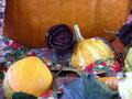
summer is doneby wkmenComment: I'd have to agree with what some of the others have said. There's too much competing in this image - colors, in/out of focus subjects, and just random 'things'. The out of focus gourds in the front are distracting; the corn cob on the left is barely in the image, I would have either included it or not; the ribbon sort of winds through the image without purpose, half facing us, half away; and there seem to be two or three different colored towels(?) peeking through from beneath the gourds and pumpkin. I think better organization and more attention to the little things could have really made this a great image. Sometimes simplicity is best. :-)
Edit: I meant to comment on the roses. As with the corn cob, I would have done something about the rose on the right edge of the image. I'm not really sure they fit into the image well, though. Part of thinks they may somehow have a chance - you know, the death of the rose representing the beginning of fall. Just not sure about them... Message edited by author 2005-01-08 21:38:32. |
| Photographer found comment helpful. |
| 01/08/2005 09:29:25 PM |
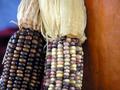
a touch of autumnby wkmenComment: Nice shot. I don't really have any suggestions for this one. I will comment on the blue though. It's a little distracting to me, but at the same time, blue and orange are complimentary colors so maybe it could work...? You capture fall well. |
| Photographer found comment helpful. |
| 01/08/2005 09:26:08 PM |
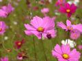
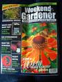
Roadside Wildflowerby wkmenComment: I really like this one. I like the amount of dof you used. I don't find the image to be too dark. The in-focus images appear to be the proper color. Everything is very sharp. Only suggestion for this one is to have maybe put all of the in-focus flowers totally in the frame. That's probably just a personally preference though. Very nice shot! |
| Photographer found comment helpful. |
| 01/08/2005 09:23:38 PM |
At the Car Showby wkmenComment: I find both flowers (left edge and upper right) very distracting. I think to have gotten a better shot you should have moved out from behind the flowers. Maybe even moved farther away from the car, if possible, so you could include the tires and right front (headlight) of the car. I think the colors and details on the car are very good. Overall, I don't care so much for this particular shot. |
| Photographer found comment helpful. |
| 01/08/2005 09:19:56 PM |
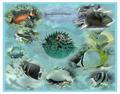
Undersea Montage #2.jpgby wkmenComment: Nice work, Wyatt. I like the colors and bordering. The individual fish are all very nice. They have good colors and seem sharp. I like your collage idea but the circular blending is a bit distracting. I can't tell if this is mulitiple shots of fish combined into one final image or if this is one image and you used the blue coloring to block out the background to highlight the fish. I would like to see the non-worked version of this. Overall, good work. |
| Photographer found comment helpful. |
| 01/07/2005 06:08:24 PM |
magazine .jpgby trainComment: Very cool! Terrific shot. It's no wonder they chose it. Congrats! |
| Photographer found comment helpful. |
| 01/06/2005 11:18:01 PM |
First Snow by PedroComment: Hey, congrats on the ribbon! What a simple and beautiful shot. I wish I could get shots like this. Terrific job.
* favorite * |
| Photographer found comment helpful. |
| 12/29/2004 11:45:14 AM |
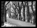
Empty promenade by miracComment: Wow, that was a tough one! Not sure I could have found her(?) if I didn't read your comment. Great shot. |
| 12/04/2004 08:24:27 PM |
|
Home -
Challenges -
Community -
League -
Photos -
Cameras -
Lenses -
Learn -
Help -
Terms of Use -
Privacy -
Top ^
DPChallenge, and website content and design, Copyright © 2001-2025 Challenging Technologies, LLC.
All digital photo copyrights belong to the photographers and may not be used without permission.
Current Server Time: 08/07/2025 05:40:06 PM EDT.