| Image |
Comment |
| 08/11/2002 11:52:00 PM |
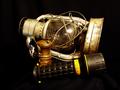
untitledby darylbrownComment: I'd rather see this without the flashlight. I think the composition could be more appealing if the lantern weren't knocked over. Good background, nice coloring. |
| 08/11/2002 05:49:00 PM |
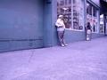
Grumpy Old Menby tydComment: Meets the challenge! The overall tonality has too much blue. |
| 08/11/2002 05:48:00 PM |
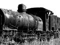
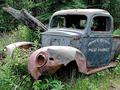
Not going Anywhere!by PointComment: Black and white works well here and it clearly fits the challenge. I'd like to see a slightly different angle to include more of the front of the engine, but that's just me. |
| 08/11/2002 05:45:00 PM |
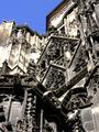
Gothic Detailby kmtolkComment: It's great that you got low enough to capture this good angle. There is a little too much detail crowded into this composition though. For the most part the dof is good. So is the light exposure. Although I love blue skies, in this case a black and white image would have sufficed. The blue draws my attention away from the detail of the subject. |
 Photographer found comment helpful. Photographer found comment helpful. |
| 08/11/2002 04:04:00 PM |
The Old Don Cesarby Photo JimComment: This is nice but seems to be tilting down to the left. I would like to have seen a little more color saturation in the picture to give it more punch. The palms for example could be greener. The sky would add drama if it was a little more contrasted. Seems to meet the "old" challenge. |
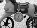
| 08/11/2002 05:55:00 PM |
Time Passagesby GotchaComment: I like the textural background, and love the repetitious circles represented by the watch and wheels. I must admit that it bothers me to have part of the horse's head showing and not the whoe thing and would like the watch to be over to my left more, to overlap the wheel. I'm sure many would disagree so it really is just a matter of taste. All that said, I do like this image. |
| Photographer found comment helpful. |
| 08/05/2002 05:04:00 PM |
Atom 153by boyte1Comment: Aside from the little particles, hair, etc, on the blue surface I like this. It was the same flaws in my own picture that kept me from submitting one of my favorites. Still giving you a high score though. |
| 08/11/2002 04:08:00 PM |
Yester Yearsby spillerComment: Nice color saturation, good focus, meets challenge, good dof. Congrats! |
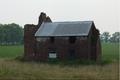
| 08/11/2002 04:12:00 PM |
Old Brickby estamperComment: On my monitor I can't see the brick because the image is too dark. I'd also like to see it off-center. Sure does meet the "something old" challenge though. |
| 08/11/2002 04:01:00 PM |
Centenarianby autoolComment: I can see the age in the patina of the wood. My submission is somewhat similar and many people just don't see the age in it, because it has been well preserved for many, many years. I thought they'd see that but didn't. I hope your's is scoring better than mine....:-) I like yours. |
Home -
Challenges -
Community -
League -
Photos -
Cameras -
Lenses -
Learn -
Help -
Terms of Use -
Privacy -
Top ^
DPChallenge, and website content and design, Copyright © 2001-2025 Challenging Technologies, LLC.
All digital photo copyrights belong to the photographers and may not be used without permission.
Current Server Time: 08/05/2025 07:45:23 PM EDT.