| Image |
Comment |
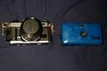
| 08/11/2002 04:43:00 PM |
pre-digitalby queen 91Comment: I'd like to have seen the cameras composed differently to break up the straight horizontal line straight in the middle. That would make it more appealing to the eye. I like your idea...just needs a little adjustment. |
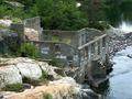
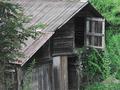
| 08/11/2002 04:53:00 PM |
Waterfront Home. Needs Workby BigSmilesComment: Geee I feel like I've been there...is it in upstate New York? Adirondacks? Anyway I like it. The rocks and the abandonment, and even the creek speak "old" to me. Nice |
| 08/11/2002 08:15:00 PM |
Carousel Horseby gigageekComment: I don't think the background does this any justice. Some side lighting would show more detail and shadow. It appears that you used flash or direct light instead. |
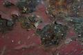
| 08/11/2002 04:32:00 PM |
EncRustby willsy66Comment: I'd like to see more color saturation and depth of field here. Sure seems to fit the challenge though. |
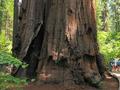
| 08/11/2002 05:29:00 PM |
Old Man of the Forestby bobgaitherComment: Beautiful texture, clearly old (and massive.) What I don't like is it is too centered and the tree or pole directly next to it on my left detracts. I think I'd have shfted the camerea to the right a bit and included more of the path and people looking at the tree. The curve of the path would draw you to the people and they would draw you back to the massive Seqouia. (sp) |
| 08/11/2002 04:29:00 PM |
KEEPER OF DREAMSby karolComment: Nice subject, good texture. The red on the bottom detracts, as I'm sure many have already told you. The water on the blue is different but doesn't seem to fit, or add to the composition. |
| 08/11/2002 06:12:00 PM |
|
 Photographer found comment helpful. Photographer found comment helpful. |
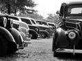
| 08/11/2002 05:20:00 PM |
Happy Daysby lecalanComment: This clearly represents the challenge but the composition just doesn't do much for me. Maybe it's because there doesn't seem to be a focal point. I think a color image would have provided more interest. The subject is very interesting and I think there is a lot of potential here. |
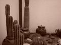
| 08/11/2002 06:10:00 PM |
Aging with the desert .by ragde_77Comment: I'd like to see this lightened up a bit and more contrast added. If you backed up a little or zoomed out to include the top of the cactus in the back I'd like it better. The background is nice, and the potential is there. I like the pots being included...nice touch! |
| 08/11/2002 11:36:00 PM |
|
Home -
Challenges -
Community -
League -
Photos -
Cameras -
Lenses -
Learn -
Help -
Terms of Use -
Privacy -
Top ^
DPChallenge, and website content and design, Copyright © 2001-2025 Challenging Technologies, LLC.
All digital photo copyrights belong to the photographers and may not be used without permission.
Current Server Time: 08/06/2025 05:34:50 AM EDT.