| Image |
Comment |
| 11/21/2002 11:21:00 PM |
|
| 11/22/2002 11:13:00 PM |
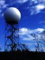
radome by FrooberComment: This is beautiful! The blue tones and the black silhouettes topped by the magnificent ball. What is it? A water tower??? I never heard of Radome. Anyway I like it very much. Grayce |
 Photographer found comment helpful. Photographer found comment helpful. |
| 11/19/2002 11:40:00 PM |
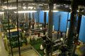
National Aquarium in Baltimore - Pump Stationby jdincolspringsComment: There's no doubt that this meets the challenge. It has some interesting vertical lines and the blue tanks add color. The lights send off too much of a glow and dominate the image imo. Perhaps a tighter crop would appeal to me more. 5 Good luck in the challenge. Grayce |
| 11/20/2002 12:01:00 AM |
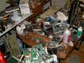
the device that changed our livesby rynoescoComment: I don't see a whole lot of effort going into this...the subject meets the challenge but it isn't particularly artistic. But I realize that's just my opinion. The plug, cord, and socket are distracting as are the video tapes, etc. The flash in the screen is another unecessary element, and the remote isn't in focus. Maybe that is intentional, but I'm not sure which is the subject here. The tv, the remote, or what. Please understand I am only pointing out my observations. I know everyione is different, and someone else might love it. I think the idea is great, but needs some work. (Don't we all) 5 Grayce |
| 11/23/2002 10:59:00 PM |
Eye Techby MarshaComment: Clever play on words and good image. Nice job! Grayce |
| 11/22/2002 11:24:00 PM |
Confused!by taylorbehneComment: So clever and original! Lots of cd pictures but this one made me chuckle. Whoever you are....brilliant idea, and well executed. I must point one distraction out, however. The white thing at the top of the image, over the stylus arm. A slightly different perspective could cut that out. Really good pic anyway though. Congrats. Grayce |
| 11/22/2002 11:09:00 PM |
bridge gate detailby grahamgormanComment: I like all the rust in this picture. Composition is a little cluttered. I think you included too much in here. Maybe a tighter crop to eliminate things like the building on the left, and the cut off light up on the right. I sincerely hope these suggestions help, and please remember they are only MY ideas. Grayce |
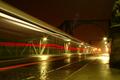
| 11/19/2002 10:50:00 PM |
Linksby stephanComment: This is a simple, relatively uncluttered composition. Colors are dramatic, and catch my eyes immediately. The ground looks sort of wet...good! There is just enough detail visible to discern it is a bridge and thus a "link" as the title indicates. Nice strong diagonal element, which I always seem to find pleasing. Some contrasting texture in the foreground...good. You did a good job with this. COngrats! 9 Grayce |
| Photographer found comment helpful. |
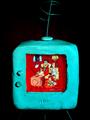
| 11/24/2002 05:36:00 PM |
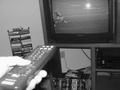
Bedrock TVby AleciaComment: Cute and funny. Good color and contrast. Good luck! Grayce |
| 11/20/2002 12:22:00 AM |
|
Home -
Challenges -
Community -
League -
Photos -
Cameras -
Lenses -
Learn -
Help -
Terms of Use -
Privacy -
Top ^
DPChallenge, and website content and design, Copyright © 2001-2025 Challenging Technologies, LLC.
All digital photo copyrights belong to the photographers and may not be used without permission.
Current Server Time: 08/18/2025 01:28:59 AM EDT.