|
|
| Image |
Comment |
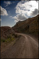
| 08/07/2006 02:53:50 PM | Road up IIIby alexgarciaComment: I like this shot very much because it reminds me of roads back home in Montana, roads that would lead you to the sky it would seem. |  Photographer found comment helpful. Photographer found comment helpful. |
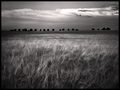
| 08/07/2006 01:06:33 AM | Listen to the windby puzzledComment: WOOOOOOOOOOHOOOOOOOOOOOOOOOOOOOOO! That's my girl!!!1 This is a fantastic shot! Congrats on your top 10 finish and the beautiful score to go with a beautiful shot! I'm so proud of you! | | Photographer found comment helpful. |
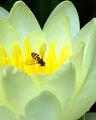
| 08/02/2006 06:24:36 PM | Little Gold Beeby banmornComment: Greetings from the Critique Club!
This is a beautiful image and such clarity. You always have the sweetest flower shots!
There is not a lot I see wrong with this image, the only thing that bothers me personally is the crop on the right side. I see you crop, crop, crop, crop but I wonder if you cropped just a bit more on the right and instead of the line right on the edge of the one petal, moving it in a bit so the inside of th petal takes you through the shot.
Also the bottom right corner is a bit distracting, the cropping would take care of a fair share of it and then you could darken what is left.
Other than that I have nothing to offer in way of critique on this picture but I will say once again, WOW!!!
I hope my comments help and Good Luck in future Challenges!
Deannda | | Photographer found comment helpful. |
| 08/02/2006 12:00:57 PM | The Boatby jerseyjimComment: Wow, this would have won you a ribbon for sure!!!
Well done! |
| 08/02/2006 12:59:01 AM | Peices of Pokerby Evilpuppy5Comment: Interesting idea but a few things really ruin this shot for me. First the lighting, being so harsh on the cards makes the white part blow out, very distracting. Gradual lighting can be effective but in this case it's not. Also the focus is completely off, very fuzzy to me, not a soft focus but fuzzy. An image like this almost begs for sharp focus and clarity.
The colors also seem a bit washed out. Again, not a bad entry, just needs some work! A 3 | | Photographer found comment helpful. |
| 08/02/2006 12:56:58 AM | In Suspenseby KonadorComment: Very creative and nice strong lines throughout the shot. This could be a 10 for me but it's almost too busy, the back clips are more of a distraction and something that adds to the shot and the few blow outs on the light are also a bit distracting. Also the one handle on the clamp in the upper left getting cut off bothers me just a bit. But still an outstanding effort, fully expect to see this in the top 10. An 8 | | Photographer found comment helpful. |
| 08/01/2006 11:39:43 PM | Boat on the Beachby jerseyjimComment: Greetings from the Critique Club!
Wow, what a shot!!! Very nice indeed!
You are right about those palm leaves though, a bit of a distraction but not much. Being a basic challenge you were very limited in that department. About the only other thing I noticed when looking at it is the bump behind the tree right at the horizon line. Is that a rock or island? Again, not much you could do because of the type of challenge. But that is honestly about all I could find wrong with the shot.
Love your profile shot, very cute. And looking at your other pictures this was a very nice challenge for you! You have a good eye for this and I can't wait to see you rise in the ranks here.
I hope my comments help and good luck in Future Challenges!
Deannda |
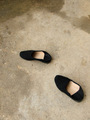
| 08/01/2006 03:37:37 PM | Movementby archivaComment: Greetings from me!
Hi, I see you never received the critique you requested on your picture so here goes. ;)
I see a lot of the comments ask what this had to do with education and honestly I had to ask the same thing. So for the sake of the picture, I'm betting you got a lot of Does Not Meet The Challenge votes. Now if this had been for the footwear challenge, your score might have gone up quite a bit.
So I'm going just comment on the shot itself. Those look like very comfortable slippers, the way the backs are pushed down tell me they are used usually in a hurry and probably for only short periods of time. Judging from the floor their are on and the stains and markings I'm guessing mostly in the garage or outdoor patio area.
The picture has potential overall but a few things got to me right off. First all the negative space, it seems really top heavy and the darker cement is more a distraction than an asset to me personally. It could work for you if you came from a different angle, taking the corner of the dark area inside and either pinpointing it in the center top, using it like a type of shading or border. Then you could re-arrange the shoes in differnt patterns and play with the overall composition. Remember that things don't always have to be centered as long as they are still balanced to a point, the rule of thirds is a wonderful thing, you could set up a slipper up on the upper and lower part of that.
Don't be afraid to experiement and play with a shot when shooting it. It's amazing some of the stuff that will pop out at you when you least expect it. That's the best thing about digital is you can't waste film! :)
Your lighting also comes off just a bit dull, a slight levels or curves adjustment could fix that.
Again, the potential is there, looking at your profile, don't quit trying!
I hope my comments help and Good Luck in future Challenges!
Deannda |
| 08/01/2006 02:39:40 PM | Smart butterby 308Comment: Greetings from me!
I see you never received the critique you requested so here goes.
Does this suck? Welllllllll, not if you compare it to my first couple of challenge entries, LOL! Mine really sucked, oh wait, they still do, LOL!
Anyway, this has potential and could be salvaged if done a little differently. One of the things I learned during my time here is to be totally aware of what you are seeing through your camera. You saw the peanut butter and bifocals. I see those as well, but also the pillow, the red edging, the heart or flower or whatever else that is under the pb.
Now, take the pB and bifocals and put them on a plain background, all white, all black, all any solid color and see what a difference this can make just doing that. All the distractions are gone so now you can concentrate on your subjects. Next, the arrangement. Fool around with it, try different things, glasses on top, pb wearing them, top off the pb, glasses inside, you could do just about anything. And then try different angles. From above, the left, the right, below, head on. See what you like the best. The one thing I love most about digital is that I can take 100 shots learning and if one comes out right and I remember what I did in that one shot it's worth it. If I get more, great!
Next, your lighting. It's a bit flat and dull. This can be corrected in post processing either with levels, brightness/contrast or curves depending on the program you use. If you can get it right the first time that's even better but if you have to do a little correction on post processing, no big deal either, unless of course your flash doesn't go off and you missed the perfect shot and it's pitch black, LOL :)
Last, composition. I don't this this is bad overall, I like the use of space in this shot and if it wasn't for the distractions it would be pretty good over all!
I see you've only done 4 challenges and haven't faired to well yet, hang in there, you get better with each one, sometimes you slide but you do learn.
I hope my comments help and Good Luck in future Challenges!
Deannda |
| 08/01/2006 02:29:20 PM | Medieval Viewby loveComment: Greetings from me! ;)
I see you never received the Critique you requested so here I am, hoping to fix that! :)
This is a lovely picture, I love the mood, the tone, the feel. You said you did lots of dodging and burning and I think some of the dodging might have hurt you a bit, as in you did a great job on the rocks that make the window but the dodging around the model is very noticable and there are lines everywhere around here. I'm betting if that wasn't as noticable you would have been a contender for a top 10 easily. The model is nice, a type of cloak would have completed the picture perfectly. If you redo this, take away some of the dodging around the model I would love to see it!
I hope my comments help and Good Luck in future Challenges!
Deannda | | Photographer found comment helpful. |
Home -
Challenges -
Community -
League -
Photos -
Cameras -
Lenses -
Learn -
Prints! -
Help -
Terms of Use -
Privacy -
Top ^
DPChallenge, and website content and design, Copyright © 2001-2024 Challenging Technologies, LLC.
All digital photo copyrights belong to the photographers and may not be used without permission.
Current Server Time: 04/30/2024 10:36:17 PM EDT.
|