| Image |
Comment |
| 01/26/2005 09:20:50 AM |
|
| 01/26/2005 09:20:29 AM |
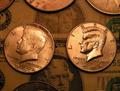
Green is always the sameby shiva5381Comment: I like the idea alot. A couple of things that might help it - the two main coins could be lined up better so that even if you wanted them at an angle, they'd be at the same angle as each other. They are just slightly "off". I like the background of the paper money, but I'm not fond of the extraneous coins at the bottom and the top. Again, in this situation, I think symmetry would improve the picture. Crop the same amount on both ends. |
 Photographer found comment helpful. Photographer found comment helpful. |
| 01/26/2005 09:17:00 AM |
|
| 01/26/2005 09:13:44 AM |
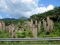
dead palms,live onby trademarxzComment: Pretty darn good, considering you didn't stop to take the photo. It could've be great had you stopped. |
| Photographer found comment helpful. |
| 01/26/2005 09:12:21 AM |
|
| 01/26/2005 09:11:18 AM |
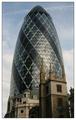
Towersby ManicComment: I really like how the buildings at the bottom are completely contained within the larger building in the back. |
| Photographer found comment helpful. |
| 01/26/2005 09:05:19 AM |
|
| 01/17/2005 12:18:08 PM |
|
| Photographer found comment helpful. |
| 01/17/2005 12:00:22 PM |
|
| Photographer found comment helpful. |
| 01/17/2005 11:56:47 AM |
|
| Photographer found comment helpful. |
Home -
Challenges -
Community -
League -
Photos -
Cameras -
Lenses -
Learn -
Help -
Terms of Use -
Privacy -
Top ^
DPChallenge, and website content and design, Copyright © 2001-2025 Challenging Technologies, LLC.
All digital photo copyrights belong to the photographers and may not be used without permission.
Current Server Time: 07/31/2025 12:46:03 AM EDT.