| Author | Thread |
|
|
08/17/2005 11:17:05 AM |
|
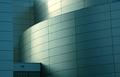
I really like the colors in this shot. The angle is a little too dramatic for my personal taste, but what do I know. Good shot. |
|
 Photographer found comment helpful. Photographer found comment helpful. |
|
|
06/21/2005 09:56:05 PM |
|
the angel and perspective jumps out at me ... i like it ... it's different. The colors are nice and rich and the reflection in the windows just add to the interest. great job |
|
| Photographer found comment helpful. |
|
|
06/21/2005 08:11:41 PM |
|
What a fun picture. I love the angle of the shot. The pumpkin of the door and the red and green of the surrounding trim is great. Nice architectural shot with a very artistic flair. |
|
| Photographer found comment helpful. |
|
|
06/21/2005 03:18:26 PM |
|
I love the angles that you use. Who needs straight and perfect. |
|
| Photographer found comment helpful. |
|
|
05/19/2005 06:43:31 PM |
|
I love shots that defy convention. This is one of those. Great colors, focus and clarity again. Good for you for going where few others dare tread with a simple and static subject. |
|
| Photographer found comment helpful. |
|
|
04/18/2005 07:23:34 PM |
|
love the colors in this, but find the reflections a bit distracting from the image as a whole. a circular polarizing filter would completely solve this problem. |
|
| Photographer found comment helpful. |
Comments Made During the Challenge  |
|
|
01/23/2005 11:17:25 PM |
|
great shot lov the reflections in the windows i assume that was the intent of the photog.(u) and subject of the image |
|
| Photographer found comment helpful. |
|
|
01/23/2005 08:16:52 PM |
any reason for this odd angle? It invites some sort of "love it - hate it" factor. Some ppl will love it others hate it. It does not appeal to me. That's your prerogative, and risk :)
You meet the challenge (very well), but since the photo does not appeal to me in other respects, it only nets you a 5, no I'm in a good mood so I bump it up to 6 |
|
| Photographer found comment helpful. |
|
|
01/23/2005 09:05:31 AM |
|
Wish you could of used a fill in flash so the top left part of the archway above door would have not be shaded out. The tilt, I don't know? I don't think it takes away, it may add. Colors are wonderful, focus good, and I like the reflections in the glass. Good Job 7 |
|
| Photographer found comment helpful. |
|
|
01/22/2005 11:23:44 PM |
|
Beautiful colors and I like the angle. |
|
| Photographer found comment helpful. |
|
|
01/22/2005 06:07:55 PM |
|
Great colors. Amazing processing. I can read the Newcastle Library 1812 1891 sign above the door with no effort. They must have just finished restoration, the paint is spotless. Superb job. This submission is in a class by itself. |
|
| Photographer found comment helpful. |
|
|
01/20/2005 10:52:34 PM |
|
The tilted perspective may not be the most sympathetic treatment of this from an architectural detail point of view, although it is a visually striking image as a result. I do like the reflected spire. 6. |
|
| Photographer found comment helpful. |
|
|
01/18/2005 12:49:42 PM |
|
| Photographer found comment helpful. |
|
|
01/17/2005 12:00:22 PM |
|
The angle is a little risky, but I think it works here! |
|
| Photographer found comment helpful. |
|
|
01/17/2005 05:39:26 AM |
|
Love the colors, the spire reflection. Not crazy about the angle, which seems forced to me. Nice work, regardless. |
|
| Photographer found comment helpful. |
|
|
01/17/2005 03:41:33 AM |
|
| Photographer found comment helpful. |
|
|
01/17/2005 01:11:30 AM |
|
| Photographer found comment helpful. |
Home -
Challenges -
Community -
League -
Photos -
Cameras -
Lenses -
Learn -
Help -
Terms of Use -
Privacy -
Top ^
DPChallenge, and website content and design, Copyright © 2001-2026 Challenging Technologies, LLC.
All digital photo copyrights belong to the photographers and may not be used without permission.
Current Server Time: 06/29/2026 01:50:24 AM EDT.