| Image |
Comment |
| 10/25/2003 12:48:01 PM |
|
 Photographer found comment helpful. Photographer found comment helpful. |
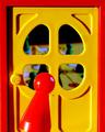
| 10/25/2003 12:21:25 PM |
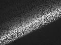
the lone sailorby MiahComment: As an abstract, the white and red distract too much, as a photograph there's nothing to identify with. The colors are pretty though as well as the the flow. |
| Photographer found comment helpful. |
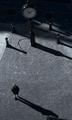
| 10/25/2003 12:04:17 PM |
Time is Always Nearby mzanoniComment: Nice and clear. The shadows work well in the composition. The perspective is great. Challenge well met.
If I may comment on things that I see that might be improved. The thing on the bottom is distracting. The alignment seems to be off. |
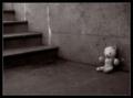
| 10/25/2003 11:48:55 AM |
Left Behindby moodvilleComment: The softness works for this to remind me that it was a child that lost his/her fav buddy. Also like the color. Composition excellent. The only thing on the dreaded negative side is the placement of the bear. I think it would look more lonely if it wasn't so perfectly upright and perfectly againt the wall. |
| Photographer found comment helpful. |
| 10/25/2003 11:40:38 AM |
Under Siegeby ddmckinney1954Comment: Is that a statue? How cool if it is. Where is it? That's a fountain beside him?
If I was in that situation, I might be praying I was alone. You have the hunted and the hunter(the fountain looks like someone is shooting). So it technically doesn't fit the challenge. I like it, so no points lost because of that. |
| 10/24/2003 07:22:11 PM |
Alonenessby eikidigiComment: Beautiful. The colors are rich, composition fine, subjects interesting. If I had one negative, I would say I'd like to see more details. All the texture is missing. 9 |
| 10/24/2003 09:34:49 AM |
TV Staticby ktritoComment: You need to use a slower shutter speed to get all the screen exposed. This is a very original idea and it does bring back memories of falling asleep in front of a tv. I think the shutter speed has to be 1/250th, not sure though. |
| 10/24/2003 09:18:20 AM |
Escapeby seancComment: Good job setting the mood. Framed well and focused well. And that's what I score on. The following part is just gabbing and does not reflect on your score.
Technical: the blood on the left side of the hand shouldn't be there, however it could be running down the thumb path and the puddle is good. With something as shocking as this, sometimes a more subtle approach can create more of a wow reaction. The puddle, the drip and the bottom thumb blood would have been enough to tell the story. And maybe a splatter on the perfect white pills.
And a question. What do you feel you have gained by desaturating part of the image? I ask this in a earnest manner. What I see is a pill bottle that looks unnaturaly molty, skin that is molty but not in a way that suggests death. And this detracts more than adds impact. |
| Photographer found comment helpful. |
| 10/24/2003 08:53:58 AM |
Alone in the shadowsby runarComment: This is the first photo I have seen in this challenge that's too dark. I've been thru about 1/2 of them. I like how the background colors have a rich, old time feel. |
| 10/24/2003 08:29:05 AM |
quiet time on the screenby hopperComment: Don't care a bit that it's a bug. Perfect is perfect. I am awed at your ability to get the grid so aligned. Wow. I really do hope you win. |
| Photographer found comment helpful. |
Home -
Challenges -
Community -
League -
Photos -
Cameras -
Lenses -
Learn -
Help -
Terms of Use -
Privacy -
Top ^
DPChallenge, and website content and design, Copyright © 2001-2025 Challenging Technologies, LLC.
All digital photo copyrights belong to the photographers and may not be used without permission.
Current Server Time: 08/25/2025 03:51:06 PM EDT.