| Image |
Comment |
| 11/13/2003 02:04:13 AM |
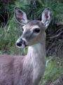
Call of the Wildby vernabethComment: It looks like her ears are tipped, like she is listening for that call. There are a lot of artifacts that destroy the clarity of the photo. I know a lot of voters want to see large pictures, but I feel that it's better to have a smaller picture that is clear than a larger one with the squiggles. You just can't win sometimes. |
 Photographer found comment helpful. Photographer found comment helpful. |
| 11/13/2003 01:59:17 AM |
|
| Photographer found comment helpful. |
| 11/13/2003 01:52:34 AM |
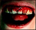
The Rocky Horror Showby ArmMarteinsComment: I don't know, but wouldn't it have been more "real" with the lower part of the teeth red? Sorry, but this way it looks like he has gingevitus or whatever that bleeding gum disease is. I really do apologize. |
| 11/13/2003 01:48:15 AM |
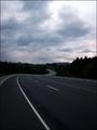
The Long Road Home (by Danielle Steel)by TwocentzComment: Good perspective and the curve adds interest. The clouds are pretty, but, I think, since the road is the interest in the picture, it would be better if you had moved the horizon up in the frame. |
| Photographer found comment helpful. |
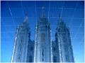
| 11/13/2003 12:14:49 AM |
Reflections on Eternityby dsidwellComment: Very well done. I love it when symetrical things are photographed with precision. The perspective is unique. The blue confuses the brain, inviting the viewer to pause and discover if this is water or glass. |
| Photographer found comment helpful. |
| 11/13/2003 12:05:26 AM |
Bowby sherComment: I'm not voting on this one. The levels of focus are well seen in this image. The cropping and composition pleasing. It makes me think of hands raised to heaven. The graves work to futher this theme. It looks oversharpened. I think I would like this even better if it was darker. I would have given you an 8 for this. |
| Photographer found comment helpful. |
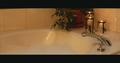
| 11/12/2003 11:56:19 PM |
The Bathby svitalComment: Exactly. If I had entered, I was going to do this! Only difference would have been my toes peeking out of the bubbles. Interesting presentation. Most of the time I like only a few items in the composition, but I think your setting would be more appealing if there was some motion, like the water running and some towels and soap or other bath related items. As it is, the weight is all on the right, so cropping off the left would not have been a bad thing to do. I voted just to make a comment, it will be stripped later. |
| 11/10/2003 10:39:24 PM |
Light Waveby mcmurmaComment: Go Sigma! You thought yours would get bad scores? I laughed when I saw you were the photographer for this one.
I'm happy to be somewhere in the top 50. Good luck on your future entries. I know you will be pulling in the blue soon. |
| Photographer found comment helpful. |
| 11/10/2003 12:32:16 AM |
|
| Photographer found comment helpful. |
| 11/10/2003 12:27:45 AM |
Endless sunshine and water?by JeanComment: Sorry you didn't win. I still think this is one of the most beautiful pictures on this site. How did you set it up? If you don't mind sharing.
Is it ice? Message edited by author 2003-11-10 02:47:33. |
| Photographer found comment helpful. |
Home -
Challenges -
Community -
League -
Photos -
Cameras -
Lenses -
Learn -
Help -
Terms of Use -
Privacy -
Top ^
DPChallenge, and website content and design, Copyright © 2001-2025 Challenging Technologies, LLC.
All digital photo copyrights belong to the photographers and may not be used without permission.
Current Server Time: 08/27/2025 08:57:32 PM EDT.