| Image |
Comment |
| 05/20/2002 02:14:00 PM |
Worth the Risk!by zerplordComment: Lighting is a bit harsh. Would have been nice to get a little closer to the figures they have some pretty nice detail. |
| 05/21/2002 03:09:00 PM |
Solitareby PaulinaRDComment: Gimme some more. Get a little lower and and give me some angle. I'm not crazy about your background, there might be a bit too much contrast. |
| 05/22/2002 09:29:00 PM |
Hide 'n' Peekby iraeComment: This is a great idea for a photo. I think I would have prefered a if the trees in the background were just a bit more out of focus. My eyes are drawn to the girl but the trees or maybe the bright ground sort of distract me from it. Good use of the rule of thirds. |
 Photographer found comment helpful. Photographer found comment helpful. |
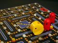
| 05/24/2002 02:12:00 PM |
Pac Attackby MaverickComment: You have a nice photo here. I've never seen this board game before but the pieces are cute looking. The one of the two things I have a problem with which I believe should be controllable is the focus. Your Pac Man and Ghosts do not appear to be completey in focus. The second controllable problem is the lighting. There appears to be some sort of shadow in the lower right of your picture. The next few things may not be controllable due to lack of software or a more sophisticated camera. Your "white" balls have a yellowish tint to them. The Pac Man logo and the lines above it all have jaggys in it. Then the final unfortuante problem which might be correctable with proper lighting is that crease in the board. Towards the top of the picture its reflecting light and its almost white and it detracts from your subject. I think you had a good idea and you put forth a valiant effort. You are on the right track. Don't give up. |
| Photographer found comment helpful. |
| 05/21/2002 03:59:00 PM |
Sin Is Inby ReubenComment: You have a really cool picture here. Why is the S and I in the foreground yellow? I wish the lighting was a little more even. I like the far away S being out of focus and making it look like its so far away. I also like the horizontal lines on your background it sort of points inward which works well. |
| Photographer found comment helpful. |
| 05/21/2002 02:23:00 PM |
Passing Go!by Susan2736Comment: I'm one of those that dislikes the forground subject to be out of focusand the background picture to be in focus. I think both figures should have been in focus. I think I understand why you did it though, the Jar Jar piece is passing go while the other piece is left behind. To make this a bit more effective it might have been better to choose a smaller piece for the foreground so that it doesn't detract from your subject and then maybe move the piece passing go closer to the line and maybe even crossing over the line. Another good idea would have been to get more of a view of where the character passing go was actually going by turning the camera more to the left. |
| 05/20/2002 02:18:00 PM |
|
| 05/24/2002 03:02:00 PM |
|
| 05/21/2002 02:28:00 PM |
It's My Turn!by MrsKroComment: I like all the colors but I can't really make sense of the game. I wish I knew what game this was. I don't know if I really like the positioning of the camera I would have liked to see more pieces lower in the fram and not cut off. |
| 05/20/2002 01:53:00 PM |
Days Gone By by tlalondeComment: That's a great photo. I love the contrast between shadow and brightness of the ball. The soft leather on the bottom is also appealing along with the photograph in the glove. It all works together very well. |
Home -
Challenges -
Community -
League -
Photos -
Cameras -
Lenses -
Learn -
Help -
Terms of Use -
Privacy -
Top ^
DPChallenge, and website content and design, Copyright © 2001-2025 Challenging Technologies, LLC.
All digital photo copyrights belong to the photographers and may not be used without permission.
Current Server Time: 08/21/2025 09:57:24 AM EDT.