| Image |
Comment |
| 01/21/2004 07:04:04 AM |
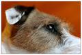
Who's The Fairest Of Them All?by EddyGComment: Another shot that should have scores much better if the damn cat-hating, dog-hating trolls could take a chill pill. Excellent shot. Keep up the good work. |
 Photographer found comment helpful. Photographer found comment helpful. |
| 01/21/2004 07:01:40 AM |
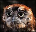
Concentrationby jaykeComment: Way under-rated. You should have been top-20. The cat and dog haters were out on this one. Keep up the good work. |
| Photographer found comment helpful. |
| 01/20/2004 07:24:21 AM |
I Will Try To Make Wise Choices by GolferDDSComment: Glad to see that you were re-instated. Way to make a stand! Congrats on your ribbon. Keep up the good work Message edited by author 2004-01-20 22:30:17. |
| Photographer found comment helpful. |
| 01/19/2004 05:40:53 AM |
|
| Photographer found comment helpful. |
| 01/15/2004 08:14:09 PM |
BANG!by jjbeguinComment: Man, they burned you on this one JJ. I had this placing in the top 15 for sure. Keep up the good work. Have a good 2004. |
| Photographer found comment helpful. |
| 01/15/2004 07:53:37 PM |
Samuelby JackoComment: Great top-10 finish bro! Another fine shot to add to your already impressive portfolio. Keep it up. But I DID beat ya this time... hee hee. More dumb luck than skill...
Later |
| Photographer found comment helpful. |
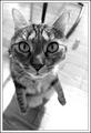
| 01/14/2004 08:41:11 PM |
Curiosityby JackoComment: That is the COOLEST perspective bro. The only thing I can wrong with this shot is that the floor to the right-front of the image is a bit blown out. Awesome crisp focus of the cat's face with everything else just out of focus. A winner in my book. |
| Photographer found comment helpful. |
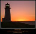
| 01/09/2004 10:06:18 PM |
PURPOSE - It is not so much where we stand, as in what direction we are moving...by BeagleboyComment: Originally posted by mgrundy:
Critique Club Comment
I must say to start that this is a stunning image. The colours are magnificent and you have still managed to capture detail in the lighthouse and the rocks in the foreground rather then end up with a silhouette against the sunlit sky.
The square(ish) format suits the picture along with the white frame around it and the verse and picture go well together. I only have one problem - the horizon really spoils what could be a perfect picture. Given the December rule set and assuming the picture couldn't be taken again, a quick minor adjustment in PS could have done the trick...
 |
It did the trick, but thanks anyway. Corrected crooked horizon and reframed with larger borders and text on two lines instead of three.
 NOW available as a print!Message edited by author 2004-01-12 18:12:31. NOW available as a print!Message edited by author 2004-01-12 18:12:31. |
| 01/05/2004 10:29:33 AM |
PURPOSE - It is not so much where we stand, as in what direction we are moving...by BeagleboyComment: Thanks for the vote folks.
Well, I must say I'm pretty happy with results. I attained two of the goals I had set out for myself on DPC in 2004:
1) I finally got a top-10 finish
2) I got one of my submissions to crack the magical 7.0 barrier.
The "cherry on top" would have been a ribbon.
Thanks for all the comments. I plan on re-doing this poster for a print available through DPCPrints.
EDIT: And oh yeah, I'll be straightening out that crooked horizon too. Always check that from now on. Live and learn Message edited by author 2004-01-05 11:13:31. |
| 01/02/2004 07:57:52 PM |
THAWby ellamayComment: There seems to be clone stamp dots all over this image. Excellent choice of subject and good crop. |
| Photographer found comment helpful. |
Home -
Challenges -
Community -
League -
Photos -
Cameras -
Lenses -
Learn -
Help -
Terms of Use -
Privacy -
Top ^
DPChallenge, and website content and design, Copyright © 2001-2025 Challenging Technologies, LLC.
All digital photo copyrights belong to the photographers and may not be used without permission.
Current Server Time: 08/06/2025 12:01:58 AM EDT.