| Image |
Comment |
| 01/28/2004 02:00:39 PM |
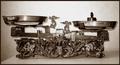
libraby HeidieComment: This is an very nice old scale: very nice subject matter. However, I |
 Photographer found comment helpful. Photographer found comment helpful. |
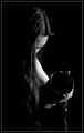
| 01/28/2004 01:58:36 PM |
The Water Bearerby CatherineComment: The skin tone on this shot seems to be off: too orange. What seems to be the kitche sink in the background is also a bit distracting. The upper right corner is quite blown out. Good idea of using coloured water to give this shot mor impact. |
| Photographer found comment helpful. |
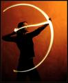
| 01/28/2004 01:53:00 PM |
Setting A Heart On Fire by ndsComment: Excellent idea! Your title bugs me though since you seem to be referring to Cupid, and not Sagitarrius. Too bad about those two spots on the wall, but I understand that classical rules were in place for this shot. Too bad that the "arrow light" is so high on her face. I would have preferred it at chin level or a little lower. Love the background colour |
| Photographer found comment helpful. |
| 01/28/2004 01:48:00 PM |
In the darkness of Sagittariusby DsealeComment: Too bad you had to crop the arrow point. Very nice idea. Lighting is good but I find too dark in the left lower corner. The overall image could have been lightened just a tad, even considering your title. |
| Photographer found comment helpful. |
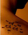
| 01/28/2004 01:45:53 PM |
piscesby sirenaComment: Don't understand what's going on with the white line on the left edge. Border gone wrong? |
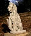
| 01/28/2004 01:44:51 PM |
Leo - The Lionby GrandmaEMTComment: The lion is too centered and way too bright when considering the surroundings. A tighter crop showing only the lion's bust might have better suited, drawing attentio to the statue and reducing he wandering efect caused by the surrounding area. This is a good example where a black and white treatment could have worked wonders. Sharpness is bang on. Keep up the good work. |
| Photographer found comment helpful. |
| 01/28/2004 01:41:04 PM |
Water Bearerby space amoebaComment: Nice idea. You may have been going fro the grainy/slightly blurred look, but I think it's over the top. A slightly more focussed or sharper image would have been better. The treatment given to the image does not do justice to the presumably beautiful long hair. A second weaker light coming in from the left would have given more body to the hair as well. I like the crop and the concept is sound. |
| Photographer found comment helpful. |
| 01/27/2004 10:52:12 AM |
|
| Photographer found comment helpful. |
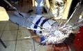
| 01/21/2004 07:14:12 AM |
pizza place shoot-outby proger_alcantaraComment: Another instance where this should have scored much higher. You got trashed by the anti-violence, anti-reality crew. You focussed this perfectly: the victim in soft focus takes away the over-the-top gore factor that we see in police file shots. Keep up the good work. |
| 01/21/2004 07:08:39 AM |
Dammit... I HATE that kleptomaniac mouse!by BeagleboyComment: I can honestly say that this shot fared a bit better than I had hoped for. It's badly lit, and not quite sharp enough for my taste. The hardest part was not getting too drastic shadows from lighting the booty. Used a Minimag flashlight.
Thanks for all the comments. I must hold a record for the highest number of comments received on a mid-level scoring shot shot (21 comments). |
Home -
Challenges -
Community -
League -
Photos -
Cameras -
Lenses -
Learn -
Help -
Terms of Use -
Privacy -
Top ^
DPChallenge, and website content and design, Copyright © 2001-2025 Challenging Technologies, LLC.
All digital photo copyrights belong to the photographers and may not be used without permission.
Current Server Time: 08/06/2025 09:27:13 AM EDT.