| Image |
Comment |
| 03/23/2004 09:24:16 PM |
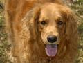
Dogsby rll07Comment: Porportions don't fit fo r a magazine cover. A vertical shot with alittle action would have helped, especially for a very active breed of dog. |
| 03/23/2004 09:21:00 PM |
Air Force Magazineby orussellComment: I could see this on the cover of an Air Force magazine. There's room for text without running through too much of the picture. Nice job. |
 Photographer found comment helpful. Photographer found comment helpful. |
| 03/23/2004 09:18:47 PM |
|
| Photographer found comment helpful. |
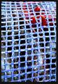
| 03/23/2004 09:18:10 PM |
Cajun Cookingby boyte1Comment: Nice idea. The netting is a little too strong. Would like to see the "food" a little better. |
| Photographer found comment helpful. |
| 03/23/2004 09:15:53 PM |
Cheese & Wine Magazineby TrollManComment: The wine bottle and glasses should be the center of attention for a wine magazine but in this image they are out of focus. |
| Photographer found comment helpful. |
| 03/23/2004 09:13:21 PM |
Mojo Music Magazineby TallblokeComment: Nice lighting idea. Would have liked to see a little bit more detail in the right side (his left) of his face. |
| Photographer found comment helpful. |
| 03/23/2004 09:11:28 PM |
Architectural Digestby dsrayComment: Too much of the sides of the escalators is showing. It would help to see more of the volume of the space to draw the viewer in. Nice vertical lines. |
| 03/23/2004 09:02:51 PM |
|
| Photographer found comment helpful. |
| 03/23/2004 09:02:15 PM |
Lighthouse Digestby browntComment: The porportions don'rt work for a magazine cover. Maybe off centering the rock outcropping and sowing more water would help or a tighter shot of the light house. |
| 03/23/2004 08:59:56 PM |
|
| Photographer found comment helpful. |
Home -
Challenges -
Community -
League -
Photos -
Cameras -
Lenses -
Learn -
Help -
Terms of Use -
Privacy -
Top ^
DPChallenge, and website content and design, Copyright © 2001-2025 Challenging Technologies, LLC.
All digital photo copyrights belong to the photographers and may not be used without permission.
Current Server Time: 08/04/2025 11:34:01 AM EDT.