| Image |
Comment |
| 03/03/2013 06:00:56 PM |
|
 Photographer found comment helpful. Photographer found comment helpful. |
| 03/03/2013 05:50:08 PM |
Separationby sfaliceComment: I like what you have seen here. Nice silhouette capturing the shapes of the city and the framing of the sky is interesting. I think a couple things to improve upon is to make sure the framing goes all the way to the top of the frame on the left and expose for the brightest portion of the sky. I think the composition would improve with the framing up to the top on all three sides. Also some of the cloud has lost detail due to being over exposed. You have done well to reduce the scene to it's basic elements. |
| Photographer found comment helpful. |
| 03/03/2013 05:40:22 PM |
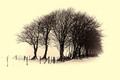
Exposed to the elementsby P-A-U-LComment: I like the line of trees and the extreme light and dark tones. I am not too fond of the yellowish toning on this, as it doesn't shout out the coldness of the elements exposed to. (Since yellow is a warm tone.) |
| Photographer found comment helpful. |
| 03/01/2013 08:42:57 PM |
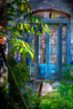
All That Remainsby CanonShooterComment: This is my choice for the blue! The light and shadow, the color, the perspective, the foreground and background elements all work to create a magical scene of a lost world tucked away!! |
| Photographer found comment helpful. |
| 03/01/2013 07:19:08 PM |
|
| Photographer found comment helpful. |
| 03/01/2013 07:14:07 PM |
|
| Photographer found comment helpful. |
| 03/01/2013 07:13:09 PM |
Pre-matureby DennisheckmanComment: Weston-esque! Though it does need a bit more sharpness and possibly a touch more contrast in my opinion. Nice deep blacks and good light. |
| Photographer found comment helpful. |
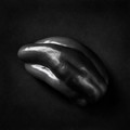
| 03/01/2013 07:10:52 PM |
Temptationby h2Comment: The studio lighting here is perfect, along with the exposure. No bad highlights or reflections to speak of. The white bowl really blends in too much with the background. The shadows are almost non-existent and the bowl really loses it's definition and shape. I think a red background would have been very a real great choice for this shot. But the technique is great for the white on white challenge coming up! |
| Photographer found comment helpful. |
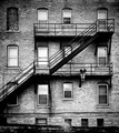
| 02/27/2013 10:36:08 PM |
downtown Z by timfythetooComment: Love the tones here and with all the detailed lines in the brick work, it looks good at this small size. Typically I would see some jaggies in there, but this is done nicely. I think the center is a little too crisply sharpened and conflicts with the blurred edges. But I do like that technique to help create the focal point. |
| Photographer found comment helpful. |
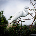
| 02/27/2013 10:32:03 PM |
~ S ~ by Ja-9Comment: You really did a great job exposing for the bright white of the bird. The upper spine of the bird is just barely visible in the brightest area! I'll bet this looks super wonderful at full size! |
| Photographer found comment helpful. |
Home -
Challenges -
Community -
League -
Photos -
Cameras -
Lenses -
Learn -
Help -
Terms of Use -
Privacy -
Top ^
DPChallenge, and website content and design, Copyright © 2001-2025 Challenging Technologies, LLC.
All digital photo copyrights belong to the photographers and may not be used without permission.
Current Server Time: 12/19/2025 12:16:01 PM EST.