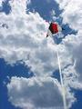
DPChallenge: A Digital Photography Contest You are not logged in. (log in or register
 
Browse Settings
Currently viewing:
Registered UserPatella

Show comments:

Per page:

Order:

Comments:


Comments Made by Patella
Pages:   ... ...
Showing 391 - 400 of ~452
Image Comment
Don't run over me!
05/01/2002 03:48:00 PM
Don't run over me!
by jonr

Comment:
nice use of color and lighting - would personally like to see the picture a tiny bit brighter - am also a little bothered by the rider's head having been cut off, but I think I would have been even more distracted from the over all image if it had been included
rubber baby duckie chuckie
05/01/2002 03:39:00 PM
rubber baby duckie chuckie
by clay

Comment:
while I can't say I really LIKE it, it scores fairly high because it's just so well done in a horribly grotesque way. Seems like the flash may have blown out some of the picture a bit too much -- and for whatever reason, the blood on the shirt looks too... pink? It doesn't seem to be quite the right color anyway...
Up Where the Air is Clear
05/06/2002 10:53:00 AM
Up Where the Air is Clear
by Patella

Comment:
A few generic responses to comments:

Over saturation? Possibly.

Over sharpened? Didn't sharpen at all -- actually despeckled a bit to try to soften some of the jaggies. This is just a sub-megapixel camera shot.

Bigger kite in frame? Could have. Didn't want to. This was about letting the viewer fly the kite. I mean, come on, if you're out flying a kite, do you fly it two feet over your head or do you let out ALL the string? Not only that, I wanted this to feel like the kite had room to fly around in the shot.

Crisper, more focused kite string? Like I said, I wanted this to feel like you'd feel if you were there flying the kite. Kite string in the foreground simply isn't going to be in focus in your visual field if you're looking at the kite. On top of that, kite string vibrates in the wind, making it hard to capture crisply. On top of THAT, this is a zoom shot, there's a lot more kite string in this shot than it looks like -- that also does things to your depth of field that are just not possible (or at least extremely hard) to control.

Other than these areas, I don't really know how to respond about having an ugly kite (personally I dig it) or using white kite string (if someone can tell me where to find black kite string, I'll give it a shot) or how this doesn't meet the challenge (in my book, this is from the perspective of the ground up).
Resurrection
05/01/2002 01:49:00 PM
Resurrection
by ss

Comment:
some of the colors on the statue seem strange -- is this something natural to the statue, something your camera did, or something that happened in the computer? While some cotton candy clouds in the background would have been cool, that's just a completely personal preference thing.
Orange Symphony
04/29/2002 03:06:00 PM
Orange Symphony1st Place
by FranziskaLang

Comment:
Very nice, very simple. If you're getting comments at all similar to mine, people will be split on whether or not the stem should be in focus. I think it's just fine as it is.
Looking up at a bug looking down.
05/01/2002 03:46:00 PM
Looking up at a bug looking down.
by tomlewis1980

Comment:
very fun macro -- it feels the tiniest bit fuzzy -- is that due to the camera or focal plane? the scratches/dust in the sky portion are kinda distracting -- and other than despeckle (which would make everything else that much fuzzier) I don't know what you could do to fix them -- somebody give this person a medium format film camera with a serious macro lens and watch out ;-)
Photographer found comment helpful.
Red  Head
05/01/2002 03:43:00 PM
Red Head
by albapete

Comment:
one of my favorite tree shots from this challenge -- appreciate that it's not all trunk and leaves but that you managed to find a good angle to get some sky as well -- wonder what those leaves look like with the sun directly behind them
building from the ground up
05/01/2002 01:18:00 PM
building from the ground up
by laurel

Comment:
Looks like this isn't completely level -- not sure the centered perspective is best -- the contrast is a little flat -- maybe a vertical a little closer to the building that focuses on one of the brick walls, some of the glass next to the door, the door handle, some of the roof, and the dirt in the yard?
Nick's Place
04/29/2002 02:57:00 PM
Nick's Place
by rcrawford

Comment:
Really liked this -- would have given it an even better score but I fund the red flowers in the lower corner distracting to the rest of the image
Homework
05/01/2002 01:12:00 PM
Homework
by Crystal Streams

Comment:
I find the door in the background distracting -- I like the tone though
Pages:   ... ...
Showing 391 - 400 of ~452


Home - Challenges - Community - League - Photos - Cameras - Lenses - Learn - Help - Terms of Use - Privacy - Top ^
DPChallenge, and website content and design, Copyright © 2001-2025 Challenging Technologies, LLC.
All digital photo copyrights belong to the photographers and may not be used without permission.
Current Server Time: 08/17/2025 07:25:58 AM EDT.