| Image |
Comment |
| 04/30/2002 11:47:00 AM |
Texas Indian Blanketsby marcelleComment: pretty flowerscape -- seems like a really high degree of pixelation though. I bet you're getting a lot of those comments -- low end camera? |
| 05/01/2002 01:24:00 PM |
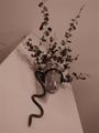
Overviewby ciscocaliComment: For me, the focus on this one just doesn't work. I like the way the walls and ceiling and corners contribute overall, but I want the vase, holder, and plant all to be in focus. I also would like to see those two branches coming in from the left removed. |
| 05/01/2002 12:25:00 PM |
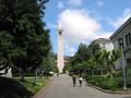
Sather Towerby bobgaitherComment: not entirely certain I see how this is ground up -- but be that as it may... the picture doesn't feel quite level -- everything seems to be leaning to the left -- I'm also a little distracted by the people, and other buildings, and light post -- maybe a tighter crop on the tower, as well as emphasizing the height of the tower by making the shot vert? |
| 04/30/2002 11:44:00 AM |
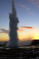
Fractals Entering Cartesian Spaceby ReignComment: wow -- does some interesting things to leave it as a horizontal like that -- looks like you had a little bit of a problem shooting in a darkishh space on a bright day? I'd like to see the midtones and shadows in this lightened up a little and the highlights toned down. (Hope that's not too Photoshop geek...) |
| 04/30/2002 11:28:00 AM |
Freedomby sonicblisComment: not a bad idea at all -- but I think 2 things detract -- first, it appears the trees in the background are more in focus than your subject -- second, I think a more interesting angle (and one that closer hits the spirit of the challenge) would have been to get closer to the ground (maybe even to lie directly underneath the path of the swing) and catch the little girl at the other end of the arc when she's more directly facing the ground |
| 04/30/2002 11:10:00 AM |
up or downby heritconComment: this could use some contrast work -- the sign and shrubs are all so dark -- the power/phone lines are also distracting |
| 04/29/2002 03:03:00 PM |
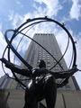
The Weight of the World by pdb209Comment: Nice composition. I can't quite determine if I like the cool tone to it or not -- I think I want the building to be a little warmer, but I don't think it's too possible given the site rules. |
| 05/01/2002 03:35:00 PM |
Reaching the skyby arnitComment: Refreshingly different shot of the kind of thing one usually sees as a bright daylight shot |
| 04/29/2002 03:16:00 PM |
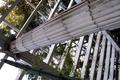
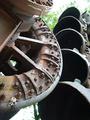
Dredge it upby yyyapComment: Very interesting shot of the machinery. Did the background get blown out (over exposed) in the camera, or during post-processing? If it weren't quite so bright, this would have received those extra couple of points from me. |
| 05/01/2002 01:37:00 PM |
Budby MaYzComment: Normally, I'd probably not like cropping the top of this poor dog's head off -- but it works. I think a plainer )or maybe even just a more simple) background would have made this a much more interesting shot. |
Home -
Challenges -
Community -
League -
Photos -
Cameras -
Lenses -
Learn -
Help -
Terms of Use -
Privacy -
Top ^
DPChallenge, and website content and design, Copyright © 2001-2025 Challenging Technologies, LLC.
All digital photo copyrights belong to the photographers and may not be used without permission.
Current Server Time: 08/17/2025 02:48:33 AM EDT.