| Image |
Comment |
| 05/13/2002 09:10:00 PM |
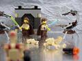
You know the story. Now, make your own... Lego®by PatellaComment: For all of you who commented on the droid LL being way out of the focal plane -- you're absolutely right and I appreciate the feedback. It was intentional for two reasons -- first, I simply liked the way I felt it put the viewer more fully in the action -- like you're part of a bunch of droids coming up on the scene. Secondly, that corner was where I would have put some of my ad type -- price of the Lego set, or a logo, or a tag line, or whatever. Yes, you want people to see the picture, but the written information is what you really want them to remember -- and if I can keep 'em looking down there at it... At any rate, thank you for all the constructive comments. |
| 05/08/2002 10:57:00 AM |
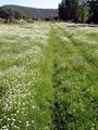
No more roads!!by manoloComment: K, have to admit, I don't get what you're selling. Beyond that, it's a nice photo. I think it might be a little better if the horizon line weren't pushed quite so close to the top of the frame. I understand you're focusing on the tire grooves in the meadow, but the trees being cut off in the upper right corner detract from the picture in my opinion. |
| 05/12/2002 02:24:00 PM |
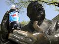
Yeah Baby... I Love Pepsi!by pdb209Comment: Really like the idea. I see just a few minor problems: glare on the Pepsi bottle is too strong (maybe if you shot at a slightly different time of day to remove), the buildings in the background (a different angle to either make them a more or less prominent feature of the image), and the tree branch kind of looks like it's balanced on top of his head (again, slightly different angle). |
| 05/12/2002 02:12:00 PM |
Snuggle Softby connieComment: Like the way you used the fabric in the background -- it echoes the clouds on the product label nicely. The only thing I think needs a bit of work is that the towel seems a little bit too bright. I only get texure on it around the edges. |
| 05/12/2002 02:31:00 PM |
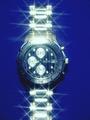
Piere Cardinby doogbullComment: I like the starlight filter -- but the highlights are a little too bright, I think. The fact that the watch is JUST off center bothers me, as do the crooked band skewed over to the left at the bottom and the way it's cut off at the top (this only because it goes all the way off the image at the bottom). |
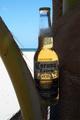
| 05/08/2002 11:09:00 AM |
La Cerveza Mas Finaby elliottwhitleyComment: Clever idea, but the foreground is SO dark. I'd suggest using either a fill flash or some kind of bounce to get some more light on the beer and the palm tree. If the flash is too bright, try using a piece of paper over the flash to tone it down a bit. |
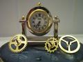
| 05/08/2002 11:04:00 AM |
Wheels of Timeby janfriesComment: the clock face seems a little dark, perhaps using some white card stock or something to bounce some light into it would lighten it up without creating a glare. I'm not certain what the two "columns" are on the background. If they can't be removed, I'd consider moving your main elements so those strips are more centered on the rest of the image. You might also try the 10 to 2 or 10 past 10 settings for the clock hands (traditional advertising positions) -- that way they're not all bunched up in the same basic spot. |
 Photographer found comment helpful. Photographer found comment helpful. |
| 05/12/2002 02:09:00 PM |
snuggleby eyegoComment: the blue tint to everything is a little strong for my taste -- I think a warmer tone might be better for a drier sheet -- kind of echo the soft warmth of something right out of a drier |
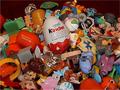
| 05/12/2002 02:28:00 PM |
Mountain of Kinder Egg Toys (Spot the Crystal Duck).by JakeComment: I think this might have been a tinier bit better if you'd filled the frame with toys instead of creating a mountain. I also really like the "Find the Object" idea -- but it wa a little too easy. Making the duck a little harder to find (less center of the image and right on top) would make the game a lot more fun to "play". Finally, the colors all seem a little dark. They don't really pop off the screen. |
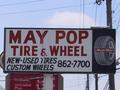
| 05/08/2002 11:13:00 AM |
Wanna Tire?by heritconComment: Such a busy background -- really makes it hard to pay attention to the sign. Were there any signs on the building selling the tires? Maybe using one of them, getting some tires in the shot. The contrast here is also a little off -- the sign is darker than it should be -- like it's been backlit. Was the other side of the sign brighter? |
Home -
Challenges -
Community -
League -
Photos -
Cameras -
Lenses -
Learn -
Help -
Terms of Use -
Privacy -
Top ^
DPChallenge, and website content and design, Copyright © 2001-2025 Challenging Technologies, LLC.
All digital photo copyrights belong to the photographers and may not be used without permission.
Current Server Time: 08/17/2025 07:21:56 AM EDT.