| Image |
Comment |
| 05/13/2002 09:30:00 PM |
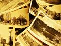
Buddha Angleby risu81Comment: I don't get the challenge aspect. (The only thing that looks like it might be upside down is one of the pictures right in the middle but under all the others. The only other thing I can think is the "Asia's on the other side of the world from me" take -- but that's very subjective to my geographical point of view.) It's an interesting montage of photos that looks great. Depending on the look you're going for, it seems a little too yellow to be sepia-toned -- I might try backing off on that a bit. |
 Photographer found comment helpful. Photographer found comment helpful. |
| 05/17/2002 11:41:00 AM |
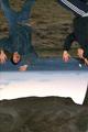
Shadowby lecalanComment: This is kinda cool. I like the feet being in the shot. I think a lot of people would probably prefer them not to be there. I think I would have tried to either perfectly center the image, or moved it further to the side, if possible. The other thing you might try would be to crop this at the 640x427 size to further accentuate the vertical nature of the shot. |
| 05/13/2002 09:18:00 PM |
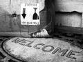
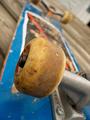
Special Deliveryby AmphianComment: I really like this. Makes a great black and white. While I love the label for this challenge, I'd like to see it even more without it but with some kind of shipping label so you know that the box shouldn't be distressed even though it is. (That last doesn't apply to the way I'm voting though.) :-) |
| 05/13/2002 09:40:00 PM |
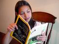
"I Wanna Look Just Like The Magazine!"by magnetic9999Comment: This is different. It feels a little too cluttered for me. There's the afghan (?) on the left, the black and red something in UR, and the stripes along the top all competing for the main focus of the cat and the magazine. (I assume it's a cat anyway...) A little more simple setting would have been better for my taste. |
| 05/15/2002 01:24:00 PM |
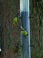
Beakside Downby ReubenComment: Nice title. :-) I started to comment that a slightly straighter camera orientation would be nice. Then I realized it probably was fairly straight, but since the birds were all on one side of the feeder, it's hanging crooked. The low-light noise mars the picture -- probably not a lot you can do about that because I'm guessing this was an early morning/late evening photo. I think I might have cropped this a little tighter so that there's an even margin between bird and border at top and bottom. Also, maybe using the 640x427 image size to accentuate the very thin vertical nature of the shot. |
| Photographer found comment helpful. |
| 05/15/2002 04:58:00 PM |
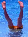
Summer Funby ShiiizzzamComment: Fun -- I can almost feel the cool water. Wonder if you'll get comments about the glare on the feet -- in my opinion, it just shows that he (I assume) is wet. Because of the blue tones on the skin and shorts, I wonder if this was a little over saturated. The water looks great this blue, but not the skin tones. I think maybe backing off of that a touch wouldn't help. |
| 05/15/2002 12:50:00 PM |
Prawlingby Palli747Comment: I think this is one of the few shots where it looks as if basically just the camera was flipped that really works. It appears to be pretty well lit and the contrast is good -- it's just so pixelated -- not a lot of really good detail. Too much compression coming out of the camera? Without knowing the process you used to take it and do any editing, I don't know what suggestions I can make to hep. |
| 05/13/2002 09:19:00 PM |
The Suicide Machineby blueeyedemoboyComment: Even though this is one of my high scorers, I wonder how other's will vote it... I don't know that there's anything I would change. Nitpicky -- but maybe moving the board over to the left slightly to avoid that tiny bit of the doorway on the upper right side (?) being in the frame. |
| 05/15/2002 05:00:00 PM |
Through the looking glass by CoreyComment: GREAT idea. I'd love to see this one shot again on a day with bright blue skies and puffy white clouds. As it stands, though, the only comment I have is that I think I'd have tried to get rid of the air bubbles in the water, and the water spots on the upper part of the glass. Make it a perfect "lens" without all the "imperfections". |
| Photographer found comment helpful. |
| 05/13/2002 09:34:00 PM |
Hmmm...by fsieradzkiComment: A compliment in disguise: A very nice portrait marred, I think, by trying to make it fit the challenge. She looks like a smart girl (whose been very nicely lit, I might add), but I can't think of any reason she'd be looking at a National Geographic upside down. Or, a nice ad for NG, also marred -- if she was holding the mag the right way round, the cover would be well lit and highlighted. |
Home -
Challenges -
Community -
League -
Photos -
Cameras -
Lenses -
Learn -
Help -
Terms of Use -
Privacy -
Top ^
DPChallenge, and website content and design, Copyright © 2001-2025 Challenging Technologies, LLC.
All digital photo copyrights belong to the photographers and may not be used without permission.
Current Server Time: 08/18/2025 04:15:47 AM EDT.