| Image |
Comment |
| 05/21/2002 09:44:00 AM |
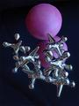
Jumbled Jacksby rumttuggerComment: I really like the idea here. I'd guess you did, but I would play around with the composition a bit more -- something doesn't feel quite right to me. Aside from the issue of composition, which is a very subjective issue, the colors here don't seem quite right. Maybe a little too blue? And a little too dark on the ball? The brightness issue is a difficult one though cause that might blow out the jacks. |
| 05/21/2002 03:05:00 PM |
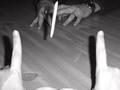
Footballby karmatComment: This seems somewhat silly to me because at least one of the participants is a married man. But who am I to judge what games people can and can't play at what age. :-) I think it would have been a little more fun if kids were playing. It's an interesting set up though. I wish you could see a different angle of the "ball" but then you wouldn't have been able to get the great first person point of view. foreground hands were a little too cose to the flash and so washed out and all three shadows take away, in my opinion, from the finished image. Hard shot to get without a flash though, so other than a different flash location I don't know what to suggest. |
 Photographer found comment helpful. Photographer found comment helpful. |
| 05/21/2002 10:39:00 AM |
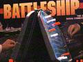
Battleshipby #1 Bronco FanComment: Well, I already know you've received comments about the grain. Since this seems to me like an advertising shot, I'd suggest trying to move the box a little higher over the game so we can see all of the name of the game. I like the way the hands on the box look like they're actually playing the real life game (especially the one on the left). Maybe you could try doing that a little bit more on the right too. |
| Photographer found comment helpful. |
| 05/23/2002 03:20:00 PM |
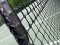
tennis courtby mnewmanComment: I considered doing something similar to this with the upside down challenge. I don't like putting things like this into comments, but this shot really needs at least 1 tennis ball somewhere. I'd also consider trying to crop/shoot this to avoid the fences and trees in the background and keep it even more simple. But that's me. Love the pattern of the net though. |
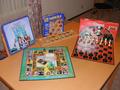
| 05/21/2002 02:29:00 PM |
Some Of My Favoritesby lcgleahComment: There are a lot of extra elements outside what you want us to be looking at. the chair in the upper right corner, another game on the floor over by the Wizard of Oz, the window and curtains. I'd suggest moving the table over closer to the wall and shooting with a nice plain background. You've got a little bit of a glare on the chess board -- it's not too bad, but it could probably be fixed so it's not quite so strong. |
| 05/21/2002 03:57:00 PM |
Monopolyby tomlewis1980Comment: My favorite of the Monopoly shots. Took for granted that we didn't need to see a major portion of the board or anything like that. (Plus, it's the Brit version. Woo hoooo.) Nice texture captured on the board and money. I appreciate the tears in the bills that show this set has been well used. Nice back lighting on the playing piece. The one thing that doesn't work for me is the overall color (two much of that blah green color that the board and 500 bills are). With the way everything looks aged already, what about a duotoned/sepia toned shot that made it look like an old photo? |
| Photographer found comment helpful. |
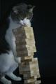
| 05/21/2002 10:30:00 AM |
The Games Cats Play. . .by FranziskaLangComment: Is that cat food, or somebody's fingers on top of the Jenga tower? This is very dark -- even a simple "auto-levels" in PS might help. The focus is also very soft -- perhaps in part to the dark shooting environment. I think maybe pointing the camera a little further to the left (moving the subject further into the frame) would have been beneficial. |
| Photographer found comment helpful. |
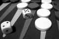
| 05/21/2002 09:48:00 AM |
Backgammonby snoopyComment: Nice composition. Good lighting. Nice texture on the board itself. I think I would have moved the LL dice toward the right just a little bit -- it feels too close to the edge. The white pieces also seem VERY white (especially in comparison to the dice), but maybe they really are. |
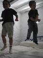
| 05/21/2002 10:27:00 AM |
jumping of bedsby manoloComment: Really fun picture, but the best part I can barely see. The setting is important to this shot, but it's the only well lit portion. I REALLY want to be able to see the expression of the child on the right. It looks like it would be killer. Your focus should be on the children and their faces -- they look like they're having fun, but because they're not well lit, your audience realy has to work at seeing it. |
| 05/21/2002 09:52:00 AM |
BenchWarmingby sjgleahComment: I was going to suggest cropping in tighter on the two on the bench, but the more I look at the image, the more I think that might be a bad idea. Too many things in the fringes of the picture that help sets its mood and give it context -- the glove in LR, the helmet LL, the kid on the left side, etc. So, I'm not sure. Maybe something to try. I really like the multiple layers of chain link fence. Good work. |
Home -
Challenges -
Community -
League -
Photos -
Cameras -
Lenses -
Learn -
Help -
Terms of Use -
Privacy -
Top ^
DPChallenge, and website content and design, Copyright © 2001-2025 Challenging Technologies, LLC.
All digital photo copyrights belong to the photographers and may not be used without permission.
Current Server Time: 08/22/2025 11:12:32 PM EDT.