|
|
|
Showing 231 - 240 of ~452 |
| Image |
Comment |
| 05/31/2002 09:33:00 AM | Give me the Keys!by BNCComment: Good use of her reflection to "polarize" the window and let his face come through. I wish his face was just a little bit further to the right in the picture so we could see a little more of her face in the reflection. I was wondering about a much tighter crop, maybe to focus on his face, her face, her hand, and the door handle -- but I'm not sure if that would be enough to identify that they were in the car. Letting her drop her right hand would get rid of those fingertips on the far right edge. |
| 05/30/2002 10:13:00 AM | Eye Variationsby hokieComment: It's funny to me that people assume this has been edited. Don't get me wrong, it's a very clever idea. Bu all I need to see is that glare on the cardstock or whatever you used that's above the right eye to know the basics of how this was done. (Either that or you're good enough to think of that and then fake it.) Personally, I want a little more light on the left eye and a little less on the eyebrow above the right. I also want that focus to be really sharp -- especially on the right, central eye. |
| 05/31/2002 09:47:00 AM | Day Dreamer by MrsKroComment: Very pretty. I'm not sure what the item is just outside the window (a chair?) but I wish it weren't there. It looks, a little, like she's staring at it, but since I don't know what it is, I can't think of a reason for her to be looking at it. Whereas if it's not there, then she's simply staring out the window.... |
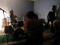
| 05/30/2002 10:17:00 AM | kite flying societyby heartsdivideComment: The shot overall is so dark, I can hardly see anybody or anything. If it weren't for the drummer (good smile on his face) and the drum set, I'm not sure if I'd be able to tell what this is even a photo of. I think the idea of using motion blur for this kind of shot is great -- just wish I could see more of it. |
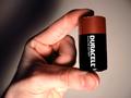
| 05/31/2002 09:28:00 AM | the wisdom of morpheusby jonathansComment: I don't get the title, but that's beside the point. I like the way the shadow on the hand works, but I'm not keen on the background shadow -- perhaps using a secondary light source would help kill that. The color of the hand is also a little... saturated, maybe? (Whether in camera, or post-processed it just seems a little too "pink.") I don't have a battery to compare it too, but the copper band seems a little dark, as well. |
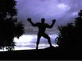
| 05/31/2002 11:14:00 AM | beach boysby wolfjackComment: Nice idea, but I think it would have been even better as a photo if you'd moved closer to the main subjects so you could avoid placing all the other people in the foreground. I didn't realize at first, but the actual horizon (the ocean) is crooked, while the perceptual horizon is straight. It didn't bother me until I realized it, but it's not very noticeable. I like the idea of these guys as silhouettes, but I'm not sure if you'd be able to tell what they're doing if you went that far. Maybe if you just brought up the levels over all -- the sand and ocean are pretty dark. |
| 05/21/2002 04:09:00 PM | The Pitchby AnAUTigerComment: This is a well timed shot, but the colors seem very strange. I thnk it needs some levels work in an editing program. The horison line is also a little crooked -- I'd suggest rotating it slightly clockwise. |
| 05/21/2002 03:11:00 PM | Preparing for blastoff! ... but captain, its fooseball not your spaceship.by gja2600Comment: If only you'd got the focus on the face instead of the hands. Such a great expression. I think a vertical format would have helped this picture as well. Especially one where you shot it that way originally and could have gotten more of the foosball table in the lower end of the picture. As it stands, however, even cropping it vertically would help minimize some of the distracting elelments around him and help focus attention on the subject. |
| 05/21/2002 10:24:00 AM | Let the Games Begin!by cameoComment: So is this an action figure??? I think maybe I could have accepted this more in terms of the present challenge if he'd had a torch in one of his hands. It's an interesting pose and I like the background, but nothing at all is sharply focused. There's also the noise in the clouds, but I realize that may be unavoidable with your camera. |
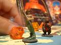
| 05/23/2002 03:40:00 PM | Dungeons and Dragonsby eddyComment: I like the oranges and blues in this. I'm not sure why you went with the motion blur on this one -- not that I have a problem with it, but because I can't tell what you're doing, what's being moved. Dice? A playing piece? Also, the anchor point of the image seems to be the medusa-like figure in the center of the foreground, but it's in front of the focal plane and slightly out of focus. Either a smaller aperture, or different focal point is needed, in my opinion. |
|
Showing 231 - 240 of ~452 |
Home -
Challenges -
Community -
League -
Photos -
Cameras -
Lenses -
Learn -
Help -
Terms of Use -
Privacy -
Top ^
DPChallenge, and website content and design, Copyright © 2001-2025 Challenging Technologies, LLC.
All digital photo copyrights belong to the photographers and may not be used without permission.
Current Server Time: 08/18/2025 09:21:33 AM EDT.
|