|
|
|
Showing 211 - 220 of ~452 |
| Image |
Comment |
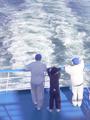
| 05/31/2002 11:21:00 AM | Three sailorsby JonniboyComment: Wow, I can't say for sure, but based on my own work with water, the colors here look a little too saturated (blue -- but maybe they really are that blue) and the picture overall is definitely very light. I'm sure you did it to bring out all the blue, and perhaps it's a monitor calibration problem, but I think stepping it down a notch or two would have been fine. If possible, getting the subjects out of the shadow of the funnel (?) might have helped as well. |
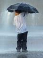
| 05/31/2002 09:43:00 AM | Taking Cover by timj351Comment: My comment may or may not be valid depending on if this is a rainstorm or a fountain. If it's a fountain, I wish I could see some of the bursts of water from the ground on the way up. That might not be possible though in terms of also getting it while it's crashing down on him. |
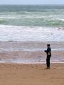
| 05/31/2002 12:43:00 PM | Wave Watchingby ManicComment: I like the layers of color in this photo. The person is well placed, but I wish they were doing something else. Even just standing with their back to the camera. (Skipping a rock, bent down to look at something, etc.) It looks like they're trying to read a letter on a windy day, but I just can't tell. |
| 05/31/2002 11:24:00 AM | Month End Madnessby zerplordComment: I think you've captured the chaos really well -- the problem is I don't really have a visual anchor point to come back to before venturing off to look at some other aspect of the picture. The man in the striped shirt almost works, but the candy next to him echoes the stripes of his shirt too much and so I get pulled away. |
| 05/31/2002 11:01:00 AM | Small Wonderby welcherComment: This is one of those photos that totally counteracts all the thumbnail voting arguments. I hope people aren't seeing the thumbnail, letting the first half of this come up, and then voting. At first, I was thinking, "Wow, this is really out of focus." Then it finally finished loading and I thought, "Ah, I see..." The idea is very good -- I wish I could see more of the hand -- especially the fingernails. I also think a simpler background would have been a big benefit. |
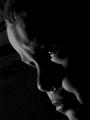
| 05/31/2002 11:05:00 AM | The Pouterby jmsetzlerComment: I think the highlight in the eye might be a little too big and too bright in relation to the rest of the picture. I'm also not certain I like the direction that the eye is looking -- perhaps that has something to do with the highlight. I like the lighting otherwise, but wish the skin tones, where visible, were a little bit brighter and closer to "18% gray." (If they are already there, and they just seem darker, then maybe closer to 18% perceptually -- if that makes sense.) |
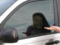
| 05/31/2002 09:33:00 AM | Give me the Keys!by BNCComment: Good use of her reflection to "polarize" the window and let his face come through. I wish his face was just a little bit further to the right in the picture so we could see a little more of her face in the reflection. I was wondering about a much tighter crop, maybe to focus on his face, her face, her hand, and the door handle -- but I'm not sure if that would be enough to identify that they were in the car. Letting her drop her right hand would get rid of those fingertips on the far right edge. |
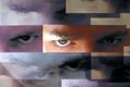
| 05/30/2002 10:13:00 AM | Eye Variationsby hokieComment: It's funny to me that people assume this has been edited. Don't get me wrong, it's a very clever idea. Bu all I need to see is that glare on the cardstock or whatever you used that's above the right eye to know the basics of how this was done. (Either that or you're good enough to think of that and then fake it.) Personally, I want a little more light on the left eye and a little less on the eyebrow above the right. I also want that focus to be really sharp -- especially on the right, central eye. |
| 05/31/2002 09:47:00 AM | Day Dreamer by MrsKroComment: Very pretty. I'm not sure what the item is just outside the window (a chair?) but I wish it weren't there. It looks, a little, like she's staring at it, but since I don't know what it is, I can't think of a reason for her to be looking at it. Whereas if it's not there, then she's simply staring out the window.... |
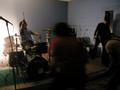
| 05/30/2002 10:17:00 AM | kite flying societyby heartsdivideComment: The shot overall is so dark, I can hardly see anybody or anything. If it weren't for the drummer (good smile on his face) and the drum set, I'm not sure if I'd be able to tell what this is even a photo of. I think the idea of using motion blur for this kind of shot is great -- just wish I could see more of it. |
|
Showing 211 - 220 of ~452 |
Home -
Challenges -
Community -
League -
Photos -
Cameras -
Lenses -
Learn -
Help -
Terms of Use -
Privacy -
Top ^
DPChallenge, and website content and design, Copyright © 2001-2025 Challenging Technologies, LLC.
All digital photo copyrights belong to the photographers and may not be used without permission.
Current Server Time: 08/18/2025 01:00:47 PM EDT.
|