| Image |
Comment |
| 06/11/2002 10:29:00 AM |
|
| 06/04/2002 03:06:00 PM |
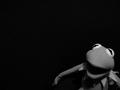
God, it's Hard Being Greenby dpchallengerComment: For me, Kermit is just a little bit too dark. This might be a monitor problem, I can't say. From what I'm seeing, I would have tried to lighten up the midtones and highlights a little bit. Otherwise, this is great -- I like the composition and look a lot. |
| 06/04/2002 03:11:00 PM |
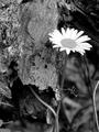
Solitudeby rumttuggerComment: I was just thinking another "hacked" title for this might be Beauty and the Beast. I like the contrast between the "smooth" flower and the rougher bark next to it. The the twig quickly making it's presence known in the lower corner seems to be the only real probem. |
| 06/09/2002 03:59:00 PM |
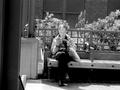
a sunny afternoonby tydComment: I think this either needs to be more drammatically tilted than it now is, or straightened so that it's level. The little bit of a tilt makes it feel like it's accidental and not intentional. I'd also suggest a slightly tighter crop, if possible, to remove the support post that's along the left side of the image. That would move your subject further to the left and make use of rule of thirds too. |
| 06/09/2002 04:19:00 PM |
Ying & Yangby zerplordComment: Funny interpretation of yin & yang. Wish the focus was a little better and the background a little less distracting. |
| 06/09/2002 12:52:00 AM |
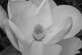
Magnoliaby elemessComment: On my machine, this falls a little flat in the contrast area. I want some of this to be a brighter white -- and I think you could probably make the dark areas in the corners of the photo darker without losing too much information elsewhere. But, that might all just be my machine. Otherwise, I really like the composition -- makes me think of Georgia O'Keefe. |
 Photographer found comment helpful. Photographer found comment helpful. |
| 06/09/2002 09:33:00 PM |
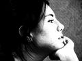
Capturedby CountComment: I'm wondering if you got hammered for what I'm guessing is taking your levels to some extremes. I like the look and think it works really well. (When the image was only half loaded, it made me think of a Geisha girl -- or maybe a publicity shot from something like The Mikado.) It might defeat the ideas you were going for when you shot, but I wonder what kind of mood this would have if she were further to the left. Right now, she feels too close to the right edge -- totally a personal taste thing. |
| 06/04/2002 03:18:00 PM |
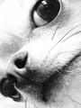
The Lookby RemieComment: This just totally cracks me up. Apart from the little bits of reflection (not the main light -- camera, maybe?) in the eye, which is very minor, I can't see anything I'd try to "fix." Good shot. |
| 06/09/2002 04:54:00 PM |
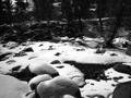
The Creekby freetimeComment: This is very black and white -- too much so to my eyes. There isn't anything here for me to really focus on -- so it feels very busy. I'd suggest getting down really close to one of those rocks and using it to fill part of the frame, maybe from a different direction so that all the trees in the background aren't hidden in shadows and their own silhouettes. |
| 06/09/2002 04:28:00 PM |
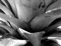
Applepineby MaYzComment: Great textures and contrast. About the only suggestion I have to offer is that maybe a composition a less centered composition, one with the lower mostly out of focus leaf further in the lower right corner, would be something to try. |
Home -
Challenges -
Community -
League -
Photos -
Cameras -
Lenses -
Learn -
Help -
Terms of Use -
Privacy -
Top ^
DPChallenge, and website content and design, Copyright © 2001-2025 Challenging Technologies, LLC.
All digital photo copyrights belong to the photographers and may not be used without permission.
Current Server Time: 08/18/2025 05:16:45 PM EDT.