DPChallenge: A Digital Photography Contest You are not logged in. (log in or register
 
Browse Settings
Currently viewing:
Registered Userhokie

Show comments:

Per page:

Order:

Comments:


Comments Made by hokie
Pages:   ... [59] [60] [61] [62] [63] [64] [65] [66] [67]
Showing 621 - 630 of ~670
Image Comment
Prepare to be Squashed: Giant Dummy on Rampage!
05/01/2002 04:24:00 PM
Prepare to be Squashed: Giant Dummy on Rampage!
by magnetic9999

Comment:
Good compostion with the background. Adds emotion. For some reason I feel like a red light on the dummy would have really added to the feeling of anger or menace I get from this photo. Imagine half that model being red :-) I go to walmart for all kinds of cheap colored bulbs for light affects.
Evening Star
05/06/2002 08:08:00 AM
Evening Star
by hokie

Comment:
BTW..can we add a spell checker..My typing SUCKS!!!
Evening Star
05/06/2002 08:07:00 AM
Evening Star
by hokie

Comment:
Thanks for voting and taking time to make comments!

The blown out sky was intentional. I had this shot as a color shot...then moved it to black and white because the sky detail wasnt good enough for color. Black and white mad eht photo look like a file photo fo a newspaper..pissem me off and I went for a hue shift to a more sepia.

As I did this the sky became more blown and detailed, the image went more silohuette and my eye stayed with the image longer. I lost the sign in the front of the Roanoke Star describing its history. That was something I needed for an article I am writing. I am adding that element back in photoshop for the shot in my article but., becasue we can't do that for the contest rules I left the sign blank ( which seemed to bother a couple folks but..thats life :-)
Texas Indian Blankets
05/01/2002 07:57:00 AM
Texas Indian Blankets
by marcelle

Comment:
One of the better shots in this challenge and actually I had a whole series of shots that looked almost identical to this :-) I used a different subject matter entirely instead but I still like this composition. Good work
The Weight of the World
05/01/2002 04:40:00 PM
The Weight of the World2nd Place
by pdb209

Comment:
This had a lot of potential to be one of my favorites if you could have focused mor on the statue and less on the building. Tall buildings are a dime a dozen but interesting sculptures are unique. Either way I like the photo..just wished for a slightley different perspective.
Dredge it up
05/01/2002 04:35:00 PM
Dredge it up
by yyyap

Comment:
I'm a sucker for rusty machinery or big earth moving equipment.
Untitled
05/01/2002 08:08:00 AM
Untitled
by itsaghostcar

Comment:
I like this photo a lot and probably have it as on of my 5 favorite shots. Did you try putting some levels on this? I downloaded the phot and just did a simple auto level and cleared up the washed out look of the image. by doing that it got rid of that whitish cast on you blacks.

Simple rule I follow. Look at the blackest part of any photo and make that your baseline black. Meaning black as black ink, perfect, no tint or overcast. That will help set the contrast for a photo. Also, did you do a lot of sharpening or cropping, I seem to get a lot or speckling in this photo.

I like this photo a lot though and rated it so.
The Oppressor?
05/01/2002 07:53:00 AM
The Oppressor?
by mykoleary

Comment:
I like this a lot but there seems to a bit of a flatness to it. Maybe if you would have left this in RGB/color mode and desaturated you could have given the subject a bit more contrast/depth. The worst way to do black and white transfers of color shots is to go to grayscale. Not saying this is how you did this but for some reason digital loses something in B&W unless you leave the photo in color mode and desaturate, perhaps leaving some tonal shift in it as well..
Photographer found comment helpful.
rubber baby duckie chuckie
05/06/2002 09:53:00 AM
rubber baby duckie chuckie
by clay

Comment:
Real bile....hehe

Keep at it clay. Your style is yours man and you definitely go where few others tread. You are the young photographers messiah :-)
rubber baby duckie chuckie
05/06/2002 06:10:00 AM
rubber baby duckie chuckie
by clay

Comment:
Ryano, listen.

There is a lot to photography other than shock value. I actually like clay's photo's a lot. He has intensity and I count a lot for that.

I think his flame picture was one of the best I have seen.

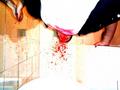
That being said, in order to capture the intensity of shock you have to get the tech stuff right to help focus the audience. Plus shock benefits from being spontaneous and not staged. I think its evident by the number of comments that this photo did one of the hardest things and thats grab the audience but lost them because it felt rigged for the shock.

Like pretensious rock like Marylyn Manson sucks but real rock like Rollins Band is intense.

Take that photo of the Vietnamese getting his head blown off. Intense. But if it were staged for a rock album it would have been pretensious. Even if the rock band had actually killed someone in the act! Since it was a photo of a real human tragedy the image was shocking, powerful, provocative, etc..

I guess what I'm saying here is even if this guy got his face punched for the camera just to bleed all over the place ( I once did a photo for an album where the guy drove a nail through his hand..for real) it would take a lot for it not to seem staged and lose its effect.

Overall I like the concept though.


Pages:   ... [59] [60] [61] [62] [63] [64] [65] [66] [67]
Showing 621 - 630 of ~670


Home - Challenges - Community - League - Photos - Cameras - Lenses - Learn - Help - Terms of Use - Privacy - Top ^
DPChallenge, and website content and design, Copyright © 2001-2025 Challenging Technologies, LLC.
All digital photo copyrights belong to the photographers and may not be used without permission.
Current Server Time: 06/20/2025 01:48:59 PM EDT.